Hello Everyone
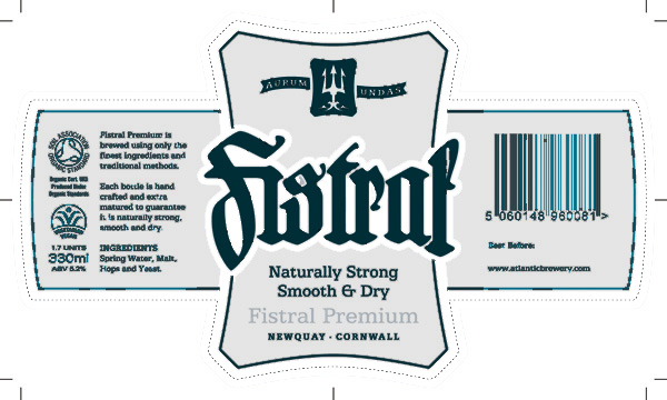
Your comments and critique of this beer label that I've just sent to print would be most welcome...
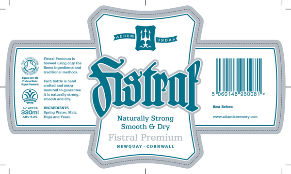
I could make any improvements after this initial short print run.
The label is to be printed PMS 3155 and metallic silver PMS 877. The dotted line is the die cut.
The 'Fistral' logotype font is a customised Hartwig Schrift and most of the other type is ATF Antique, plus a little Trade Gothic.
I have asked the printers to change the barcode numbers font from Arial (please Lord, for the sake of the children, anything but Arial) to something more techy/utilitarian if possible.
To give you some context, Fistral beach is the UK's surfing capital and is on the international competion circuit. The brewery that makes the beer is just a few miles inland. This is the only label going on the bottle which is a standard 330ml clear one and will have a silver crown cap. The beer itself is a pale gold. And chilled. Nice.