
Dear Typophile community.
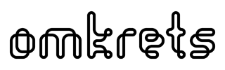
This logo is for a small architecture firm in Stockholm:
(high resolution here)
It is based on the typeface Orgasmia Outline by Brito Renato (t26.com) but I have altered the "o" and the "t" to make every letter consist of (only) one self-intersecting line.
I like how the letters are both pixel-based and drawn with a line.
The name " o m k r e t s " means "circumference" or "orbit" (sort of) in Swedish.
Please tell me what you think!
Thanks!
Mårten


