hi,
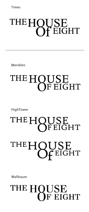
I am looking for a type with the following features:
- an antiqua, readable even in miniscule sizes;
- serifs are cut strict and straight (like in Times, not like in Garamond or Filosofia);
- axis inclination minimal or none; especially the "8" should stand still;
- nice "G" :)
- no slab-serifs.
The goal is to see if I can find a type, which can do better than the Times in a logotype, which I have to work with (and promote) for the following years to come. I guess, the designer either wasn't a specialist in type, or wasn't looking far enough (I tend to think, it's the first case).
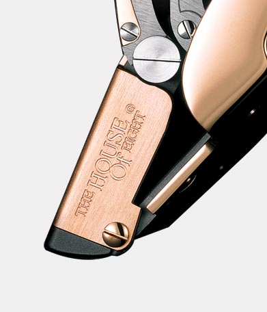
The most tough application of this logotype I've met, was a laser engraving on a product, which [the engraving] measured about 1/2 inch × 1/4 inch. I will try to push the "idea" of a signette instead of 4 words of the brand, but it will definitely take time.
So.... ?