
Hey Chaps,
Came across some cool old Helvetica specimens, thought I would post them for people to see...
These are just the first lot, Ill be going through a box of more stuff to photograph
http://www.experimenta.co.nz/Helvetica.html
Enjoy
Duncan
Hey Chaps,
Came across some cool old Helvetica specimens, thought I would post them for people to see...
These are just the first lot, Ill be going through a box of more stuff to photograph
http://www.experimenta.co.nz/Helvetica.html
Enjoy
Duncan

Some weeks ago it was the 50th birthday of Helvetica. A lot of very famous type designers were there and agreed that the original form of the Helvetica medium (the Haas Helvetica) was really missing because of a poor digitalization. It's kinda interesting because you can easly find some old letraset of this Haas Helvetica and I do own a lot of them. There are some little differences between the Haas and the Lynotype version like the non parallelism of the endings, a better lowercase a bowl and a lot of other detalis that makes it look better than the actual one. I wanted to digitalize it by myself but for the moment I don't have the time and the experience to do so. I hope someday the Haas Helvetica medium will come back!

Thanks for sharing this, Duncan. There's a lot of Helvetica bashing going on on this site & although I have to admit it's probably the most common & overused font, I'm still a big fan. It's been around for 50 years & there has to be a reason for that... After 50 years it still doesn't look one bit outdated & you just have to admire its neutral appearance. Sure, it might be a little "misused" in terms of an easy answer for any kind of design, but that's exactly where its beauty lies; it càn't really be misused in any design because it's so universal. Great font, great link!

Duncan,
would you like to add some pictures of lead Helvetica, Folio and/or Walbaum?
The standard of lead what was and is used by the foundries:
5-6 Sn
28-29 Sb
But Monotype used less Antimon:
8,5-9,5 Sn
18,5-19,5 Sb
And therefore Monotype types look "cheap".
Sn (Stannum) Zinn
Sb (Stibium) Antimon
Pb (Plumbum) Lead
So the Walbaum of Berthold from 1922 looks much more better the Monotype one does:
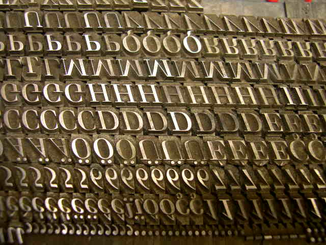
And D. Stempel AG used more Antimon for Helvetica (and Lithographia) to make it harder and more metallic looking:

Georg

Really interesting stuff (especially Stempel's letterhead) - cheers for posting this.

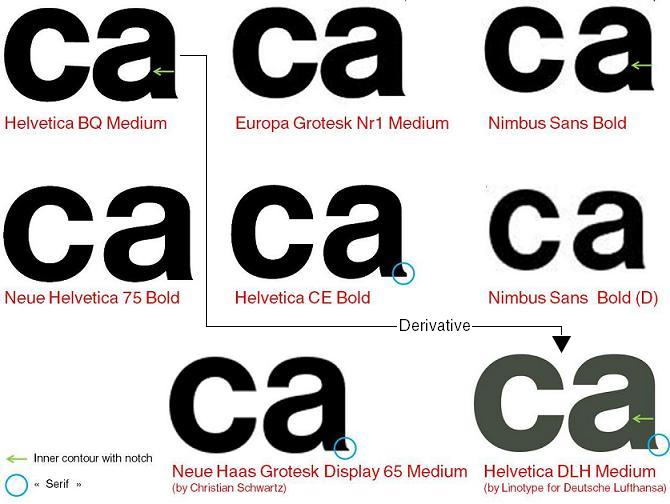
This is in response to kuroneko – I too personally believe that the initial cut of Die Neue Haas Grotesk by Max Miedinger has (or had) a certain charm that the following designs simply failed to carry, for whatever reason – technical or otherwise.
Here’s a compilation of the letter pair “ca” of Helveticas I’ve come across and spent some time examining. Please note that I haven’t included versions of Monotype Imaging (CG Triumvirate), ParaType (Pragmatica), Bitstream (Swiss 721) and many many more. Corrections/modifications/additions welcome!
To me, Christian Schwartz’ Haas Neue Grotesk is the hottest thing ever, which TOO is now controlled by Linotype.
RG

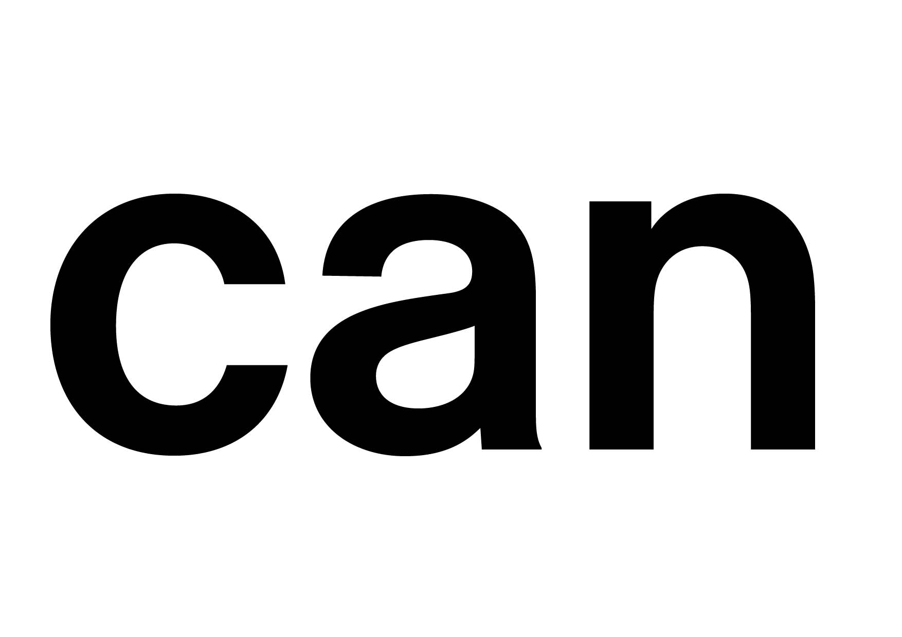
But something of the ‘organic’ construction of Miedinger's drawing is still not captured in these versions. An attempt:
Captured from web.archive.org on 14 Oct 2013. view this capture