Fellow Typophiles,
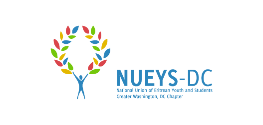
I was asked to design a new logotype for an organization called NUEYS. The National Union of Eritrean Youth and Students (NUEYS) is an independent organization that was established in the 1960’s. The purpose of the organization is to uplift and consolidate scattered youth initiatives into a coherent group movement. This is the first project of this type I have worked on and I found it a great experience.
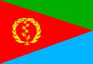
The wreath is directly inspired by the golden arch found on the Eritrean flag. For the character I was inspired by the branches of the wreath that looked like legs. What do you think of the mark?
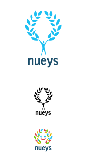
I have also added a branding variant of the mark which will be used for very young children in the region.
I am not too sure about the type. Ideally it should be in majuscule already. I have used the Delicious typeface by Jos Buivenga, its lovely and free (which is an important factor) but I am not sure it fits the design. If anyone has any alternatives I am open to any propositions.
Any thoughts and comments?
Thanks!