Hi Typophiles,
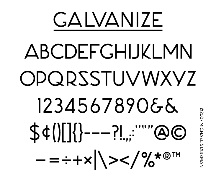
I've been working on my first typeface, and would appreciate your feedback. Please be gentle.
The typeface is all caps. It's based on some letters cast into the front of an old industrial building in San Francisco. The angular S was one of the original letterforms; I've also drawn a less eccentric alternate. There are also two ampersands because I like them both.
Many thanks.
Michael Starkman