
Font designed for outlines, takes OpenType to next level
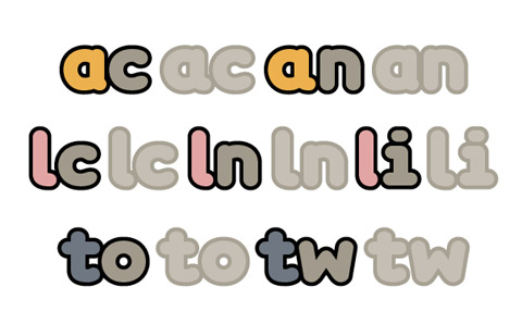
Toronto, Canada — Shinntype announces the release of a bold new font designed specifically to look good when outlined. Softmachine exploits several features of the OpenType format to produce smooth outline typography, a popular contemporary type treatment.
“When normal fonts are outlined in applications like InDesign, Quark XPress, or Illustrator, the effect often produces pointy artefacts and doubling-up of the outline,“ says Shinntype founder and designer Nick Shinn, “Softmachine uses OpenType to smooth out those kinks.”
Softmachine is a rounded sans-serif face of bold weight, with a large x-height, horizontally extended proportions, and ascenders that are much higher than the capitals. Although it is a single font not a family, Softmachine has two variants, or Stylistic Sets as they are termed in OpenType; one is a true “clean” sans serif, and the other is in the “some serifs” genre, with full serifs on the capital I and the lower case i, j, and l, and vestigial serif-like terminals on many other glyphs.
Softmachine creates its smooth effect by means of a combination of rounded letter forms, contextual substitutions of alternate glyphs to avoid uneven spacing, and precise “almost touching” kerning, to a uniform tolerance whereby the nearest proximity of almost every character combination is identical.
While the basic alphabet of Softmachine is original but not radical, its premise, and the use of OpenType to modulate spacing for outlining, are a unique invention. Contextual alternates have previously been employed to make cursive script fonts appear more natural, or to simulate random variation—not for this kind of spacing control.
To a large extent, this is pure design. The shape and proportions of Softmachine are determined not by stylistic considerations, but by the demands of the implicit outline; the short capitals, for instance, result from the need to restrict the width between horizontal stems in E and S to the default outline thickness (which is predicated as the shortest distance between adjacent glyphs.
Softmachine has a full character set for every Latin script language encoding: Western, Central European, Turkish, Baltic, Scandinavian, and Celtic.