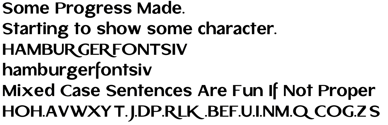
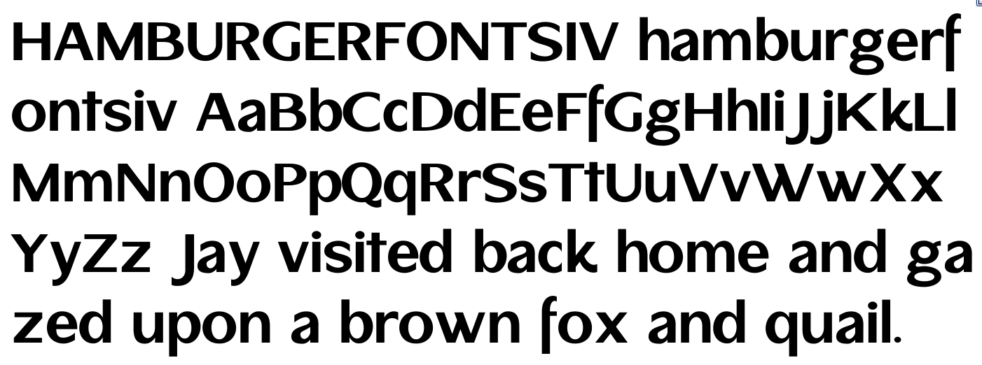
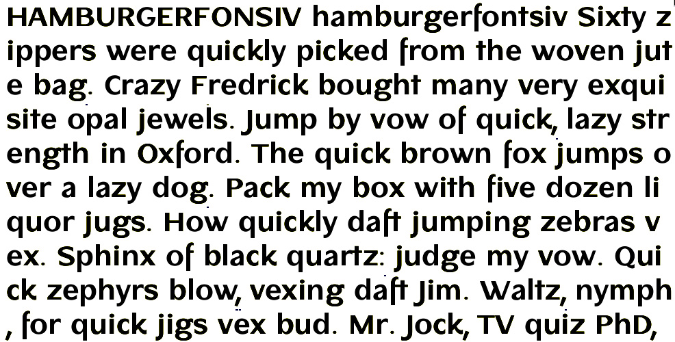
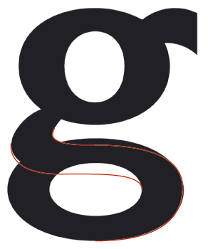
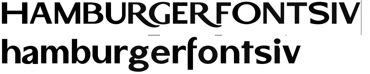
I have just begun work on this. As you can see, there are a lot of issues. Some of the character widths are incorrect, stem widths are inconsistant, and there are notches in strange areas.
I am looking for just general comments. Does the face have potential? Any thoughts on the notches? I think I will use them throughout the face, but I will have to see how they work out.
Although this face is inspired by Clarendon, I frequently deviate quite a bit from my intentions. I am aware this concept has been done before(http://www.typography.com/catalog/leviathan/index.html), but I think I can bring something new to it.
More to come tommorrow.
Jeremy Dooley
http://www.insignedesign.com