
Hello All,
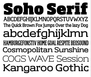
Just to say I have a new typeface release out. It's called 'Soho'.
Nice PDF and all the details can be found here...
Cheers,
Seb
Hello All,
Just to say I have a new typeface release out. It's called 'Soho'.
Nice PDF and all the details can be found here...
Cheers,
Seb

Cheers! This face reminds me a bit of something I saw recently but I can't put my finger on it.

does it remind you of that flash UK p[aper?? Youre a brit aren't you Nigella?
Muzz
Dear Muzz,
I don't think it was a newspaper but a bespoke typeface for something else like a bank maybe? I forget but it's lovely to have so many weights to choose from!
Nige:
I didn't realise bnks were into custom typefaces! I think that there are too many wights to choose from personally. Why did you do so many Seb?? Isn't it a bit over the top like Rambo in the movie of the same naem?
Muzz
>Why did you do so many Seb??
Because someone will always want a weight you didn't do.
I guess I've just tried to cover all the bases. :-)
ah ok. kinda like when i drink 15 beers then have gone so far I might as well keep going till I **** or fight??
Muzz

Sebastian, congratulations on another beautiful typeface. I'm sure it will find a lot of use...

Eye-poppingly gorgeous at an eye popping price! Unfortunately £1106.00 is a gold-winning olympic leap past my lowly freelancers wallet.
Thanks Chris.
>Eye-poppingly gorgeous at an eye popping price!
I'm glad you like the face Colin. Listen, 32,668 glyphs.
That's 3p per glyph, which is virtually giving it away.:-)
There will be standard OT fonts available at some point soon
which might be more within your budget.
Thanks for the reply Sebastian.
Yes it is indeed good value if you put it like that but it's still priced way out of my league. I'd have my credit card out in a flash if it was nearer £500 so I'll hold out for some alternative pack or format options in the future.
Are there any package prices/discount options for (Regular Non-italics - Thin. Extra Light, Light, Regular, Medium, Bold, Extra Bold, Heavy and Ultra ++ the Condensed Pack)? The Starter Pack is too basic and there doesn't seem to be anything between this and the Professional Pack. I don't use italics in my work much and the individual weight prices are a little costly when trying to build custom packs.
Thanks again,
Colin
Hi Colin,
I understand. Speaking entirely personally I like the
idea of someone being able to buy a set of 6 or 12 fonts
of their choosing at a discount but I don't make
those decisions and I imagine it would probably be
difficult to implement ecommerce wise.
Standard OT fonts will be available soon and I'll
mention your suggestions. Cheers.

I like the way you have managed to get a cleaner and more open look in the slab serif style. And well executed--congratulations!
What tools did you use in developing your multiple weights?
Hello William,
Thanks.
I used the multiple master tools in FontLab.
However it's still been a very protracted and drawn
out process. No magical solution or secret tools
unfortunately that I'm aware of. What MM does help
with is consistency of shapes across weights once
you get it working properly.
Sebastian - Soho hits a nice sweet spot in slab land. It's clear you've been reading the Guardian and it's not a bad idea to offer something of the same flavor to those who appreciate Schwartz's and Barnes' work on that paper.
I'm interested in how you came about the double-story lowercase 'g'. The connection between bowls is very cramped. Do you not recommend this 'g' for small settings?
Thanks Stephen,
Just for the record Soho was well under way in mid 2004.
Soho is in many respects Neo Slab. As early as 2003 it
was clear that slabs were gaining momentum in the UK in
a big way and I wanted to try to capitalise on that.
I showed the design as a 'coming soon' design in May 2005
at a presentation for Faces in the UK. I showed slides of the
unreleased sans and the slab serif versions. It didn't arrive
until nearly two years later because I bit off more than I could
chew in my spare time. It was originally a much bigger project
and if I'd stuck to the original plan it wouldn't have got
released until 2037.
I personally like the fullness and openness of the g you mention.
I don't personally think there is a problem until you go under 10pt.
With 3 g's to choose from I'm hoping there's one for every occasion.
Thanks for the background, Sebastian. It's easy for us critics and users to forget how many years can pass from initial concept to release. Don't be afraid of revealing what inspired you along the way, be it Guardian Egyptian or otherwise.
And thank you for the 3 'g's! I contend that the huge counters of your 2-story 'g' create a distracting heaviness in the center of the letter. But one of the great benefits of the OpenType era is that type makers are incorporating alternate forms where they might not have before.
Hello Stephen,
In terms of influences I guess a nod to Dispatch by
Cyrus Highsmith which must have influenced my decision
making on some level as the only 'modern' slab serif
design with multiple widths I was aware of at the time.
Definitely a nod to the open nature of Gerard Unger's
typefaces like Argo and Dave Farey's Cachet which informed
the design of Neo, the starting point for Soho. I've
always liked both a great deal.
The Guardian typeface is excellent and may well have
had an influence on some level since it's appearance
but I've been working on this slab design for a long time.
I actually dug out a slide from that May 05 presentation
which I'm attaching. The designs obviously matured since
then and become more conservative but you can see where
it's heading.
I am very fond of the Guardian Egyptian, and to my eyes Soho is a very different animal. The Guardian Egyptian is for a start not a true slab serif as it has angled serifs, rather than square ones, as this does. Its starting point is the proportions of traditional serifed faces, whereas Soho is much wider. It also has more prominent 'slabs'.
Looking at the 'influences' I can definitely see the influence of Chachet on Neo Sans, but I don't see where the Argo comes in...
>Looking at the ‘influences’ I can definitely see the influence of
>Cachet on Neo Sans, but I don’t see where the Argo comes in…
Hi William,
I'm just talking in broad terms about a sans design with
such open terminals. Argo is obviously more nuanced and 'typographic'.
I think Argo has influenced a lot of modern sans designs.
Lovely typeface.
Should i upload photos of print-stuff that included Soho?

Oh yes, please. I would love to see the typeface in use.
Sorry for delay cuidado,
I wasn't being rude! I haven't been checking this thread and missed your post. I'd love to see the typeface in use myself. I've only seen Soho in 'proper' print use twice so far. Please post if you get the chance.
Cheers,
Seb
Looks really good. Congrats!
T
Thanks Thomas, and congratulations on Hypatia Sans.
I meant to say previously that anyone who was
put off by the pricing of Soho initially might
be pleasantly surprised if they check them again.
Cheers,
Seb

I browsed through a copy of the British GQ yesterday and just wanted to say that it seems like they're the first big magazine to have picked up Soho. They stopped using Gridnik completely and a lot of text is now set in different weights of Soho. I haven't realIy got any pictures except this very small one found here: http://www.subscription.co.uk/covers/current/gq.jpg
I wonder if the american edition will pick up on it too, but usually Fred and co are doing their own thing in the US.

It looks really nice and works well in GQ.
Congrats!
Hi Seb,
I purchased Soho for a project I am working on and am very happy with it. I have put a spread up here;
http://www.coroflot.com/adam_poole
but would be happy to send you a hard copy if you were interested.
I am trying to get it plastered all over a VW van for another project too, assuming all goes well.
Cheers,
Adam

Saw this in Grafik, but as another one said, I can't afford this now =/
But lot's of cred for a really beautiful typeface!
Captured from commoncrawl.org on 25 Apr 2015. original URL
