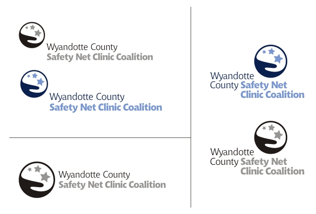
This logo is for a new association of safety net clinics which are banding together to pool resources and talent. The goals are to create a strong, unifying branding element that can be used for communicating with government, private, educational, and charitable organizations in health care.
The hand is certainly cliché, but they really like the idea it conveys. It's automatically humanistic. To the client, it represents caring. In this logo, it's also catching those who are falling through the cracks.
The name is very long and it really can't be abbreviated. I am trying to give the type enough visual interest that it could stand on its own without the logo.
I respect all your opinions, so I'd love to hear feedback. What do you think of the type choice (Chianti)? The logo? Does the positive shape register more strongly than the negative shape? (I don't want the negative shape to pop at all... it doesn't represent anything.)
Thanks for your critiques!


_4466.jpg)


_4402.jpg)

_3551.jpg)