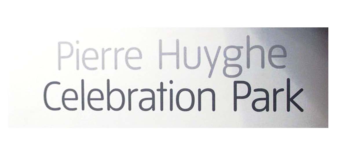
It looks like the custom version of Gotham that was designed for Print Magazine.
- Mike Yanega
Even though its letterforms are flatter, Sys has the most similar structure, in terms of letters like the C, g, y and t. Hoefler’s Gotham Rounded has more structural differences, but I am not sure if it has many differences from the custom version for Print magazine.
- Mike Yanega
I don’t think this is from Print. Can you tell us where you found it, Coca?
It’s Inspira. Not available for licensing. You might like one of these other rounded fonts.
not inspira…look at the “a”
the type is in http://www.tate.org.uk/modern/exhibitions/pierrehuyghe/
Ahh. It’s the custom Tate face that we’ve covered here many times. I’m ashamed.
Captured from web.archive.org on 20 Mar 2007. view this capture