Typophile

node 32045

Hi everybody,
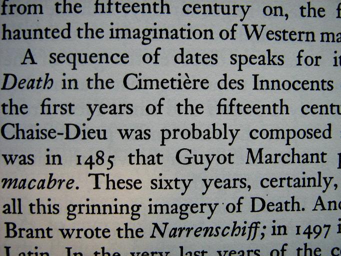
Here’s a font I can’t quite identify. It reminds me of Caslon but it seems more
rounded, compact, and ‘heavy’. I’ve tried using the Serif Font Identification Guide but did not find a match.
The book is a 1997 reprint of a 1971 edition of Michel Foucault’s ‘Madness and Civilization’.
Hope someone can at least give me a pointer.
Thanks in advance.

AttachmentSize
1.JPG71.27 KB
2.JPG85.59 KB
caps.JPG958.48 KB
3.JPG96.79 KB
italics.JPG66.91 KB
unknown

I’m guessing Janson.

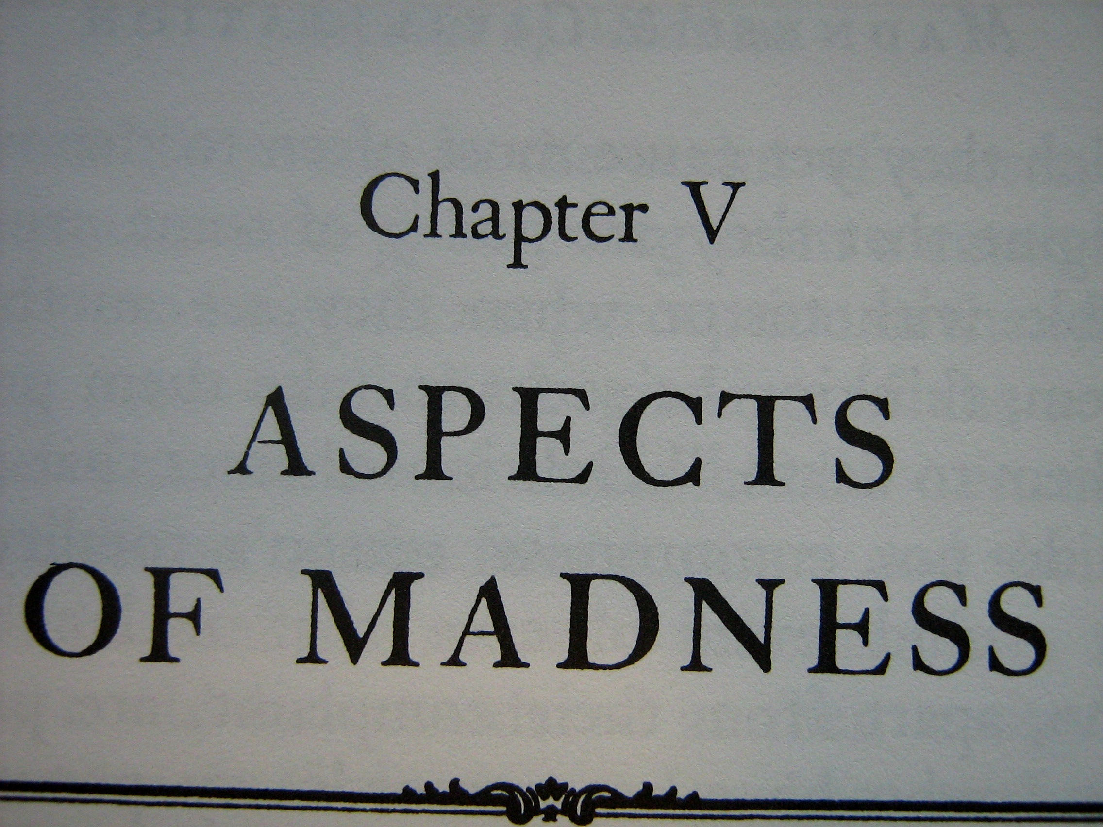
EDIT: Not sure what the Caps.jpg is though. It’s Caslon-esque.

unknown

That was my thought too. It’s not the Monotype version, but i also doubt it’s the URW. I’m guessing maybe the Berthold Janson Antiqua, but I haven’t looked at all your samples yet.

- Mike Yanega

unknown

Thanks, I was thinking of Janson too.
But I haven’t been able to match the peculiar italic ‘f’, for example. Or the capital G.

unknown

That’s really quite nice.

unknown

I agree, I think the caps are Caslon. The text itself strikes me as some kind of mongrel between (especially) janson and caslon - but I love the font.

unknown

Yes, the italic f is giving me problems too. I was hoping some of the other Kis fonts might show the difference, but so far I haven’t seen it. The chin on the G and the oddly splayed M and the drooping ‘g’ ear are Kis/Janson hallmarks, so I still don’t think this is Caslon.

You say that the book is a reprint of a 1971 book. I wonder if they used the old plates, and that this is a metal version of the type.

- Mike Yanega

unknown

Your caps sample shows a different typeface than the text samples. I agree that the A, in particular, looks like Caslon. Now I wonder if the italic is from a third face?

- Mike Yanega

unknown

The capital M isn’t tilted either, like in Janson.

unknown

I have found some old versions of Caslon that have a similar italic f by looking in the McGrew book of metal typefaces. I believe the italic is some sort of Caslon which I have not been able to match across the board.The italic A in your sample also has the Caslon ‘notch’ at the apex, I think.

- Mike Yanega

unknown

Yes, it’s quite possible that it’s a metal face. It certainly looks ‘uneven’ like a metal impression.
EDIT: By the way I’ve discovered the italic ‘f’ is more or less identical to Sabon. More mystery.

Captured from web.archive.org on 9 Mar 2007. view this capture