Hello dear Typophiles
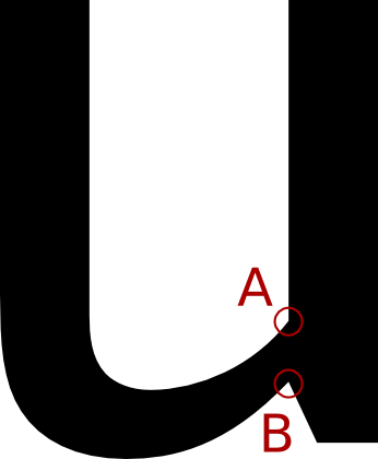
Kulby is a humanist sans I'm currently working on. It's purpose is to be legible at small sizes, yet still be harmonic and not disturbing at larger sizes. Therefore I have avoided ink-traps and other more or less extreme compensations for setting small.
It's is my first attempt at making a 'real' typeface, but please give it all you got, I want it to become good ;-)
The two things that are the most difficult for me to spot now after working with it, are the widths of the characters and the character colour (stroke weight).
Many thanks
Claus Eggers Sørensen
| Attachment | Size |
|---|---|
| Kulby-Medium A4 specimen 0.008.64.pdf | 485.89 KB |
| Kulby-Medium A4 specimen 0.009.73.pdf | 486.5 KB |
| Spec 14.03.07.pdf | 451.23 KB |