I'm using Frutiger for my A and B heads right now, but they don't really do anything for me. Any suggestions welcome. It's for a tennis how-to book. It just detracts from the elegance I'm going for.

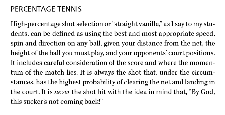
I'm using Frutiger for my A and B heads right now, but they don't really do anything for me. Any suggestions welcome. It's for a tennis how-to book. It just detracts from the elegance I'm going for.


Or Gerard Unger's ITC Flora or Praxis?
Asvetic/Linda,
Wow. I do love those options. :( alas i am sad, I should have mentioned, am restricted to the ATL. Maybe those will help me find something...
Well in that case, try Gill Sans, it's the inspiration for Bliss Pro. Or even Myriad Pro, it's a very elegant sans that's overlooked because it's the default font for most of Adobe's products... there's a reason for that.
I second Myriad Pro -- a vastly underrated font.

Underrated? Really? Everyone and their dog is using it -- especially since Apple adopted Myriad for their corp ID.
I said "underrated" not "underused" -- there's a difference.
(And I don't see it being overused either: just because Apple is using it doesn't mean everyone else is....) (EDIT: or that no one else should....)

Whether you use Myriad Pro or Gill Sans, try a little letter spacing, I think your sans is set too tight.

Cronos Pro is a humanist sans designed by Slimbach. You should try it.
But Kepler has something like 170 different variants from optical size to compression/expansion to weight. You sure you couldn't find something in that range to use effectively as a subhead without having to jump to a sans?
Aside from that, Kepler is a "modern" style typeface. Why not go for a grotesque instead of a humanist sans? It would match the proportions of the Modern better.
Captured from web.archive.org on 20 Apr 2015. view this capture