I'm curious about the average typographic standards (or lack thereof) of newspapers in different countries.
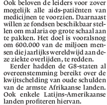
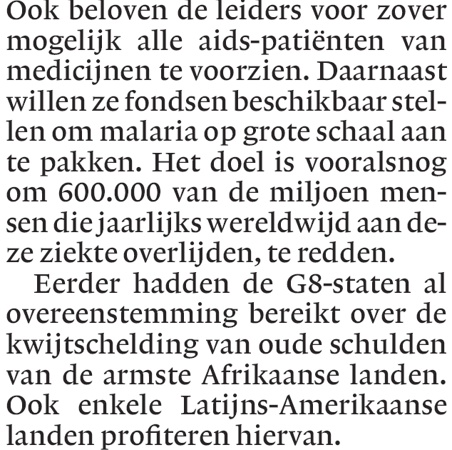
Below is a scan of a clipping from a regional daily ("Estado de Minas", circulation just over 2 million). The image isn't very good, and even at 150% of the original size it's hard to see details (I tried tweaking contrast etc but that's about the best I could get), but I think there's more than enough there for a first appraisal.
It would be great to see other samples from around the world. Also, feel free to comment on this sample.