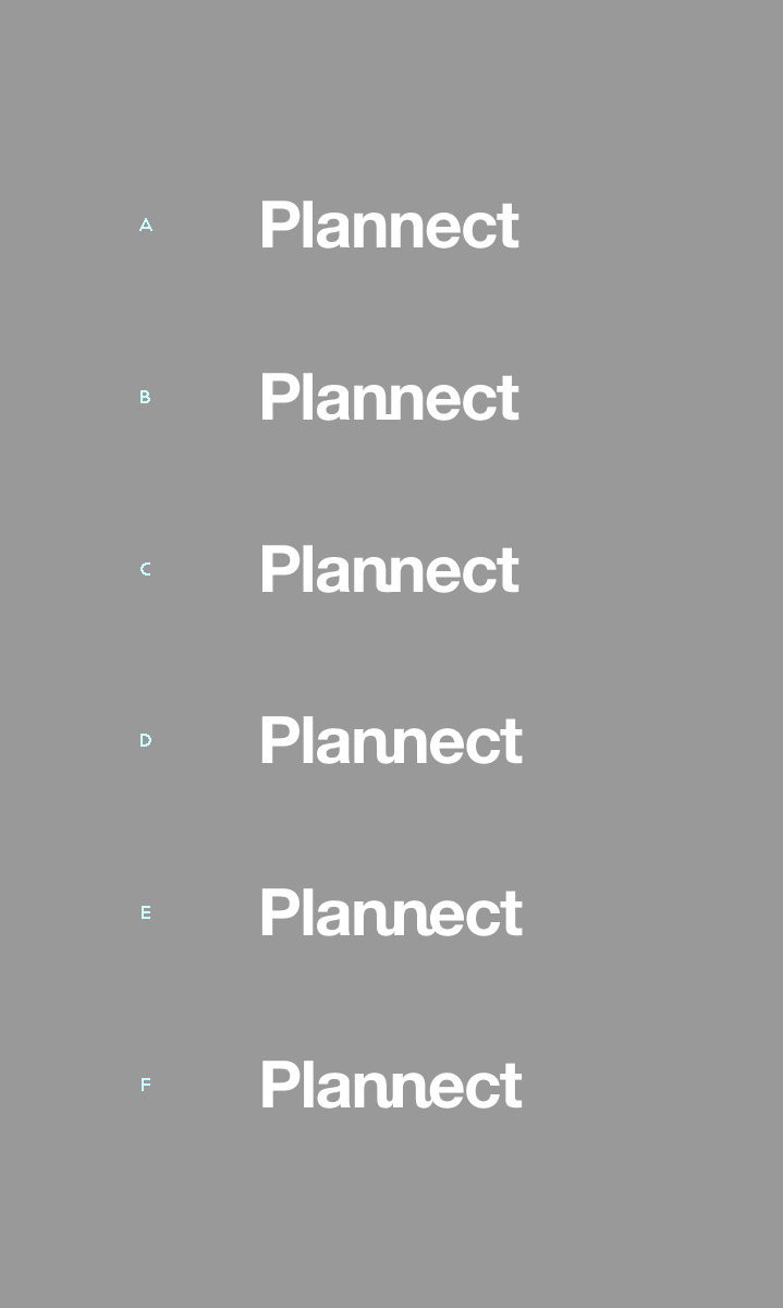
Okay, I think I've talked about this before, but I do like Helvetica. That's right, the H word. But while I like its look for certain layout tasks, I've never actually designed with it before. As in a logo.
So here's my question: can Helvetica be used to communicate a message, without the fact of its usage overriding that message?
I have a property I'm developing that combines the word plan and connect in its name. Plannect. Plan as a word feels to me to be rather impersonal, unattached. In fact, a common use for the word is to separate one's self from responsibility for a thing: "I'm planning on doing that, yes," which means I may or may not do it, depending on how I feel or how dificult it turns out to be.
Hence, Helvetica.
The word connect, on the other hand, is going to stand for friendship and sharing and family. So here's the logo as I've played with it so far; the two n's seem like the logical place phonetically and graphically to illustrate the act of connection.
Can anyone tell me if this is a horrible idea or not?
Tyler
| Attachment | Size |
|---|---|
| logo_05.png | 22.65 KB |