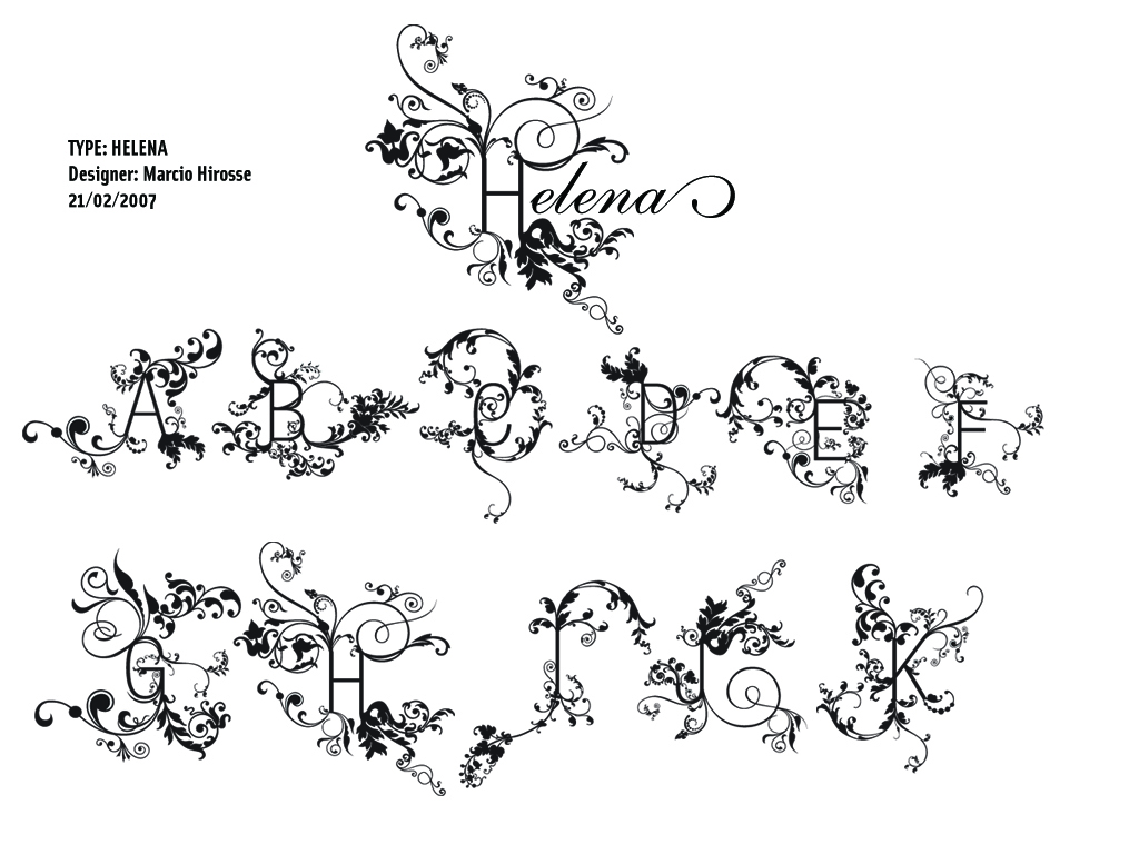
I created the new typo model, she calls himself " Helena ".
I want that all say on the drawing of that typo.
Hugs.
MARCIO HIROSSE
mhirosse@uol.com.br
www.fabrikadetypos.com.br
| Attachment | Size |
|---|---|
| Helena.jpg | 980.52 KB |
I created the new typo model, she calls himself " Helena ".
I want that all say on the drawing of that typo.
Hugs.
MARCIO HIROSSE
mhirosse@uol.com.br
www.fabrikadetypos.com.br
| Attachment | Size |
|---|---|
| Helena.jpg | 980.52 KB |

Hello Marcio,
This strikes me as something more along the lines of custom lettering than something I would create a typeface out of. The idea of growth from the letter is fun, but the letters themselves seem very stiff. Is that Akzidenz Grotesk? I can't quite tell. You might consider having the skeleton be more humanist and letter geometric.
I've also taken the liberty to re-attach the image here.
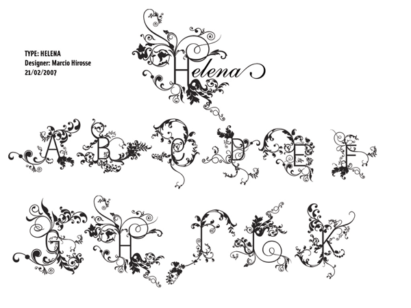

Interesting concept, although I think that the base letters could have a more 'organic' look themselves. (Of course, I'm rather new here, so this is my first time doing a type critique...)
- Richard

I really like it. (Thanks, Miss Tiffany for re-attaching the image, as I got an error msg when trying to view the original.) Personally, I like the contrast between the simple letterforms and the more organic outgrowths; sort of like the letters were man-made and left out in the woods for a long time and all these things started growing out of them. Wish I could see it more clearly, and would really like to see it in color(s). What I like most about this face is that it seems you really enjoyed creating it!

The ornaments are really great, but I'm afraid I'm going to have to agree with the others on the used font.
Did you design all the ornaments yourself or just took bits & pieces from existing ornamental dingbats? I did a few "collages" of dingbats about 2 years ago & I wanted it to look more ornamental, but I haven't really found any nice ornamental dingbats. I used a lot of pieces from Ardenwood (http://www.myfonts.com/search?search%5Btext%5D=ardenwood) which has an original look to it.
Thank you for the praises.
I really had a lot of satisfaction in creating the font HELENA.
I made a collage of several ornaments (dingbats) with a more geometric font.
To do the download (DEMO) of the font HELENA, access the site:
http://www.elifont.com/font.php?font=11606
Hugs and thank you
MARCIO HIROSSE
FABRIKA DE TYPOS
www.fabrikadetypos.com.br

@mhirosse Just stumbled across your post while searching the forum.
Beautiful ornamentation on the typeface HELENA. I'd love to see you revisit the connection points where the Terminals flow out into dingbats. The transition is a little abrupt in the image above.
Very nice work.
- Rusty
Captured from commoncrawl.org on 19 Apr 2015. original URL