This is an early test of the redraw of a shelved typeface that I started back in 2001.
The original Typophile thread is still here: http://typophile.com/node/14283
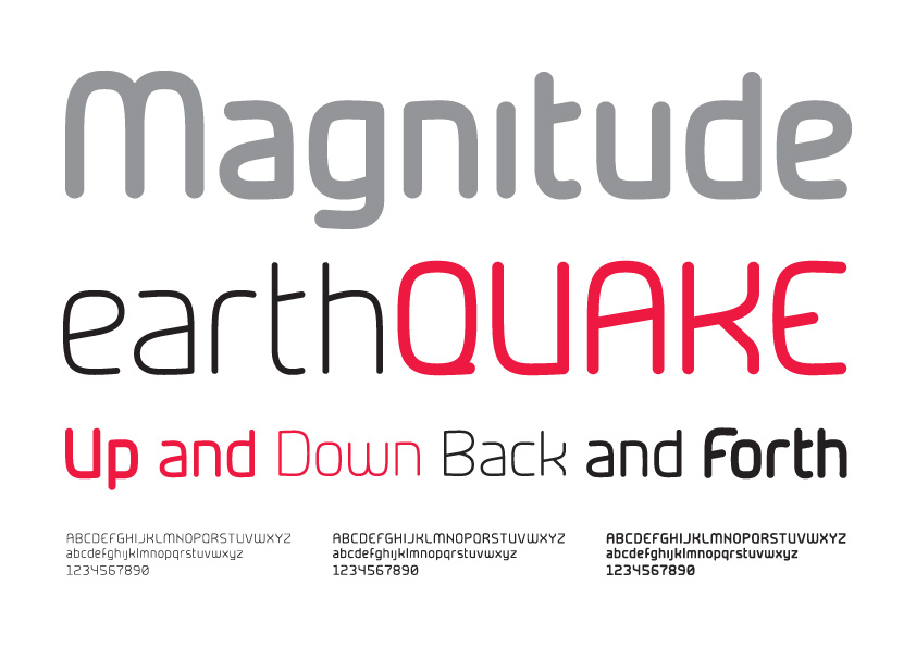
I've updated the look and feel, giving it a less rigid appearance compared to the old version. I've also developed the lowercase, hopefully giving the typeface more versatility. I've tried to retain as much of the 'character' of the old version as possible. Being an early test there's quite a bit of work left to be done.
Attached are two specimens, one of the original from a few years back, and one of the new updated version. Excuse the 'cobbled together' nature of the specimen, it was thrown together in Illustrator pretty quickly.
Some feedback on the general look of the face and comments on the glyphs/curves/character relationships/anything else would be gratefully appreciated. And if you think I should bin it by all means say so... honesty is what I'm looking for.
Thanks :)
| Attachment | Size |
|---|---|
| magnitude_original.pdf | 253.05 KB |
| magnitude_07_test.pdf | 714.69 KB |
| magnitude_07_upd1.pdf | 810.63 KB |