
Saw this on a book cover the other day. Anyone familiar with it?
| Attachment | Size |
|---|---|
| Underworld.gif | 82.26 KB |
Saw this on a book cover the other day. Anyone familiar with it?
| Attachment | Size |
|---|---|
| Underworld.gif | 82.26 KB |

I would rather say Swiss... sure looks like Helvetica, but with a twisted “r”
I doubt it’s Swiss - the resemblence with Helvetica is minor? Plus I have never seen it used in Switzerland. But thanks for input!

How old is the book?

C and r are the clues.
It is not Swiss and Helvetica.
_____________________________________________
-
golden ratio of passion. sansogno.coastaldisturbance.com

There’s a face with that kind of R. It’s like a mix between Helvetica and Univers, if my memory serves. And the name is something Gothic.

Chalet New York 1980 slightly condensed?
http://www.houseind.com/index.php?page=showfont&id=4&subpage=viewfonts
Tim
The book is from ’72. I’ve seen the font used on another printed matter so i doubt it’s custom made.
“Mr Brown”,
Hmm, I just took a quick glance, and I was obviously too hasty with my answer. I looked at the “e”, which is very “helvetic”. Good luck anyway.
It is not chalet, already tryed, tough it has same r charachter.
_____________________________________________
-
golden ratio of passion. sansogno.coastaldisturbance.com
I’m surprised that no one seems to know it - it must have been a rare face in the 70s. I actually start doubting that it has been digitised... Any I.D. suggestion welcome!
There are still a lot of film and metal types that haven’t yet been digitized. Many foundries made their own versions of Helvetica and other popular faces and they aren’t all well known.
Yes Stephen, I’m pretty sure it goes in this category. Knowing the name of it though would help me tracking it down in specimen books etc.

There was an ATF typeface called Lining Gothic (shown in Jaspert’s “Encyclopaedia of Type Faces”) that seems very similar. In fact, there were a large variety of Grotesques/Gothics with numbers which seem to include many that are at least similar. Each foundry had their own ’flavors’ of these sans serif workhorses, and film types had a spectrum of widths and weights and stylistic variations, which could be further varied by using lenses. I think this may be very hard to pin down exactly.
- Mike Yanega

’Crosby/Fletcher/Forbes. A Sign Systems Manual’
It looks to me like the main typeface featured in the above book. In the book they detail how they change certain elements of ’Standard’ (Akzidenz Grotesk for Americans!)
See
http://images.google.com/imgres?imgurl=http://ec3.images-amazon.com/imag...
Sorry that’s such a mouthful
Thanks Mike + 1985. Good stuff. That C/F/F book looks like a gem! The font looks very similar indeed to the one on my book. (Line gothic?) In fact, my book might even be designed by C/F/F which would suggest that they did custom make it but then use it on some other jobs too. I took a copy from the cover in a library so can’t look it up now. Intresting lead though indeed...
I went home and found the book and i’m almost certain it is that typeface, in the book they call the outcome Airport.
The lowercase ’r’ is really nice but some of the other characters such as the lc ’y’ seem very black.
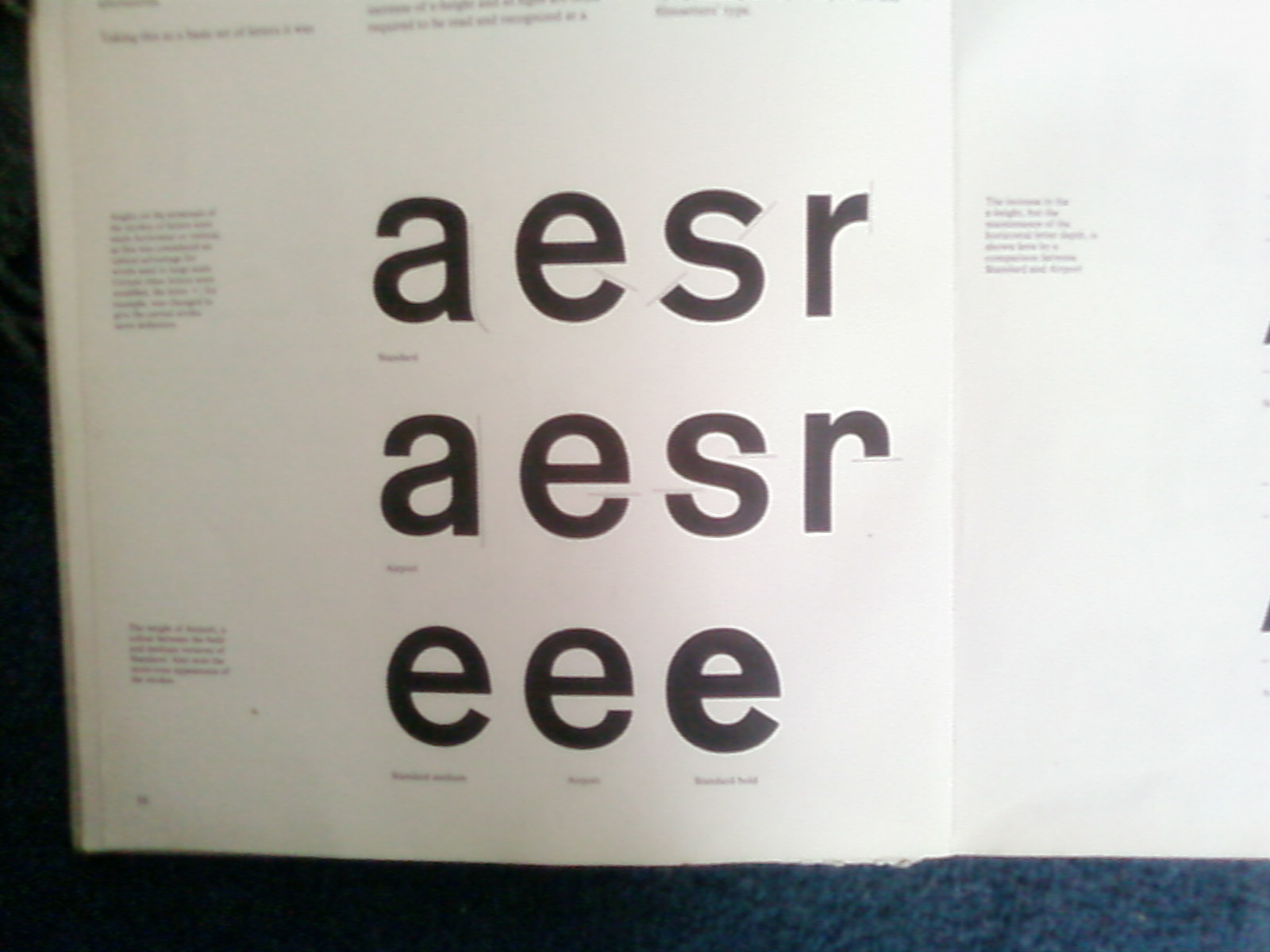
Here is a quick photo (apologies for quality) showing how they changed the characters of Standard bold. The bottom three show how they arrived at the weight of the letters somewhere between Standard medium and Standard bold.
Great book
:)
Funny enough C/F/F reworking of Akzidenz looks much more like a modification of Helvetica. I now remeber having seen it used in an airport signage, can’t remember where. That must be the reason for the name, isn’t it?
Well, better late than never!
I’ve been doing an assignment (or whatever you might call it) on Matthew Carter (you know, Snell Roundhand, Charter, Galliard, Tahoma, Verdana, Georgia...) and I saw this thread just now... well, he designed a typeface in 1970 that was to be used on the – at the time – new terminal of Heathrow Airport. I’ve never actually seen it, but the timing makes sense and the influences of the design too. They didn’t actually name it, but I’ve seen sources where people refer to it as Airport.
If I’m not mistaken, it was never produced as a usable font, not even then... I remember reading it was pasted up on the signage from Photostats, although I don’t even really know what those are.
ruD
Captured from web.archive.org on 11 Dec 2008. view this capture

