
The concept:
The dilemma:
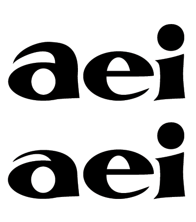
Which 'a' do you like more? Perhaps, which do you hate less?
The concept:
The dilemma:
Which 'a' do you like more? Perhaps, which do you hate less?

What does the concept have to do with the dilemma?
---------
Brad Hamilton: Why don't you get a job Spicoli?
Jeff Spicoli: What for?
Brad Hamilton: You need money.
Jeff Spicoli: All I need are some tasty waves, a cool buzz, and I'm fine.
The concept is approved. The dilemma is deciding which 'a' is better suited to adding to the growing alphabet.
Closer drafts of the a's, with the e and i there again for height comparison.
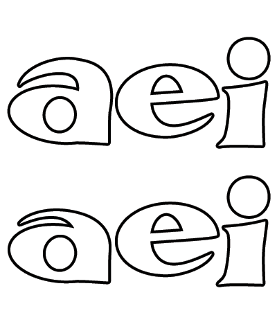

I'd go with the taller a. The short a seems squished and is even a bit hard to read as an a.

Why does the a have a circular counter, but not the e?
The counter is rounder/squatter to keep the horizontals equal width with the other letters. The outside of the bowl is equal to the g's and shorter than the xheight.
The e's counter (including the open counter, ignoring the bar) is equal to the proportions of the c, o, d, b, p and q's counters. Though the p and q might change.

I think that the "taller" a wins hands down. The other a doesn't look so healthy. However, I think that you might be taking the wrong direction by basing the a on the o. I think that the a would be much better if it took after the n.
I don't think that the a and the e always have to match. But they should be ballanced,
Since I don't think I like either, but agree that the taller is more legible, I'll look at the 'n'.
Captured from web.archive.org on 19 Apr 2015. view this capture