
Typophile
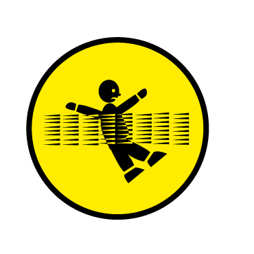
UN radiation danger sign...

Interesting: I couldn't find anything in the links to this to indicate if there's going to be a change in the biohazard symbol though. After all, many biohazards are also radioactive, so you'd think there'd be some sort of co-ordination....

I really think that is a poorly designed symbol. Most of the other symbols have a clear meaning, this one looks terrible. Very hard to tell what it means, other than it's bad.

The skull or the biohazard signs would work better alone. ¿Who the fock got paid for this?
Héctor
It would be better if they hadn't mismatched clipart *styles* The skull doesn't match the dude at all....

Warning: The sun is now radioactive! Death rains from above! Only Olympic runners will survive!
Wait a minute...wasn't that a Vin Diesel movie?

The point of this ugly thing is that the radioactive symbol on its own is meaningless without familiarity. If I didn't know what it meant, I'd assume it was a ventilation fan. The biohazard symbol has the same problem; though it doesn't really resemble anything, it doesn't look all that unplesant without understanding its usage.
The triangle frame is an interantional symbol for "Danger" but it too is entirely abstract. Nothing particularly dangerous about it, except that it might hurt if you sat on one.
The skull and bones has had pretty long use as a symbol for poison, but this could have been handled with better stylistic consistency. But what does this symbol really say? Is it "this will make you dead" or "Warning: pirates"?
The running man symbol is the only one that is totally intuitive, and even that has the problem of having a directional arrow. What will people do if the exit is in the opposite direction?

my next tatoo... that is real bad design...

I love it! It's such a mess! You really sense that there's something wrong and that you should get the hell of wherever you are i-m-m-e-d-i-a-t-e-l-y. I looked at it and I started hyperventilating and panic straight away so I guess it does work!
Gee, I only get that way when I see misspellings on large outdoor signage. ;-)

And I just love all the pretty haz mats they put out for us to view on the GWB-- LOL
lore...great work on your web....site.
richardT

I think the biohazard symbol is pretty creepy.
But if it's not possible to have intuitive symbols for everything, a picture narrative makes sense.
What about the words DANGER! BIOHAZARD! in a nasty font?
Faux condensing is scary.


I've said before that a foolproof world is an ugly world. I feel vindicated, which is not the same as satisfied.
"The symbol is to be placed on the device housing the source, as a warning not to dismantle the device or to get any closer. It will not be visible under normal use, only if someone attempts to disassemble the device."
So, it says the ceiling fan is falling at a rate that is fatal unless you jog (that way ->), but it means "not to dismantle the device or to get any closer". Now, is it so badly designed that it is not only ugly, but broken as well, by the same misguided designers? I don't think I am being too philosophical to say that there might be a correlation. Way to go, team of "human factor experts, graphic artists, and radiation protection experts" and middle management, conservative brass and PR-monkeys.
I hate when people bitch but don’t contribute any solutions. So here, Take radiation symbol, which, contrary to the PR quotes, people can be taught to recognize (otherwise they wouldn’t have included in the trinity of fugly). Increase center to make it look different enough to get attention, copy/paste the first clip-art skull on the net in the center. Must’ve taken almost 5 minutes. Double that and I’d even make the proportions elegant. It looks like the danger is inside something, radiating out, and the selfish gene should handle it from there.
(funnier if you wait for it...)
3
2
1
Tell me where to send the bill when the IAEA gets sick of their own monster.

lol that's great... Even that is better then the new symbol :-P
I hate when people bitch but don’t contribute any solutions.
Designers aren't capable of offering any better solution than the ones that have existed previously. At least before there was one symbol that people could be taught to avoid, combined with the symbols for biohazards, poisons, and flammable chemicals, that's not too much to teach people. Better symbols are not the problem at this point—a lack of education is.
If the IAEA doesn't pick that up, Choz, it might be good for an independent record label logo.
lore…great work on your web….site
Lol! I don't know why people get all funny about my website! It's obviously not meant to be taken seriously (otherwise I wouldn't upload a photo of my grandmother) so I don't know what the fuss is all about! Just pretend it's a restaurant: you don't like it, don't go there anymore. What does my site has to do with anything? Whatever.
Anyway, I was certainly not bitching. The sign really had this effect on me.
Designers aren’t capable of offering any better solution than the ones that have existed previously.
I wasn't complaining about anyone here but myself, lightly. I was just referring to my own complaining post. As lame as it is, I do happen to agree with Josh that mine is better than the IAEA's (w/ a real skull instead of the pirate tape). More immediate, less rebus. And more symmetrical.
I wasn’t complaining about anyone here but myself, lightly. I was just referring to my own complaining post.
I know. But your post still made me realize that the real problem isn't the design of the symbol, it's that too many people don't recognize the symbol.
Putting something aside from a dot in the middle helps with that i think. the arcs look more radiant and lest abstract. Perhaps it needs a real reworking rather then the patch on a patch on a patch on a triangle that the PR offers.
The problem with depicting a warning for ionizing radiation is that you can't really sense it apart from being a little bit warm. How does one illustrate an invisible fire that will make you sterile and give you cancer and make your hair and teeth fall out in some days to weeks' time? How does one even imagine such an image? Abstract symbols pulled out of one's arse seem to be the only recourse, and with those you need a massive public education campaign, and we're back to where we started.
Yes, large sources can get a very very hot. That's how nuclear power plants work, but if you're close enough to feel it that much you're pretty well cooked already.
How does one illustrate an invisible fire that will make you sterile and give you cancer and make your hair and teeth fall out in some days to weeks’ time? How does one even imagine such an image?
Photos of Tammy Faye Baker w/o the paint? Give the right idea instinctively.
I just think that a mod of the existing symbol is the right idea. It puts to use the fortune already spent on education. With as many people as there are already aware of it, it isn't worthless. But it isn't stellar, as it is too abstract, and only seems to be chosen because it look like it belongs with similar symbols (biohaz./fallout shelter). There are a lot of ideas that might work better. Flames made of dotted lines? A diseased, shedding cat? Mr. Yuck with x's for eyes? Mr. Yuck is great, from a universal stand point, I imagine.
I suspect a team of professionals could come up with something both abstract and pertinent.
The other problem, I think is that the Rad symbol has been overused, decreasing it's alarm. Since people see it where there is indeed radiation, but they are very unlikely to suffer adverse affects (normally), they disregard the mediocre symbol. Which is why the IAEA wants the new symbol to mean, "dangerous, no really this time"; we broke the last one.

My 2 cents... Is it ugly? Yes, of course. From a design standpoint it is definitely not appealing. But according to their description, it has been tested in 11 countries, and the message was clearly understood. So ultimately - it is a success. Regardless of whether it appeals to our aesthetic sensibilities. This is a prime example of how something "ugly" can still work. I have to admit I have seen bad design, that fails miserably according to all the principles of good design, but somehow still seems to communicate.

obviously it means:
"there's a big strong fan blowing so all pirates should run away."

The biohazard symbol is completely different. That is a radiation symbol. God help the world of type in an emergency!
http://xenotransplant.ineu.org/images/biohazard.gif

Good point Chris. Although it's always good to be open to improvement provided the goals of that 'improvement' are the right ones.
Anyone willing to take a shot at improving this design? Might not be a bad idea. I know some design firms in the U.S. did something similar with voting ballots. The article mentioned that one of the radiation specialists helped develop the symbol. I'm guessing they didn't get a designer involved, but did it themselves.
"...This is a prime example of how something “ugly” can still work. I have to admit I have seen bad design, that fails miserably according to all the principles of good design, but somehow still seems to communicate."
Is there where new design paradigms come from?
The article claims a team of specialists, including designers had their hand in it.
key word for error margin: team
i know it can go either way; i've certainly been strengthened and augmented by collaborators. but i've also seen projects suffer from the committee process. consensus is mistaken for clarity.
It sounds as if they are pleased with the results they are getting and if what they are saying is accurate* and people really do undersatnd it it would be maddness to get a 'better looking' sign designed by esthetes who prize good looks over safty which is what 90% of design firms would likely generate. Anyway, my point is nobody there seems to be in the market for a new sign. This doesn't mean that it isn't a worthy cause. Far from it. And it isn't as if I cannot imagine a better sign existing!
* It might not be for all I know...

Excuse me if this has been mentioned here before, but I read it described as the "When the sh!t hits the fan, run from the skull" symbol.
A good illustration of how words can be helpful on signage.

but i’ve also seen projects suffer from the committee process.
As they say, A camel is a horse designed by committee.

Two things:
1. Why not have the rays passing through the dude and distorting his shape? I think it would look cool; highlight symbolically the ill-effects of radiation and disuade people from becoming like the black stick man
2. Why do all the black stick men have to be emotionless? Doesn't a sad face tell you a lot ie. "you don't want to be here, I went here, bad things happened, I got sad"?
--N
kind of like this roughie
"Is there where new design paradigms come from?"
Probably to some extent. David Carson is a good example.
Don't get me wrong, this is BAD design all the way around. But apparently people understand the meaning in spite of the poor execution.
Nicholas - that works for me!
Here's my take on this. Simplify. Radiation exposure = death. No arrows or radiation symbol needed. If I see a skull like this on a sign, I'm leaving before asking any questions. Make it orange, for better visibility and contrast with the black.


Some kind of Darwinian experiment?
Designers stand around critting it and glowing, rest of the world runs and repopulates.
Survival of those with the least aesthetics:)
Tim
Chris, You example looks good but I don't think it gets as much info across yet. I wonder if a series of 3 signs isn't the best idea. A no entry, Death, and radiation perhaps in that order. What not to do, what will happen & why. Making all 3 ideas sit together so small seems like a mistake.


ChrisL
Yeah, but Chris, it needs to be universally understandable, and English isn't.
(The sentiment is spot-on, though....)
I guess I thought the visual image of a guy running in all senses of the word would not be as tasteful as the above :-)
ChrisL

Maybe this is better :-P
ChrisL
@Chris Keegan: From your symbol I read "Don't stick your head in the microwave" which I figure is close enough to the intent. It makes for a much better general radiation symbol than the existing one, and it would work well for things other than large ionizing radiation sources too (e.g.: high-power broadcast antennas, RADAR tranceivers, &c.)
It's not quite the "Get the fark out now!" the IAEA is trying to get across, but it looks a lot better.
The thing that pops into my head is who is going to put up these signs? How much are they going to get paid?
Here is the job interview might go:
________
Interviewer: Now Jethro, I see you have some experience in legal matters and private property rights.
Jethro: If whut ya mean is I been ta prison fer trespassin, yup, yer right.
Interviewer: You also have an understanding of proper disposal of refuge.
Jethro: Yesiree, I done my time fer dumpin unused roadkill and don’t be lissnin to whut some folks say bout me cuz, I am reformed now bein as I am here on prisoner release program ‘n all.
Interviewer: Well you certainly qualify for the job as long as you can tack up signs with no problem.
Jethro: Hell, I kin tack up enny dang thing ta git outta the slammer! Show me tha dang signs ta see whut yaa mean.
Interviewer: Here you go, have a look.
Jethro: That’s some weird feller runnin from a pirate flag bein whomped by a ceiling fan ain’t it? Shoot if that don’t look weird. Is this dangerous work with all that scary lookin stuff?
Interviewer: Oh no, no, no, these signs are not a bit dangerous. We tested them in a nursery and all the children just thrived around them. See here is the Goodhouskeeping seal of approval right here on the back right along with this affidavit from the President saying it is perfectly safe. If you are still worried we could lend you these very special protective gloves used by the most expensive doctors on Earth to protect them from any illness.
Jethro: Ya mean Dr Phil wears ‘um?
Interviewer: He swears by them.
Jethro: Now whut’s the pay fer this worK?
Interviewer: Ordinarily, this work goes for $5 an hour but with your prior experience we might have to up the anty to $6 and hour.
Jethro: I like the way you think! Yeseree, I’ll take that job!
ChrisL
but Chris isn't that Britney Spears running to the right in that symbol. It seems radioactive Britney might be as dangerous as anything, at least in the tabloids.
Interviewer: Oh no, no, no, these signs are not a bit dangerous. We tested them in a nursery and all the children just thrived
OMFG Dammit Chris, I just spilled my coffee laughing at that, then laughed at spilling my coffee. Thanks. No, really, thanks!
I am going to take Chris' suggestion and have a quick go at this as well. It will be a day or so though. Then he can crit my solution back! ;-)

ChrisL- If you don't mind, I wholeheartedly agree with Linda Cunningham that the exclusive use of English is not appropriate for warning signs of this gravity. May I offer the version Francais?
DB~

LOL!
ChrisL

This relief was dicovered in Pompey.
Odd, eh?

This relief was dicovered in Pompey.
Plop plop, fizz fizz.
An original hieroglyphs warning sign some thousand years ago – the egyptians had nuclear energy!
http://www.typografie.info/typoforum/viewtopic.php?t=3049&start=16#19586
Thomas,
That is priceless!!!
Crocodile done whee :-)
ChrisL
The new symbol, developed by human factor experts, graphic artists, and radiation protection experts...It will not be visible under normal use, only if someone attempts to disassemble the device.
OK let's start with the job title "human factor expert". I mean is that actually on someone's business card? When you get wonks with titles like that in on the committee the odds of something strong and clear emerging are mighty slim.
Then add the fact that nobody is going to see this unless they're dumb enough to start prying into a radioactive device. So it has to be ultra super clear. Hideous as this is, I have to say it does convey its message.
That said, I think the Jolly Roger inside the trefoil would probably have done the trick.
Patty just blew my image of the trefoil Girl Scout cookies forever :-)
ChrisL
Patty,
These are real people with titles like Human Interface Designers, Information Architects, Human Factors Engineers. They all get paid much more than you and I too :-)
ChrisL
My brother was Chief Information Architect for awhile so I do have a handle on that job title, but human factor experts... how do you get there?
"...unless they’re dumb enough to start prying into a radioactive device"
If that is the case, no sign will stop them. Perhaps a simple message (before they enter the Darwin Awards list) might be more appropriate, something like: "You may now bend over and kiss your arse goodbye"
ChrisL
if it's only viewable once you've opened the device, may i propose this design ?

From the shores of Lake George, Mr Harvey cuts to the quick :-)
ChrisL
I like it, Chris! ;-)
Brilliant!
sorry i coudn't take time to craft a proper international roadsign finger. i'll get on it.
i swiped this one from Ween... :)
Since exposure to the sign will be brief and it will only be seen by idiots just prior to death, I wouldn't waste time on perfecting your "digital" image :-)
ChrisL
It’s not an international symbol though.
Tim
I thought the middle finger raised was well know in most of the world?
ChrisL
Nope,
There are loads of hand signals that mean one thing in most of the English-speaking world that are either incomprehensible elsewhere (like this one) or mean absolutely the opposite (like the thumb and index finger forming a circle with the other three fingers up to signify OK -- you don't want to use it in Japan, trust me!)
When I was in Viet Nam in 1968, I saw it used copiously by the locals.
ChrisL
They probably figured out a more "positive" meaning from you and your comrades.... :-)
Ah, yes, nothinglike being part of an invasion force to make you feel loved and wanted :-)
ChrisL
i swiped this one from Ween…
You know I thought it looked like the ween finger as soon as i saw it,
tastes good on the bun
--N
What do you think? The idea I had was that comic strips are understtod well all around the world but that the frame used in the official example was less than ideal. The frame helps to tell the story. I also didn't get a turn around go the other way kind of idea from the offcial one. Anyway, this is untested and far from exhaustive. I think the 3rd one is probably the most successful.I also admit that I am using alot more signs/space in my example that the original did. But this seems like an application where more clarity might warent a bit more sign. Sorry my radiation symbol looks so sperm like. It's a rough...

Actually a comic where there is a person, a person radiation , and then a dead person & radiation might be an even better idea...
I like the green signs, though, Eben, as they give the reader an indication of "good" behaviour (for people too stupid to know what they should be doing!).
What about this?

Yes. Maybe that's better. Maybe it's a little too 'feel good' though. ;-)
Love those little particles, scrambling up every cell
If I don't run away, I'm going to end up glowing in hell....
Now that is "feel good".... ;-)
Maybe we just take our cue from Keith Haring

actually more like this:


ChrisL
How about just printing a big translucent skull on a sheet of mylar so that the viewer sees the skull imposed over his own reflection?
Now that I think about it having the 'rays' point at the skull suggest intention on their part - which is a mistake.
Captured from web.archive.org on 9 May 2011. view this capture