Hello typophile users.
Im a Graphic design student....yes, another one..
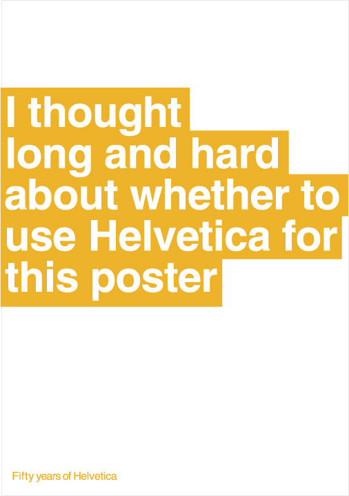
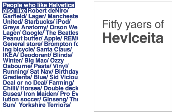
Im doing this project in which i complete briefs set by design studios, this brief is to make an A1 helvetica poster for the 50th anniversary of the typeface, using only 1 colour, set by Michael Place of 'build', a 2 week deadline. Iv had tons of ideas, this one is my favourite so far, and i thought id put it up here to see what people thought of it.
In my research, Helvetica amongst designers i have found, is a default. It the first thing they might set something in, without thought. So I thought id try and make an issue about 'putting thought' into choosing Helvetica. Which would be somewhat ironic on a poster for its 50th anniversary. I have tried to make it look 'trendy' and 'throw-away'to give the message doubt whether i have spent time choosing the typeface.
You're the typographers, my view of Helvetica might well be completely different to yours, id be thankful of any feedback good or bad, whether you think i should take a different route etc
Thankyou!