Typophile

Congrats to Kris for Feijoa's release!

This thread ran to 2 pages of replies and only one was recovered, so replies are missing.

Chris Lozos

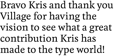
Nearly 3 years ago, I discovered Typophile and the first type in the Critique area to catch my attention was the work of Kris Sowersby. I remember his early frustration as the work progressed and his joy as it moved to realization. I knew it was in him then and I am happy to see it out and about for the rest of the world to see. Bravo Kris and thank you Village for having the vision to see what a great contribution Kris has made to the type world.

Go have a look and even a buy at:

http://vllg.com/KLIM/Feijoa/mudTyper+Weights/

Regards,

ChrisL
Good one Kris mate... nice new website too ;)

Dunk

Wonderful. May it be the opening salvo in the illustrious career of a gifted designer.

hhp

Congratulations!

I have been an on and off typophile reader for, what I have just discovered, three years and two weeks. In that time I don't think I have ever posted anything. Pathetic.

The only reason I know my membership length is because I had to go through the password rediscovery rigmarole to write this message.

Why? The brilliance of Feijoa motivated me: the slackest of typophile readers and wannabe designers. It motivated me to post a message saying:

Congratulations Kris. I am pleased to see what I always knew would happen, happen.

I am also mighty thankful that I have been able to work with you since our sh*tty projects in first year.

A mate well made.

Cheers,
Andy.

niiiiiiiiiiiiiiiiiiiice!

congrats, Kris!

Yey!! Congratulations!!

Oh my what a lovely typeface!!! I'll be certain to buy it when I have a few extra quid though I do wish it had a Bold Italic.

Excellent work, Kris. Well done.

Bravo Kris. Roman so warm and rich, Italic so clean and open, Bold so dark and satisfying. All the best, it's special!

This is what I've been looking forward to since I saw your site. Congratulations!

Thanks you all for the support & constructive criticism throughout the development of Feijoa! I really have to thank the Typophilers for their encouragement. Neither Feijoa nor Village would have 'happened' to me if it wasn't for this site.

I do plan to expand the Feijoa family, but I am over-exposed to it at this stage. This is effectively a sharpened version, kinda like Feijoa's 9–5 suit wearing brother. And trust me, there will be some really interesting things coming soon, I just can't say exactly what…

—K

Everything in its own time, Kris: Feijoa is a real keeper.

As I wrote in the other thread: Fabulous. And the first of many wonderful typefaces, I'm sure.

Bloody goodon yer mate!! Time to celbrate with a few steiny's eh?? Gonna get me a copy pretty soon!!

Muzz

Fantastic work, Kris! I'm glad that it is out in the world now. Enjoy it, and the extensions you'll add.

Wow, it even has a ffä ligature! Beautiful font, congratulations!

Very beautiful, judging onscreen. I'd love to have some prints to be fully convinced ;-)

Jacques

"there will be some really interesting things coming soon,"

Please oh please let that be a superfamily with Karbon, Karbon Serif, and the fascinating curvy counterpart (where did it go on the new site?)

Kris, Feijoa is a beauty, congrats!

What?!

Karbon is from Kris Sowersby also?! Ich bin platt.
I'm surely buy Karbon Serif, if it is available, i swear.
Let the others buy Feijoa, hehe - i like it rough.

The best, t.

Hip hip hooray!

congratulations! i've had an eye on this at the village site for some time now. i'll definately purchase sometime in the future.

Really nice, I loved it !!!

Congratulations Kris

Félicitations! Very beautiful work. You can be proud of it.

André

Chris, that's inspiring to a kid like me. Beautiful typeface!

The Kris who designed Feijoa spells his name with a K, Kris. I am just another admirer of his work. :-)

ChrisL

That's a lovely font. Mmmm... talk about inspirational! Having seen this I went out and worked on my first "get er done and then forget about it" font a little more.

Loving it.

Where's your great KLIM logo gone on the website?

Mad props! Keep 'em comin!

Kia ora folks,

Thank you all for your kinds words! Make it all worthwhile, gives me the warm & fuzzies.

Carl—Please oh please let that be a superfamily with Karbon, Karbon Serif

I will get around to that, eventually. Custom work will be taking up a lot of time though.

Thomas—Karbon is from Kris Sowersby also?! Ich bin platt. I’m surely buy Karbon Serif, if it is available, i swear.

Glad you like it! Again, it is very much in progress. I won't release something I feel is unfinished.

NIck—Where’s your great KLIM logo gone on the website?

I got sick of it, and it doesn't work at small sizes! I felt it was uneccessary, as I really wanted the new site to be black & white & simple & type only.

MetalFoot—That’s a lovely font. Mmmm… talk about inspirational! Having seen this I went out and worked on my first “get er done and then forget about it” font a little more.

Tell me about it. I have about 15 families in various states of completion. It is too easy to open one up, click around, then give up. Nothing like a deadline for inspiration!

DavidBoldItalic—Chris, that’s inspiring to a kid like me. Beautiful typeface!

Chur bro—there's no time like the present. Get cracking!

I'll also be adding a PDF of various type projects to the KLIM site pretty soon. I'll let you all know, if you are interested.

—K

> I felt it was uneccessary

Don't get too Modernist on us though, OK?

hhp

I took away my logo!

Good stuff Kris, now all you need to do is get Sting back up and running. Ha ha

Thanks George! It is awesome that your "Hellenic Hair" aesthetic is still going strong—how very consistent of you. Just the other day I was actually wondering where the "Shred" t-shirt came from, now I know!

—K

>I got sick of it.
You're crazy...
You deserve a new one. Here's my submission:

crikey Nick dont you think that's a bit funnty to design another bloke's logo wothout asking??

Muzz

Dear Nick,

"You deserve a new one. Here’s my submission:"

It pains me to say this but I must agree with an Aussie for once. Designing a logo for someone without being asked is terribly presumptuous!

Muzzer, Nigella, the logo was a gorgeous letter K intwined, if I remember, in some beautiful floral or dragon background.

I'm pretty sure the set of painfully plain boxes is Nick's joke.

Muzz,
You only had to ask.

The one I remember was like the atlas header ('Karv'?)

http://www.newzealandatlas.co.nz/

I can't find Karv...what's going on?

clever like a fox.

Just in the nick of time Muzz!

ChrisL

Thanks for the effort Nick, but I don't really think your logo is appropriate. The Atlas lettering is Karv, and based upon my old logo. Who would have thought becoming logo-less would cause a stir!

Bill, that one you're thinking of was the first version, but I didn't like it in the end either. Perhaps I am just fickle…

—K

Oh, and I will be adding a couple of PDF's to the KLIM site in teh next couple of days.

—K

Kris - how do you get to see the ligatures in the type setter? What combination of keys do I need to press?

Dave

Such a beautiful typeface. Thanks Kris!

WhitePepper: "Kris - how do you get to see the ligatures in the type setter? What combination of keys do I need to press?"

According to Chester this version of the mudTyper does not handle advanced OT features. Sorry about this!

However, two new PDF files at KLIM.

The Feijoa PDF shows text settings and character sets of all styles. (The text is part of a story written by my very good mate R.D. Syde—no dummy copy here! )

The KlimType 01 PDF is essentially a sample of typefaces, lettering & work in progress by the KLIM Type Foundry. It shows the depth and breadth of our typographic work, plus a few sneak previews for those who are interested!

Thanks for all the support so far, I really appreciate it!

—K

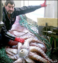
Besides Kris landing his typface at Village, it looks like he got Muzz to help him land a giant squid as well!
:-)
NZ fishermen land colossal squid

ChrisL

It's been a long time since am not participating in Typophile,
but I felt that Kris deserves a brake of my silence
(I also remember his first enthusiastic posts).

Well done my friend.

―christos

Captured from web.archive.org on 21 Mar 2015. view this capture