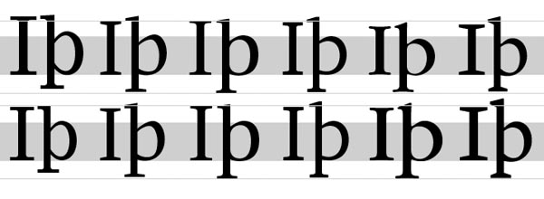
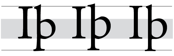
Someone explain this to me:
Everywhere I look, people declare that typefaces with large x-heights are more readable than something with small x-heights. For instance, many people don't like Futura for body copy because of the long ascenders/low x-height (aside from the sans/serif debate). They say it breaks up the color too much. Same thing for other typefaces with low x-heights like Venetians.
But that doesn't make sense to me. Presumably, the larger x-height makes the letters appear larger. But that means that you need to increase the leading proportionately to compensate. If you used a typeface with a low x-height at a larger point size, wouldn't you basically have the same results?