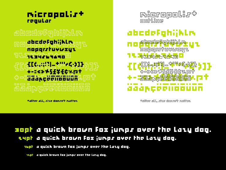
First of all, I wasn't sure whether to post this font here, in the Display forum or the Experimental forum.
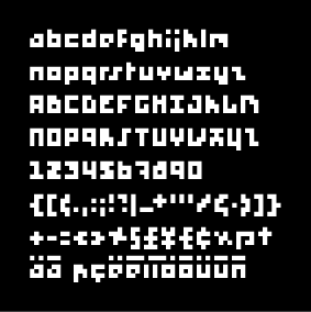
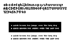
I've tried to make a legible (and I use that term broadly) font with a 10 pixel limit for each glyph while respecing each character's characteristics (ascenders/descenders). I'm not sure if I succeeded at this, after all, I knòw what it's supposed to be, but I do like the outcome of it.
| Attachment | Size |
|---|---|
| Micro.gif | 28.88 KB |
| Micro2.gif | 3.6 KB |
| Micro3.gif | 2.39 KB |