
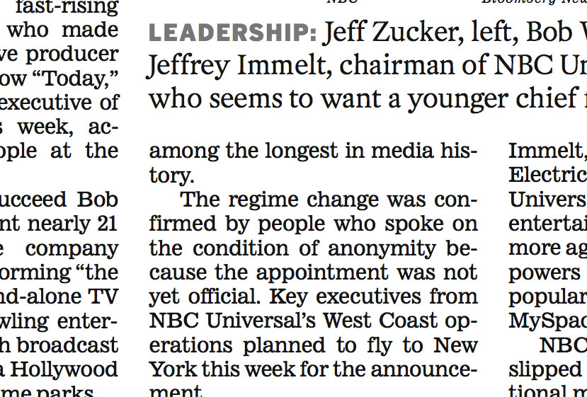
I'm looking for the closest possible match to the caption and body faces used by the LA Times. Any guesses?
Thanks in advance!
I'm looking for the closest possible match to the caption and body faces used by the LA Times. Any guesses?
Thanks in advance!
New Century Schoolbook will be my placeholder for now - it's super-close!

"...and the old workhorse Ionic No. 5 was deployed for text."
http://www.myfonts.com/fonts/linotype/ionic-no-5/familytree.html
From the blog of Roger Black, the famed publication designer who led the L.A. Times redesign.
Out of curiosity,
is there any recent typefaces that have been tested and made specifically for coarse newsprint screens.
Looking for more choices than the tried and true list:
Century, times, Excelsior, Ionic, Paragon, Corona, Ideal, Rex, Regal and imperial.
Do I need to even worry about this any more since most are printed on Web Offset these days?
Font Bureau offers several text faces in various "grades" designed specifically for newspapers, including Poynter Gothic, Poynter Old Style and Poynter Agate.
More info on their Readbility Series here:
http://fontbureau.com/pdf/FB_Readability_Pricing.pdf
More info on selecting/testing type for newspapers:
http://fontbureau.com/newspaper/presstest/
Hoefler & Frere-Jones offer Mercury in grades, as well, "designed for newspapers, where ink meets paper in unpredictable ways..."
http://typography.com/catalog/mercurytext/grades_duplexing.html

Or indeed Gerard Unger's typefaces for newsprint: Swift, Gulliver and Capitolium News.

It is important to note that while Gerard Unger's typefaces were designed for use in printing for the news he designed for the new technology. Or in other words, the fact that the paper and printing process had improved drastically and could now print crisp sharp lines and shapes.
Miss Tiffany you are right about that in the cases of Gulliver and Capitolium News. Swift however can bear quite a beating, and i would claim that it survives bad printing better than the 'old workhorses' like Ionic No 5 or the other Scotch Roman news-print typefaces contemporary to Ionic. I mean – just look at the example above. As a matter of fact I don't get why these ancient faces are still in use? Familiarity?
Thanks for the eyeball, marcox! Any idea on the caption face?

Looks like Poynter Gothic Text.
Claus: Yes, that is true. Swift was designed previous to his work with USAToday so the design probably took into account the poorer printing qualities.
My bad - the caption serif face. Any ideas? :)
Captured from web.archive.org on 14 Nov 2014. view this capture