
Hi all,
I'm not too sure if it's the proper name but what keyboard do I need too use on mac OS X to get the Ldot character. It's called Ldot in Fontlab, it's and L with a dot just inside it.
c.
Hi all,
I'm not too sure if it's the proper name but what keyboard do I need too use on mac OS X to get the Ldot character. It's called Ldot in Fontlab, it's and L with a dot just inside it.
c.
Ok so I found out it's the catalan middot, and I've changed the keyboard to Catalan, but what keys do I use to get the character.
c.

Have you looked at the Art director's toolkit, it tells you where to find glyphs? With Minion Pro it actually only says glyph 771, and doesn't give any unicode results.
If your font has the glyph, you can access it via glyph pallette in InDesign and Illustrator
If you're designing a font I can't help, sorry.

Keep the keyboard the same. Go to the edit menu>special characters> Type in 013f where I have typed catalan. Drag and drop the character into your software.
Sorry for the large screen. Mikey
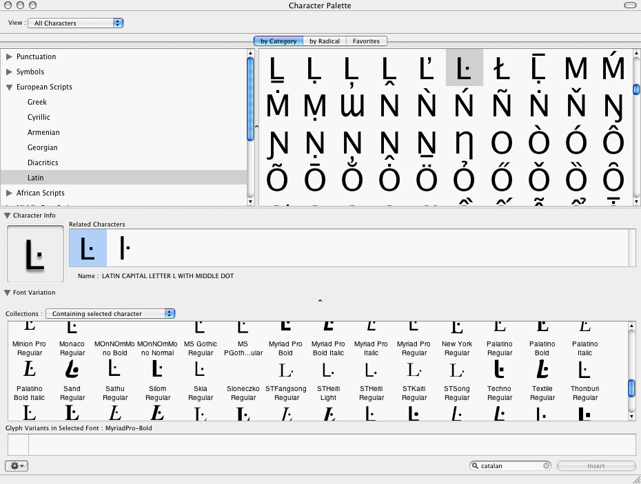

Also, System Preferences – International – Input Menu – Keyboard Viewer & Show input menu in menu bar. That’s more helpful than character palette if you have to access the glyphs frequently and can change the keyboard layout.
ŀl is “ela geminada”… for the record.
;^)
Thanks for all the input everyone - thats great.

Coop,
keep in mind to design the ldot/Ldot so that:
* When ldot is immediately followed by the normal l, and when Ldot is immediately followed by the normal L, the dot in ldot/Ldot appears visually centered between the two l/L's.
* There should be no implied wordspace between ŀ and l, so a word like "coŀlecció" should look like one word, the space between the two "l"s should not be visibly larger than between other letters.
This is a similar recommendation to what you should do with the "apostrophic caron" for Czech and Slovak: the word "ďábel" should have no implied wordspace, very much unlike the English "don’t", where the apostrophe can have some space on its own. For this reason, the dot in ldot, and the apostrophic caron in dcaron, tcaron, lcaron should be designed very "sparsely".
Captured from web.archive.org on 13 Oct 2013. view this capture