Hello, this web site seems like a really good place.
I would appreciate your advice on setting type in InDesign. I have only just started using this software, I have previously only used Photoshop for typography because I have not had such specific requirements until now. So I am trying to learn the software and this is my first problem. Hopefully you can help.
I print an art magazine. It is a very simple little thing, I normally print 100 or 200 copies and it is all screenprinted, letterpressed, rubber stamps et cetera. I do not call it a 'zine' because it is not, though it does have a 'cheap' aesthetic.
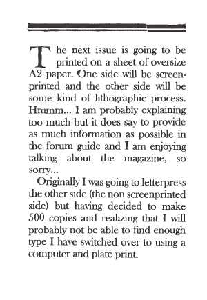
The next issue is going to be printed on a sheet of oversize A2 paper. One side will be screenprinted and the other side will be some kind of lithographic process. Hmmm... I am probably explaining too much but it does say to provide as much information as possible in the forum guide and I am enjoying talking about the magazine, so sorry...
Originally I was going to letterpress the other side (the non screenprinted side) but having decided to make 500 copies and realizing that I will probably not be able to find enough type I have switched over to using a computer and plate print.
The layout of this side will be similar to a traditional newspaper. I am going to have a header with the title and then eight columns running the full length of the page. Each column will be two inches (12 ems) wide and the gutters will be 1/8th of an inch. The full width of the print area will be 16 7/8 inches. I am probably going to be using 10pt Baskerville (which might raise another question later on). The page will be full of type, closely packed together and printed as black as possible; I want the columns to appear as eight black drips of tar or oil running down the page.
Anyway, my apologies again, here is my question, almost:
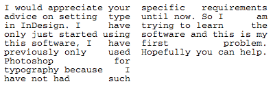
I want the type to be justified in the columns but not in a typical sense. I will have to put an image here to show you a vague example of what I mean:
-
Does this help? Basically the idea is that I am going to be using InDesign in the same way that I would be if I were using letterpress, rather then evening out the spacing between each word to justify the type I am just going to put all of the space before the last word in each line. I am not sure how this is going to look but the intention is for it to appear like a crack running down the column, it does not work particularly well in the code example above but the idea is there.
I know that you can 'Insert White Space' in InDesign; em spaces, en spaces, thin space et cetera so that is useful. But I want to know if it is possible to calculate the width of each line so that I can work out exactly how much space I need to insert before the last word so that the columns are justified perfectly. (?)
Do you know how to do that?
Thank you for your help.