
Hello!
I am currently designing a logo for a new business and was wondering whether there exists an 'sh' ligature anywhere? My knowledge of type doesn't stretch very far but i don't think this is a commonly used ligature?
Thankyou!
Dave
Hello!
I am currently designing a logo for a new business and was wondering whether there exists an 'sh' ligature anywhere? My knowledge of type doesn't stretch very far but i don't think this is a commonly used ligature?
Thankyou!
Dave

If there isn't it shouldn't be too hard to construct one, either with something along the lines of a "ct" loop or by extending the top stroke of the s straight into the arch of the h.
ct loop sounds like a good idea! Now I just need to find a typeface with one of those!

Or make the loop yourself.

I would be interested to see what you make. So please post it here so we can see it. BTW there used to be a thing called a long s and it had a ligature with t as well. You might want to look at that. If you search typophile on google ( site:typophile.com ligature ) you will find all kinds of stuff to help you. Maybe even an existing sh lig.

http://www.myfonts.com/fonts/linotype/adobe-caslon/
http://www.myfonts.com/fonts/dstype/esta/
Some examples of ct and st ligatures.
Tim

I love the "gi' ligature in esta.
I've been trying to find/create a good SH ligature for part of a personal logo.

extending the top stroke of the s straight into the arch of the h
I'd do this also
_______
AL
lenart.pl
Really like the st combination of esta (and the gi too - sch2525)- thanks Tim! As for extending the top stroke of the s straight into the arch of the h, would this only work with caps?
Here is what I mean by extending the top stroke of the s straight into the arch of the h:

A quick & dirty example with Gill Sans, before and after. This would look better done a bit more carefully, but you get the idea.
Aaaaah! I see! Thanks for that! Very useful!
I like something like this based on the st/ct lig. I made it quickly in phtoshop with a brush freehand...

Yep - I like that too!
Okay, based on the advice given, here's my first attempt. I've basically taken the ct ligature from Adobe Caslon, and connected the s to the underside curve of the serif of the h.
I'm no typographer, so any further advice, thoughts or opinions would be gratefully received.
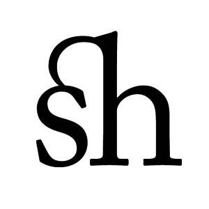
I would lighten the weight of the top of the swoosh/join. The best ligatures of this type I have seen make the connection but do it in a light almost self effacing way. I might reduce the weight of the h's top serif as well because the weight of it is exagerated now that the connection is there. Or you could bring the arc into the h from higher up. There are many many ways of going from where you are but I think it's a fine start. I would try all this in pencil quickly rather than mucking about on screen. But I would try at least 4 or 5 different modifications.

what about a long-s + h ligature? that would look better, and they existed historically in the past. I best some fonts even have them still.
I had a look at the long-s idea but didn't particularly like the look of them. Does anybody know of any that exist in modern typefaces?

Do you have an example, Dan?
Palatino Linotype (bundled with some Microsoft products, and available here) has long-s ligatures, although the f/long-s forms in Palatino are not my favorite forms. Here is an image to show how it could be done, though:

I'm sure some other types with monster-sized character sets have these, too. Maybe in the Adobe fonts? Garamond Premiere Pro?


Great - thanks for these! I can see the italics working quite well as the next letter in the logo will be 'l' which might add some sort of symetrical balance - though I wont know till I try!

Young kris has one in his feijoa font:
http://typophile.com/node/20161?from=50&comments_per_page=50
Maybve he'll bloody well release it one day!!
Muzz
I'm sure its hard to send your baby out into the real world. :)
Feijoa is going to be insanely good!

Emigre's Mrs. Eaves might have some ligatures you can study.
WhitePepper, I like your own ligature the best so far. Because you've taken it from another pair of letters, you need to make the joins look smoother and more natural, if you will, to the letters you are using. I second Eben's comments, adding that the way the curve joins the s looks especially unnatural (to me, that is).
I don't think they are soooo bad. Just that they could be better. And I would look at both ends notwithstanding the fact that one of the joins may have been 'official'. I think both connections look sub-optimal. But it might be good to look at it in context. This is for a logo. Correct?
Yes that's right. The word I'm working with is 'Acushla' (pronounced A-koosh-la), and my line of thought is that the sh ligature is a good way to finish off the second syllable 'koosh' and draws attention to the pleasant sounding 'sh'.
I've tried a few more options (below) (number 1 is the same as the previous post, allowing you to see how it's developed) which gradually seem to gain more of a higher, rounder loop, ending in number 5 where I've slightly altered the end of the 's' by curving that sharp corner (don't know if typographiclly speaking, that's an acceptable thing to do?)
Let me know your thoughts :)


I like #3 personaly, although the transition between ligature and the S still feels a little bit awkward to my eye: that transition is better in #5, although I would prefer the "sharper" S.
(Just one non-type designer's opinion....) ;-)
#4 is the same as #5 but with the "sharper" s, but I was worried that the sudden change of direction in the sharp 'corner' of the 's' into the loop was a little too much and so came up with #5 i.e a smoother 'corner' that flowed straight into the loop.
Thanks Linda!
I'm currently sketching out an idea based on the feijoa 'sh' ligature mentioned earlier. I'll post it when I feel happy with it.
Anyone else any further thoughts on the 5 posted above?
You rounded the entire end over though, right? Perhaps if you keep the tip a little sharper but keep the smooth transition.... It might be nice to see it set as the logo as well to see how it flows with the other glyphs too.
I don’t think they are soooo bad.
Eben, I never said they were.
I like 5 the best so far, but I think that the transition into the s is a bit on the thin side.
I like the bottom of 3 & the top of 5. I think I do anyway.

I have that kind of ligature in my font habibi
http://skriftklog.dk/index_2006.php
Can anybody buy a copy of Habibi? Your ligature is pretty. Is there a PDF?
That particular font is still in the works I'm afraid.
Check out a pdf of the ligature here:
http://skriftklog.dk/div/habibi-sh.pdf
Ahhh! Interesting! I like the way you've approached the top of the 'h' from underneath! That gives me another potential option - thanks!
Okay, as requested, here's how the sh ligature fits in with the whole logo. It's still a work in process, and I'm posting it to give the ligature some context, though any comments would be welcomed to help guide me to a better all-round solution.
The first image here shows the word spelled out without any treatment, and the following 3 show various different approaches.
Thanks,
Dave

Dave, I really like the treatment you gave the "A" as well -- my vote would be for #2 above.
[edit: I mean the second full word with the ligature, the "middle" one of the three "designs."]


Nice one Paul! The spirit of connected writing is probably the birthplace for most of these and still where it looks at home.
Is that one of yours Paul?
ChrisL
Paul: Very sweet!
oh, yes. i guess i should have credited the lig above. It's from LTC Artscript

Magnus,
Habibi looks great - any idea of when it might be completed?
jarrod
Captured from web.archive.org on 14 Feb 2015. view this capture