
Any thoughts on this here sample?
| Attachment | Size |
|---|---|
| Picture 3.png | 13.74 KB |
Any thoughts on this here sample?
| Attachment | Size |
|---|---|
| Picture 3.png | 13.74 KB |

Those shapes are really cool. It doesn't look like you've put enough (any?) overshoot on the 'A', 'O', and 'V'. Otherwise, I like it.
- Lex
you're right about that. try this...

Cool. Let's see more letters.
- Lex
well, what i don't have for you is more letterforms...yet. what i do have is this...
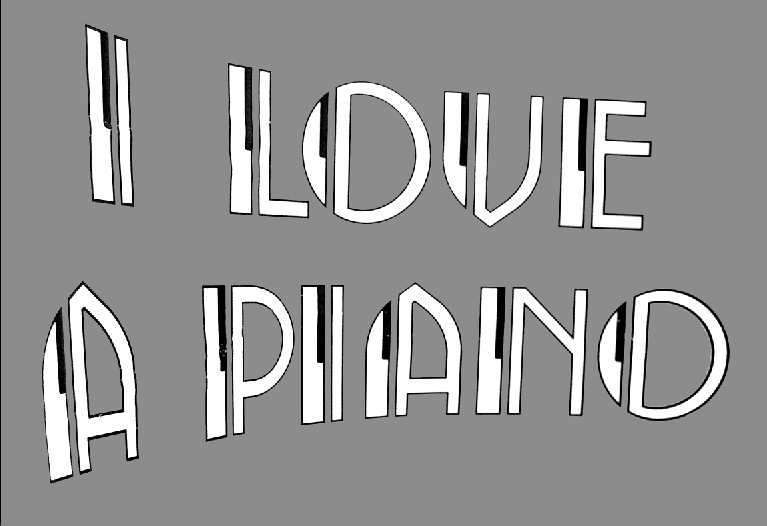

i love the shapes
i just don't get the thin black outline
i think it would be much better without
let's see more letters !
Captured from web.archive.org on 19 Apr 2015. view this capture
