
Hello everyone,
I'm currently a pre undergraduate design student and would be very grateful if you could give me some feedback on one of my designs. I was asked to design a poster advertising the St Bride library.
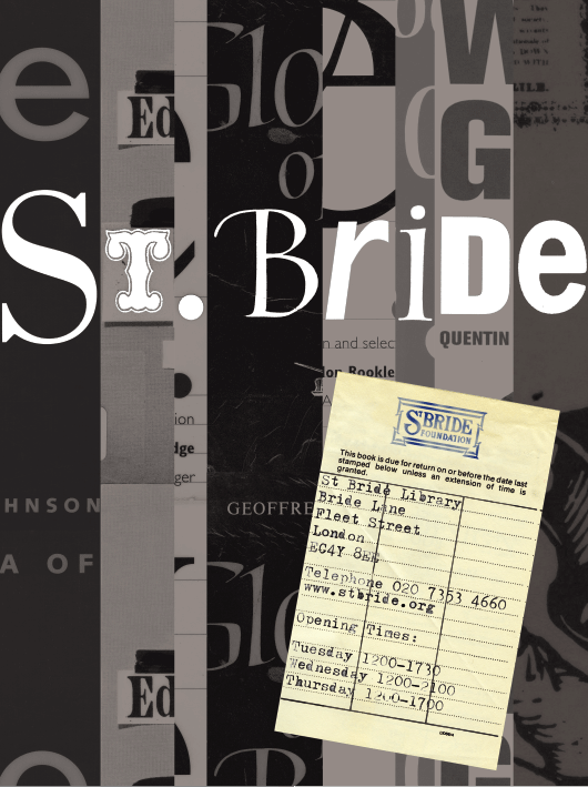
Hello everyone,
I'm currently a pre undergraduate design student and would be very grateful if you could give me some feedback on one of my designs. I was asked to design a poster advertising the St Bride library.

I like it a lot. I doesn't shove the book reference in your face as much. And I like your old check-out ticket - I think we were the last generation of students to have those. I think it blends the contemporary black-and-white with the old-school very well.
My only concerns are:
The T in the headline because it's so decorative, I found it kind of distracting against the other characters that you used.
And some of the "stamped" characters are hard to read because they are too light (presumably because they don't have enough ink on them).
But other than that, I like it a lot.
-Scott
Thank you very much for the positive feedback Scott.
The actual poster size is just over A3 so the type is a little clearer when produced at full size but i can see the points that you have made. But I am glad that you like the design!
Many Thanks
Hi, I like this creative idea very much and it looks very different to what could of been done. Making the background greyscale is again different and makes the white type stand out. The library ticket is a nice idea but I'm sure sure if its ledgable to read easily. Nice design well done
My only criticism - and I like this a lot - is that I might darken the greys in the background a touch so that the white type pops a little more. Just to decrease the contrast a bit.
Captured from web.archive.org on 6 Nov 2013. view this capture
