
While testing a pen, I inadvertently drew a "protoglyph", and something potentially interesting struck me. Is anybody else thinking what I'm thinking?

hhp
This thread ran to 4 pages of replies and only 3 were recovered, so replies are missing.
While testing a pen, I inadvertently drew a "protoglyph", and something potentially interesting struck me. Is anybody else thinking what I'm thinking?
hhp

Is anybody else thinking what I’m thinking?
Hrant... I don't think I'm fully capable of thinking like that! ;-)
My first cognitive impressions are of calligraphic ampersand.
But before that I just admired the flow, balance and movement.
Looking forward to a signed copy I can hang up.

> drew a “protoglyph”
ampersand?
An ampersand? This is getting interestinger and interestinger...
Actually I'm not after a glyph ID.
hhp

infinity

I don’t suppose you were thinking of Barbara Hepworth?
Tim

I would say the interesting bit is that your mind fills in the black spaces that can vary between the notion you have of what it is, I first saw an ampersand, now it's a 'g', because I start negating or adding spaces to the mental composition. I, however, have no idea what you are getting at – I am a bit of a n00b ;).

Is anybody else thinking what I’m thinking?
I think so brain, but this time, you wear the tutu. narf!
sorry hrant, i couldn't help myself ;^p

"one's a genius, the other's insane..."
but seriously, i am trying to figure out what a "protoglyph" is. a glyph is a symbol with meaning, of course, according to our very own typowiki. and proto- is a prefix meaning first, earliest, or original. furthermore, in combination with other words, it means - more or less - a foundation or basis for things which come after it or develop from it. e.g., prototype, protolanguage, etc.
are you thinking your inadvertant squiggle has a universality or flexibility to be the basis for a whole - ahem - "set" of glyphs?
jarrod

I was thinking of a lorentz attractor. If you ask me to explain it I will say its a peek a boo or owl eyes.
Mike

but that's not a proto-thingy :-(

Looks a bit like a mobius strip.

Are you thinking of a 'flipped' or reversed ductus al la the moebius strip?

& on 2 infinity
That or simply "8 is enough"
:-)
ChrisL
or maybe it is that famous old Hollywood "Hourglass Figure"
ChrisL

It looks like one of those lucite high-heeled shoes that strippers wear.

Not the last Chippendale's act I saw.... ;-)

Mr Escher comes in mind
Chiro-notanic protoglyph open stroke G-clef.
Or maybe a cute little butterfly on a breezy day! :-)

Free-Hand Lissajous Figures?!

Hrant
Rather than playing the guessing game, what are you thinking?
Gerald

He is thinking to become a chirographer !
Yeah, get rid of the bouma for g∞d !
Check this out, maybe Aziz is on the run.
Cool protoglyphing doodling by the way !

Are you thinking what I'm thinking? That was the last election' slogan for the Conservatives in England, wasn't it? I remember there was a big billboard near my house with Howard's face and the slogan and someone had sprayed on it "Are you smoking what I'm smoking?".
Sorry, hrant, go ahead. This thread is beginning to read like a thriller. Can't wait to see how it ends.

Sorry Hrant, but I only do long distance mind-reading on Thursdays... what are you thinking? Is it about the thick/thin stroke thinning and crossing over itself – like those impossible skidlines on a slippery road sign?
Yah... what is it???
:-) Mikey

While testing a pen ... something potentially interesting struck me. Is anybody else thinking what I’m thinking?
Sure. Your pen skips.
What!? That's not it? Okay, why not shelve the guesswork games and "fess up"?

Lemon curry?

Can derive 20 of 26 alphabet characters from the thingie.
Warm, cold or Icy ?
And if this is a ball point, the ball is stuffed.
A pre-neolythic Picasso Bic peroid ?

For Paul - this is my favourite Pinky-ism:
I think so Brain. But me and Pippi Longstocking: what would the children be like?
Oh well, whatever they're like, they'll be loved.
...and the other is insane"
ChrisL
> "protoglyph"
Actually I’m not after a glyph ID.
Then it's a model for a glyph yet to be developed, accepted and adapted for use.
But it just looks too familiar to be seen as new.

Don’t stop… Squiggle squiggle — Outhere Brothers (1995)

That, in the past, there were no plurals, rather convention dictated that nouns were the opportunity to 1. trial new pens 2. Or test that the pen they were currently using was still good for another few letters, that's how we developed our modern 's' simply through an historical misunderstanding
you don't have to tell me I got it, both you and I know
--N

Please direct me to the correct forum.
I have a ? about fontographer. After all my work of creating my type face I am having no luck with the simple thing of making the space bar work. hopefully it is simple to you.
R

proto- |ˌproʊdoʊ| |ˌprəʊtəʊ| (usu. prot- before a vowel)
combining form
original; primitive : prototherian | prototype.
• first; anterior; relating to a precursor : protomartyr | protozoan.
ORIGIN from Greek prōtos ‘first.’
glyph |glif| |glɪf| |glɪf|
noun
1 a hieroglyphic character or symbol; a pictograph : flanges painted with esoteric glyphs.
• strictly, a sculptured symbol (e.g., as forming the ancient Mayan writing system).
• Computing a small graphic symbol.
2 Architecture an ornamental carved groove or channel, as on a Greek frieze.
DERIVATIVES
glyphic |ˈglifik| |ˌglɪfɪk| adjective
ORIGIN late 18th cent. (sense 2) : from French glyphe, from Greek gluphē ‘carving.’
Maybe you are thinking about getting into interior decorating...?
Or, maybe you are thinking that if you post a vague question you will get a lot of funny, wrong answers... ?
go figure
nothing good to say so trash talk rules
good bye
oh yeah thanks for nothing
Richard,
I think Duncan was posting in response to the thread not your question. I did send you an instant message to suggest you visit the Build forum with your query.
http://typophile.com/forum/6
Tim
Thanks
Tim thanks for your advice, but no in reality Duncan could have easily said what you said but no, insults rule. I am not surprised.
Richard
Richard, I’m positive Duncan was referring to the thread’s question “Is anybody else thinking what I’m thinking?” and I’m sure Hrant is well able for/used to light-hearted insults/remarks.
Conor, thanks...I went to BUILD after Tims idea and got an instant answer from a fellow member, no jokes, no insults, no reading between the lines. Hey I am new to this site and am a very serious designer looking for information. I will try and create a new thread in the appropriate forum.
thanks
R

My first thought was an 8, then a female torso, then a LC g.
Richard,
My comments were definitely not directed at you or your post. I am sorry you understood it that way. If you read the messages on this thread prior to your postings I am sure you will see what my comments were refering to.
Also, as you use this site more I think that you will find that there is a generally light-hearted kidding that goes on here.
Again, I am sorry if you feel that I was insulting you. I was not.
Duncan
Even with my active imagination I could have never imagined that this thread would become a microcosm of the human reality. You got your sex maniacs, your culture junkies, people who can't stand guessing, math-heads, politicos, poets, persecution syndrome sufferers, and everything in between... All with a single protoglyph. I coulda been a Freud.
Spill the beans? Absolutely the most damage I could do to this thread at this point.
hhp
Duncan,
thanks
call me thin skinned...no worries. I guess I will attempt to create a new thread in the build forum.
R
Bee flight?
(btw got to love wikipedia, Phoebe has got an illiterate admirer)
Tim
Hrant, I'll take my answer off line then. ;-)
I see the beginings of what could be a nice art-deco S.

typotheticals hinted at it, channeling Picasso?


Hrant's empty bourbon bottle? ;)
You got your sex maniacs, your culture junkies, people who can’t stand guessing, math-heads, politicos, poets, persecution syndrome sufferers, and everything in between…
Let's see, I think I qualify as a 1, 2, 4, 5, and a 7.
Do I win?

i know, it's a "back to work" reminder ?
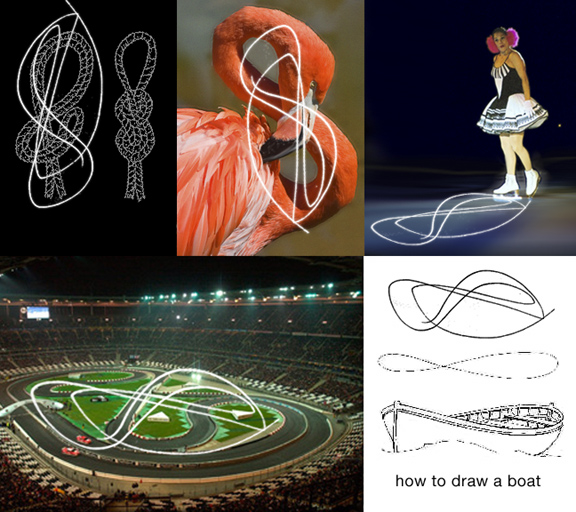

Ch>>>> I love love love your composite image. Very good. The draggqueen ice-skater priceless!!! hahahahahaaha.
Mikey ;-)
A rethink on this “protoglyph”.
for some reason Proto (glyph) seems to indicate that it is the Proto, or base of glyph. After all Protoplasm is the base form, so protoglyph is the base or clay form for a set of glyphs all based upon, or derived from this scribble.
To use the term “protoglyph” Hrant has not casually tossed this word in. It is there for a reason, so ignore the picture and concentrate upon the word.
Here's a term that may clear up my ramble, think about it.
- ProtoType
Oho ! Something just occured to me. Left of normal thinking but not inconceivable. With a more complex “protoglyph”, it would be possible to have a font of one (1) glyph, where all characters are taken from using mathematical formula to extract from that single glyph all information to make and display each and every other glyph imaginable.
Alternately that single glyph cell could be made up of a grid of unconnected points where using same system as before, all characters and glyphs could be determined from.
Wow, imagine it, all font files would be tiny in size.
years ago a friend of mine in the national guard had the job of painting serial numbers on helicopters and other hardware. they used a rather crazy looking stencil that had multiple facets capable of generating any letter or number. it was an awkward thing; it had to be turned and flipped several times for some characters. the resulting "font" was funny in a strictly utilitarian kind of way... with variations minimized by guidelines but inevitable according to who wielded the tool. i'll try to find an image of the thing.

It looks like a klein bottle to me.
OK, now that the wonderful brain-dumping has gone dormant I think it's safe to reveal what I was thinking, even though it's pretty boring compared to the previous flotsam and jetsam of the human psyche...
Not too long ago, in a thread as close as a few clicks away, there was (yet another) "discussion" about chirography and its [de]merits. I had made a distinction between painting and drawing, claiming that the former forms the bodies of shapes (and hence can't make ideal notan) while the latter forms the boundaries of shapes (hence has a qualitatively better chance). Well, looking that that protoglyph (which I still think is a useful term) it struck me that you can actually draw a boundary chirographically! Which is not to say it's practical and fruitful to do so. One clue that it isn't is that absolutely nobody does that. And one great reason not to is that the topology of the glyph (in fact that 8 - yes, all I was seeing was a boring numeral) might make it non-sensical, since you can't have crossing outlines. You can make an "o" for example, but to make a decent "x" you'd need to go around in a contortive way (although what else is new about chirography :-). Anyway, even though I think it's unworkable it might still result in interesting experiments and extrapolations, so have fun with the idea if you like.
hhp
And picking up some scraps:
> I don’t suppose you were thinking of Barbara Hepworth?
I guess now I am!
> lorentz attractor
I love that thing. In college I actually made an animation of it with my Amiga, put it on videotape, and borrowed an A/V cart to show it in math class. The teacher was drooling... but I suspect the other students were squirming and sneering.
> moebius strip
> Escher
Those are interestingly parallel to the topological unworkability of the idea.
> Maybe you are thinking about getting into interior decorating…?
Well, I've always wanted to do clothing design.
But I'm curious how you got that idea from the protoglyph?
> it would be possible to have a font of one (1) glyph
No, that wasn't it - I did that years ago:
http://www.themicrofoundry.com/ss_uniglyph1.html
> a rather crazy looking stencil ... i’ll try to find an image of the thing.
Please!
> maybe you are thinking that if you post a vague
> question you will get a lot of funny, wrong answers… ?
I guess now I am!
hhp

"in fact that 8 - yes, all I was seeing was a boring numeral"
I did wonder seeing that the file name starts with 'new8'
Plus the fact that it looks much like an 8 :)
I did post "8 is enough" a while back ;-P
ChrisL
I knew it would have to do with an [anti]chirographic stance in some way! Ha!
I don't know how mindbendingly obvious this is to anybody but just in case it isn't... ...draw a boundary chirographically! One clue that it isn’t is that absolutely nobody does that. You can of course do 'chirographic' work with two pencils bound together. And you are working in the 'boundries' in that case. And likewise you can do faux chirographic work on a napkin by drawing the seemingly 'chirographic' forms out using a non-chirographic method. But Hrant, your example doesn't seem chirographic to me in any way at all. There is no sense of a front moving. And the while the lines are drawn it is their seen relationship and/or their drawn relationship that might make the form 'chirographic'. Still, I can imagine a process where you start out with two pencils to experiment and end up tweaking those forms with an eraser and pencil on your way to a typographic form you wanted. Have I misunderstood you? What process do you have in mind?
> I had made a distinction between painting and drawing.....
painting and drawing letters, or just any kind of painting & drawing?
Eben, I actually don't think it's anti. In fact it tries to find a place for chirography, although like I said I don't think it can go anywhere highly functional.
> two pencils bound together. And you are working in the ‘boundries’ in that case.
No, that's still painting, and not my idea here.
> you can do faux chirographic work on a napkin by drawing the
> seemingly ‘chirographic’ forms out using a non-chirographic method.
For the n-th time: it's not about the tool, it's about your mind's intent.
Maybe thinking of Peter's "para-chirography" would help.
> your example doesn’t seem chirographic to me in any way at all.
Hopefully because it's not, in the conventional, ubiquitous sense. But the fact is those curves were made chirographically, which however is not how anybody draws letterform outlines.
David, most specifically I'm thinking about the making of
glyphs in a text face (although I suspect it can be broader).
hhp
Discussing this with Eben I realized that some key elaborations might help this idea along. First there's the issue of: what's the difference between this and drawing? I would say that drawing is slow, iterative, vague and deliberate, while this exhibits a true chirographic essence in its flow and certainty. As for the difference between conventional chirography and this, perhaps the best thing I can point to is the way stroke contrast is distributed: in chirography it results from the nature of the [virtual] tool, while in this method it results from an abstract decision on the part of the maker; if you look at that protoglyph, any part of it (I mean the black/body) can be any thickness*, determined only by the "whim" of the designer - something it shares with drawing. But again, it's different than drawing because the organicity of chirography is there. I dunno, does that help?
* Specifically in my proto-8 the left of the head loop and the base of the bottom loop are heaviest, which is not something natural to conventional chirography. Now, this weighting was not intentional, but it could (and -probably- should) be.
hhp
In drawing in the art sense, there is what is known as gesture drawing as in some of Mattisse's work where a quick knowing and skilled hand could, in a few flowing lines, convey an image of a human figure. There is also "tight drawing" like Durer who slowly built up the image with great deliberation. The constructivists and de Stijl artists also were deliberate and "constructed" their work (well duh-ah:-). Both of these styles are still drawing but perhaps Hrant might call gesture drawing chirography.
ChrisL
The difference is drawing an image versus drawing shape bodies,
which, beyond less tangible attributes have to be composed of
closed outlines, which furthermore cannot intersect.
BTW, what is a good name for this thing?
(I mean the technique, not the protoglyph.)
hhp

Most people call it doodling.
"what is a good name for this thing?"
Closed figure outlines, perimeter drawing, or perhaps just constructs?
ChrisL
What's the Greek (or Latin) root for outline/border?
hhp
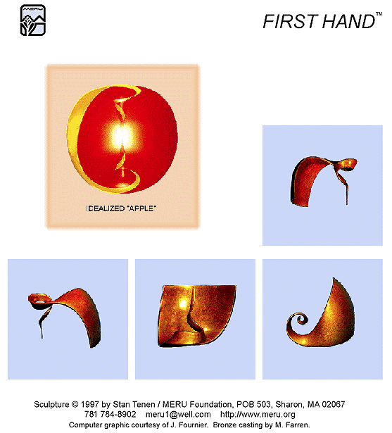
okay sorry to lead us into spacey new age territory but this universal glyph idea
reminded me of something i saw years ago and finally found a link for:
( no, not the military sencil) the Meru Foundation...
they're dedicated to cryptic reading of sacred hebrew texts (yikes). they have this OBJECT, a 3-D shape, which can be rotated in any direction to be viewed as any letter of the hebrew alphabet.
they claim the hebrew alphabet can be also generated by posing the human hand, and was formed as a sort of proto sign language using the hand itself as the glyph mechanism.
this object was designed as a perfected version of the capabilities of the hand gestures.
i'm not sure i'm doing justice to their ideas, nor am i particularly inclined to pursue it all, just thought it was an interesting link for this discussion.
You could try
ambit – Latin ambitus circuit
margin – Latin margo edge
contour – Italian contornare draw in outline
profile – Italian (obsolete) profilo a drawing or border, from profilare from Latin filum thread.
Tim
> they claim the hebrew alphabet can be
> also generated by posing the human hand
Classic post-rationalization.
Quickie trivia question: what (mainstream) writing system has glyphs
based (partly) on the shapes of the mouth/tongue/lips when saying the
sound in question?
That 3D thing is a nice exercise though.
Tim, thanks.
I'm getting the feeling now that somethingo-chiro-graphy
(or chiro-somethingo-graphy) is just too cumbersome.
hhp
How about comtourgraph? or simply outlinegraph?
ChrisL
Margraph (latin/greek construction)
Downside is it sounds like European nobility (although I like the word)
http://en.wikipedia.org/wiki/Margrave
Tim
What's the Latin for painting?
hhp

pictura, from pict- ‘painted’ (from the verb pingere).
Hmmm, I'm thinking we're finally close to a good term for drawing (as opposed to painting/chirography), which is really great! Maybe "margography". But the ideal for this animal is something that combines something like "border" with something like "chiro" or "painting"...
hhp
How about Charro? :-)ChrisL
This goes back several posts now:
>> Maybe you are thinking about getting into interior decorating…?
>Well, I’ve always wanted to do clothing design.
>But I’m curious how you got that idea from the protoglyph?
When I tried to find a definition for "protoglyph" a recurring theme was primitive drawings on the walls of caves. So I was playing with the long shot that you were implicating "wall art" based on your use of the word "protoglyph."
It was silly and a stretch :-)
Duncan
Liminography !
http://en.wikipedia.org/wiki/Liminality
From the wikipedia
"Liminality (from the Latin word līmen, meaning "a threshold") is the quality of the second stage of a ritual in the theories of Arnold van Gennep, Victor Turner, and others. In these theories, a ritual, especially a rite of passage, involves some change to the participants, especially their social status.
The liminal state is characterized by ambiguity, openness, and indeterminacy. One's sense of identity dissolves to some extent, bringing about disorientation. Liminality is a period of transition, during which your normal limits to thought, self-understanding, and behavior are relaxed, opening the way to something new.
People, places, or things may not complete a transition, or a transition between two states may not be fully possible. Those who remain in a state between two other states may become permanently liminal."
I am suggesting this because the process I am seeing & hearing you think about seems all about process, looking for new methods as in 'technique', but also of thought, and is also concerned with both white and black in terms of their relation or threshold rather than in terms of themselves. And 'liminal' is already a solid academic term. So ya got that cred built right in.
Happy?
I love it - the existential angle is right on.
(Although to be clear I mean for drawing, not this thing.)
BTW Duncan, you were thinking of petroglyph, right?
hhp

I think the distinction you're sketching here is the same as (or at least analogous to) the dichotomy between "linear" and "painterly" theorized by one of the "founding fathers" of the discipline of art history, Heinrich Wölfflin.
And even before Wölfflin, there are theories of art coming out of Italy that distinguish disegno ("design" or "drawing," epitomized by Florentines like Michelangelo) from colorito ("colorism," epitomized by Venetians like Titian). The term "disegno" in particular is often left in the Italian because "drawing" doesn't entirely capture the additional meanings of composition, limitation, demarcation, etc.
So maybe you've been "disegning"? :-)
I am liking "Liminography" Eben!
ChrisL
Damn, if I wasn’t a designer I wanted to be a neologist, this could have been my chance of immortality:)
Out of curiosity, Hrant, which way up did you draw the liminograph, where was the starting point, were you standing or sitting, where did the line wander off to?
Tim
Well if you ever switch get yourself a
toga: it's the official dress of neologists.
--
I must have been standing up, because I was testing/warming-up a "non-trusted" pen, which I typically only do when I'm in a hurry. And the orientation you see is pretty much how I was looking at it.
As for the starting point (and thus direction) it's strange that I'm actually not totally sure. Normally I'd start something like that either going up rightward, or going down leftward (which I think is normal right-hander action) but this is neither. Looking at it some more though I suspect it was most probably started from the bottom-right loose end. Where did it wander off to? I think it must have ended pretty soon afterwards, either just straight or with a small reverse-flick.
BTW, what about "chiroliminal" for this?
hhp
I figured to do a quick digitization of the proto-8:
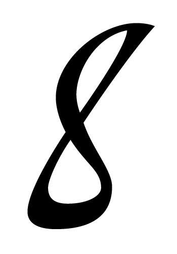
It's based on a 20-degree rotation of the scan, and the bottom-right cross-over has been resolved... which of course makes it no longer "pure", chiroliminally - but typographically it's unavoidable. The alternative, contortive chirography, could also be seen as "impure".
hhp
> most specifically I’m thinking about the making of glyphs in a text face (although I suspect it can be broader).
OK. I see. But why 2 terms -- drawing & painting, and not just designing glyphs?
> claiming that the former [painting] forms the bodies of shapes ... while the latter [drawing] forms the boundaries of shapes...
I think that the best term is line drawing, and not drawing (I know, as you said -- thinking about the making of glyphs but...):
This is line drawing/ drawing/ painting (?):
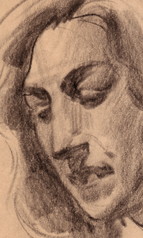
> But why 2 terms
Because the method (different than the tool) affects the results.
Painting the body of a glyph is different than drawing a notanic border.
BTW, there are a lot more than two ways.
In fact what I'm describing here is a third way.
> This is line drawing/ drawing/ painting (?)
I think it's a painting.
But since it's not a glyph, it doesn't matter (for the sake of staying focused).
hhp
OK then, let's make this [pseudo-]official:
Liminography (thanks, Eben) is the rendering of the black-white threshold. What type designers [are supposed to] do. This is one (strange) kind of liminography: chiroliminography.
Chirography BTW doesn't *have* to use a certain marking tool. The central concept is laying down a "black" mark by some movements of the hand/arm system. So you could say that chirography is a subset of painting. I would call this painting "pictography", but that's taken, and really "painting" is a fine word [here].
I do see some technical problems with this terminology structure, but nothing is perfect, so unless somebody manages to throw a capable wrench into it, this is what I'll be using.
hhp
So for the sake of clarity chiroliminography is your new ord of coice. correct? Or was it Liminography?
new ord of coice. correct?
Not really.
Well, this thing is chiroliminographic, but that's a pretty exotic subset of liminography. Liminography is basically when you make the black-white border the design constraint. In contrast, chirography is when you make the black body the design constraint.
Now, you might say that we necessarily make the black-white border no matter what we're thinking, but that's a mechanical issue; the ideological issue is what you believe as being important - your *intent* (and that *does* affect the results). The more you believe notan is important, the more you approach liminography (and I contest, better readability); the more you believe that something like the Moving Front is important the more you approach chirography (which I contest is an arbitrary constraint, so anti-design).
--
This "8" is made by hand, but it does not favor the black (which necessarily comes at the expense of optimal* notan). On the other hand, because it's "spontaneous" instead of deliberative & iterative this method can't really result in a proper text font; it's really just an interesting display font philosophy. The "normal" way to make an optimal* text font remains the equivalent of a refrigerator making ice!
* Not the same thing as "prefect", or even "ideal".
hhp
Sorry about my appalling spelling.
Hrant, Thanks for clarifying!

If ‘optimal’ -- in the context of notan -- is not the same as ‘perfect’, or even ‘ideal’, then what does it mean? Presuming, based on common usage, that there can't be something ‘better than optimal’, we can at least agree that things can be more or less sub-optimal, closer to or further from optimal, however you are defining the latter. But in the context of notan I am wondering how you recognise these relative states of sub-optimisation. Declaring that favouring the black necessarily comes at the expense of optimal notation seems to me to be begging the question, because it suggests that you are assuming that optimal notan involves some kind of balance between black and white, whereas there are other possibilities, e.g. that it involves specific kinds of tension between black and white.
[Of course, we presume to talk about optimal typographic notan, i.e. functionally optimal for reading. In the more general sense of notan, I don't think it makes any sense to talk in terms of optimisation: notan is an aesthetic phenomenon.]
OK, maybe "optimal" and "ideal" are about the same. :-)
Although the latter does sound overly self-contented.
And I would say that "optimal" can make sense only within some boundaries against which it's pushing, so I agree that optimalness of notan only makes sense in context (and actually the context doesn't even have to be readability).
But in the context of readability, I do believe that marking the black blocks your path to optimal notan; it makes the letters qualitatively poorer at blending into boumas. This, no matter how much you *want* to make the white equal. Thomas Jefferson had children with Sally Hemings, but she was still a slave.
hhp

"I do believe that marking the black blocks your path to optimal notan; it makes the letters qualitatively poorer at blending into boumas."
This is the one link I'm not getting: Why, exactly, is there a correlation between notan – in the sense of balancing the black and the white – and readability? Why exactly can Legato "tie" the letters together into more coherent boumas – or, asking the other way round: Why do you say (if I got that right) that we read the black *and* the white, as coherent wholes, rather than black figures against a white background?
Because letters have to be less themselves for boumas to be more themselves. When the whites "talk to each other", boumas are stronger.
The only time letters matter is when immersive reading breaks, for example when we run into an unfamiliar word; then letters have to be identifiable after (relatively) long foveal observation by the consciousness, which is very easy to ensure.
Our consciousness likes to separate and identify, so it sees individual active black things sitting on top of a uniform passive white background; but our consciousness is not what makes immersive reading work. The black cannot exist without the white - they are essentially one thing.
hhp
We will only have gone too far in optimizing reading notan when people have trouble identifying individual letters. We're still an Astronomical Unit away from that.
hhp
"letters have to be less themselves for boumas to be more themselves."
Aah – the big legibility/readability difference. Good food for thought.

Manuscripts are loaded with them. I have given you enough info go look for yourself. Edward Johnston wrote of them, and their history, in the early 1900's so I think that precedes Roger!
http://www.scribd.com/doc/72847950/Writing-Illuminating-Lettering-Edward...
I believe Johnston starts on Versals around page 119. This book is from the early 1900's. I believe these pages were done around 1903.
So I guess I was not wrong, huh!
Oh, and Zapf and a host of others were doing them before Excoffon. They appear in many books, printed about calligraphers, in the 1800's. The Russians, Estonians and Finnish had a real affection for them.
Actually they preceded the 14th century!
Thanks for the link. But I have to say that's not the same thing - it just shows the drafting of outlines (which obviously has been happening for centuries). The main idea in this thread (to me) is the free-form chirographic rendering of outlines; sort of how chirographers think of the black, but applied to the outline (which has no thickness). One thing to look for is "funny" crossings of outlines (and not the sort that happens when you're marking the black - like the "o" in Peter's example).
But more potential examples would be great. The thing is if you have a point to make I think you should make the effort to provide evidence. I don't go on a wild-goose chase when I can't even hear the goose.
hhp
It is exactly the same thing. Their work was functional, not experimental. It is the same principle. Your condescension towards me shows you laziness and inability to see the forest for the trees.
If I may attempt to moderate:
I think it is possible to acknowledge Michael's point that writing outlines of letters, i.e. suggesting structures by visualising the edges of stems instead of stroking them, is an old method that is familiar to anyone who has studied formal lettering. At the same time, within the varieties of forms producible by this method, there are distinctions to be made, as in stroked letters, between formal, constructed letters and informal, cursive letters, and Hrant is talking about the latter. Now, given that distinction, which requires one to look at how a thing is made as well as what it looks like, I'd say that Peter's Helmut Salden example, despite its flamboyance, is actually an example of the formal, constructed letter and hence, as Michael, says exactly the same sort of beast as the traditional versal letter. Okano's Quintet, on the other hand, is clearly distinct in that the outline is cursive. I do think Hrant is getting a little over excited, but that's his wont. :)
Thanks John. There is the distinction between free form drawing/painting that Hrant is always trying to ascribe to what I do and what I really do. Calligraphy is not painting as he has asserted in his previous posts. And the distinction between what he has done, in his protoglyph (whatever the heck that is/means), is largely the difference between interpretive and formal calligraphy, i.e. Versals.

protoglyph
Word of the day.
n.
John, agreed. On all points. :-)
What's ironic Michael is that I've finally found a way that chirography might make sense to me but that's not good enough either.
hhp
... as opposed to what I really do. That is what I meant to say.
Calligraphy Hrant... DON'T offend me at every opportunity with "your" chosen nomenclature (meant solely to rankle my ire) and maybe things might go a bit smoother. And stop playing the victim. If you want to have a serious dialog treat people with respect and you might find them a bit more responsive and helpful.
Michael,
This reminds me of yet another technique with flat pen that I learned 50 years ago from Howard Glasser but forgot the proper name. The technique uses a flat pen but doubles the stroke. As I understood it, it was used to make very large letters which would not be practical with a pen of that era. Today, steel brushes do it with ease. Back then, the user could double the weight of a single pen stroke but increase the stroke contrast as desired. Any clue as to the name of the technique?
Chris... you may have been using COIT pens, or a variation of them. Howard was a true innovator, a real sweetheart. A giant, wasn't he! The Coit was probably very popular at the time... centuries ago when you studied with Howard. :-) There were also "automatic pens" (manufacturer name) around that time. They were used by Gruskin, Baker and Freeman.
Michael,
I have not made myself clear, sorry. The technique I am trying to describe can be done with any flat pen. It was not a mounting of two pens together to draw a double stroke. It was drawing the two strokes one after the other. It was done with Roman Capitals.
Was it a "split" pen Chris, sorry, forgot to ask!
That would have been Versals. :-) Howard is steeped in tradition... especially the "Irish" continuation of Uncial/Versal.
My intent isn't to make you froth at the mouth. I really don't care.
hhp
Neither do I Hrant. But if you wish to carry on a civil discourse do not be so arrogant, condescending and discourteous.
If you truly want to know something that is way out of your realm, ask nicely instead of making everything so contentious.
Notice, I was having no problems with anyone else in this thread.
Stop stalking me.
hhp
You flatter yourself!
EDIT:
The odd thing is I found your drawing interesting/refreshing, and it is reminiscent of things that are occurring, and have been for some time, in the calligraphic field. GSE Briem in the early 80's etc. So I thought it would be interesting to add the calligraphic side to it, since that is where it emanated from. Far be it from me to stop you from shooting yourself in the foot in the pursuit of knowledge.
Sumner Stone did some of these experiments in the late 70's. You may want to check those out also if you can get past your ego and paranoia.

Okay, now how about a 9.
I'll be back around groundhogs day, 2017.

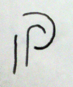
I can't believe I hadn't seen this amazing stuff before:
http://retrographicdesign.com/hand-lettering-by-david-kindersley-1969/
hhp
Whod've thought the lowliest of office supplies could play into this:
http://www.urtd.net/fonts/clip
hhp
A rather pretty “M” that might be interesting in this context,
https://www.facebook.com/RachelYallopCalligraphyLettering/posts/58828063...
Totally chiroliminographic - thanks Nina.
Now help me find a shorter term. :-)
hhp
And another paperclip font!
http://www.myfonts.com/fonts/letterbox/morice-round/
hhp

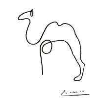

...my line version of google.
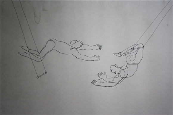

Von Glitschka "Continuous Line Illustration" style.
Some examples:
http://www.vonglitschka.com/2010/05/06/tasty-visual-recipes/
http://www.vonglitschka.com/2011/11/28/fly/
http://www.vonglitschka.com/2012/08/07/att-linears/
http://www.vonglitschka.com/2010/02/12/linear-personality/
http://www.vonglitschka.com/2009/09/04/continuous-line-icons/
http://www.vonglitschka.com/2012/03/13/driving-the-line/
http://www.vonglitschka.com/2011/03/18/march-madness/
And Step by Step Tutorial (text file plus images for each step):
http://www.illustrationclass.com/downloads/raw_tuts/Continuous_Line_Illu...
Does this count?
http://www.flickr.com/photos/lee20sk/8945763391
Great stuff people.
Some more candidates here:
http://dribbble.com/JockintheBox
Like: http://dribbble.com/shots/960623-1968-Olympics-meets-Slab-serif-II?list=...
hhp
This one is awesome!
http://fontstruct.com/fontstructions/show/827761
Yes, interesting twist!
hhp
Another example:
https://twitter.com/LloydNeel/status/452374284938133504/photo/1
hhp
And I wonder if this also qualifies:
http://www.rymaneco.co.uk/
hhp
Captured from web.archive.org on 27 May 2018. view this capture