
http://i157.photobucket.com/albums/t74/sleestack2/148426003_e61f1da5db_o...
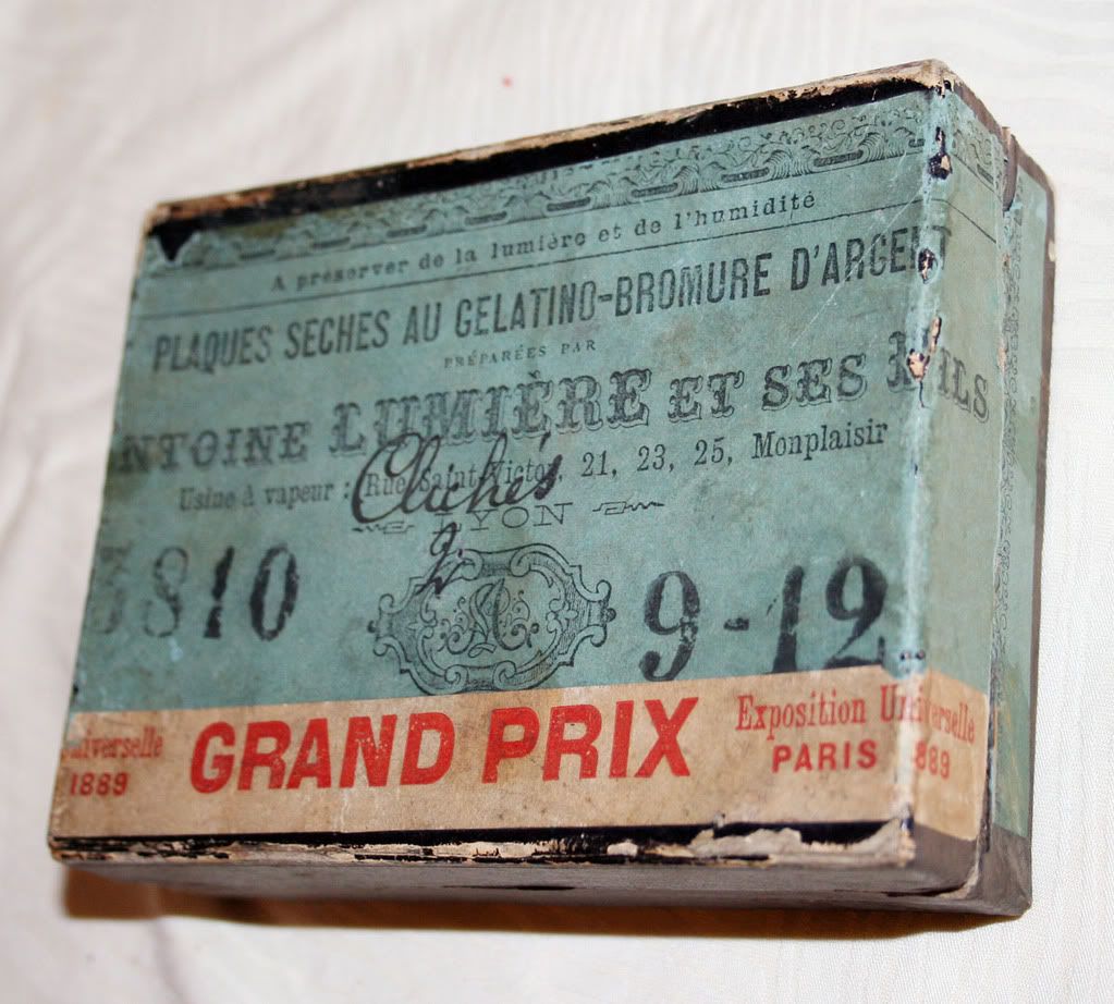
Im looking for a font that looks like the one that reads Lumiere on this box.
Thanks
http://i157.photobucket.com/albums/t74/sleestack2/148426003_e61f1da5db_o...
Im looking for a font that looks like the one that reads Lumiere on this box.
Thanks
That's a beautiful box. Is it yours?
Ideas: URW Wood Type, Cactus Flower, Buckhorn. You could add a simple line shadow to any of these.
No its not. They don't make fonts like that anymore I guess. These new ones just aren't the same
Yes, contemporary font design is very different. Many metal and wood types have been digitized, but there are many more that have not.
I wonder where all the stuff from all these old graphic and type houses ended up
Sadly, a lot of it was made into ammunition for Civil War reenactments. No joke.

Archive Type specializes in old fonts found in old prints, books and samples.
ammunition for Civil War reenactments???? joke?

Sadly, a lot of it was made into ammunition for Civil War reenactments. No joke.
For Heaven's sake, don't mention such horrors! I'll be having nightmares for a month about slackjawed war buffs denying amazing letterpress types to future generations.
it looks like my box is french so there must be treasures all over the world.
archivetype.com is great, I hope the selection grows. They get it.

What about the 'Madame'?
-->
http://www.linotype.com/1201/madame-family.html
Hi
That madame font is too clean. I like how archivetype retains the "imperfections from years of good service all perfectly preserved".
I wish there were more fonts like theirs

One of my favorites for this kind of type has always been Solotype. Way back in the day, before digital type, Dan Solo's company created custom display type to customer's specifications. They would also take off time every year to travel the world and add to their collection, which is massive. Several years ago Dover published a catalog of their specimens. It's worth the 10 or 20 bucks to get one. Thankfully they started digitizing their specimens a few years ago. They may have the exact font you are looking for. There was a link on their MyFonts page that was very close:
http://www.myfonts.com/fonts/solotype/quadrille-2
To get that distressed/aged look, I tweak the outlines in Illustrator and then grunge it in Photoshop, sometimes using filters like Machine Wash.
I should have checked Stephen Coles' post first. His suggestion of Buckhorn is closer than Quadrille. But definately checkout Mr. Retro's Machine Wash filters for getting that aged look.
http://www.mrretro.com/image_filters.html
Click on test drive to see samples.
Just isn't the same. Too clean. Superimposed. Archivetype has the real feel Im looking for.
The finish of Archive Type's stuff looks great, but you'll acheive a more authentic look if you start with a clean typeface and "antique" it yourself after setting. This way, no two characters look the same.

Sadly, a lot of it was made into ammunition for Civil War reenactments. No joke.
For Heaven’s sake, don’t mention such horrors! I’ll be having nightmares for a month about slackjawed war buffs denying amazing letterpress types to future generations.
Even if we could take back those bullets and turn them into type once again, we'd have no place to put the sorts: all the cases were bought by antique dealers and interior decorators to fill up with little doo-dahs and hang on walls . . .

Search for "tuscan" at MyFonts, then Photoshop-filter as needed.
hhp
Captured from web.archive.org on 24 Dec 2014. view this capture