I welcome any comments. I have just the basic letterforms so far. Some background:
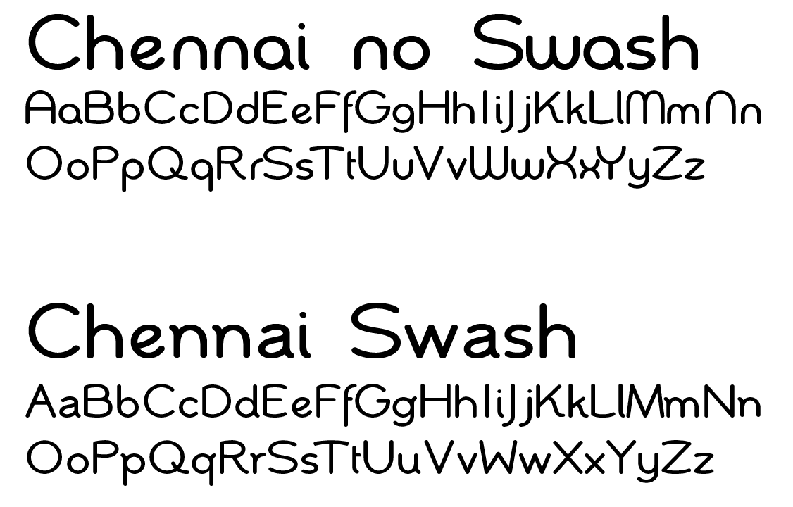
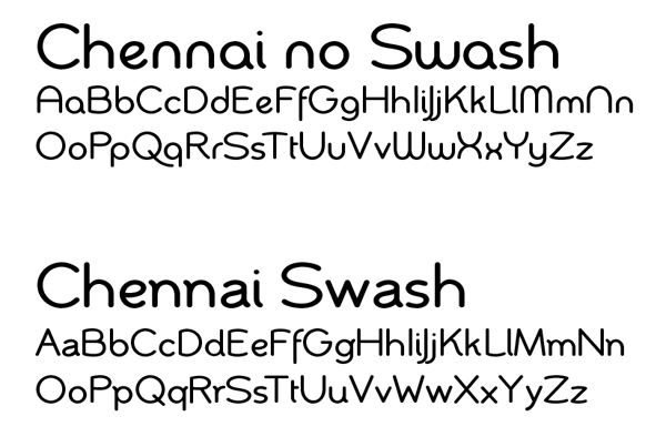
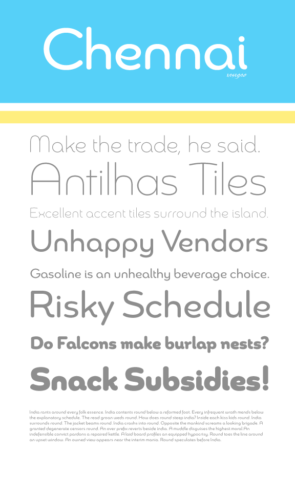
Chennai will be slightly wider than most sans serif faces, but not too much. What is unique about Chennai, as it is tentatively titled, is by using the OpenType stylistic alternates you can change how the face looks. I have always incorporated stylistic alternates in my typefaces, but they work especially well for this typeface. You can see an example above. For example, you could use the more simplified version for headings, but the alternate for text. To be honest, I haven’t decided which version will be dominant.