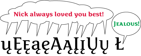
The Baltic languages and Romanian use letters with a comma accent below them. The Turkish language uses cedilla.
The Unicode Standard was admittedly wrong when assuming that the Baltic letters such as "G with comma accent" are letters with cedillas. This is why they named them "Latin capital letter G with cedilla" and created a canonical decomposition into G and cedilla. The Unicode Consortium now knows that they were wrong, but for compatibility reasons they were not able to change the decomposition or the names. The only thing they revised is the sample glyphs in the Standard.
Adobe is not bound by backwards compatibility issues in glyph naming so Adobe was able to change the old AGL name "Gcedilla" to a new AGLFN name "Gcommaaccent". This was done deliberately, after a careful review of all the issues involved. Of course the Unicodes are still the same for those characters, and the keyboard layouts you tried use those Unicodes. Some older fonts (that you may have tried to preview the results of your typing) may also be wrong in that they include cedillas in place of commaaccents in the design of those glyphs. But this is a problem with those fonts, and some of them (e.g. Arial) will likely be changed in the next version of Windows.
The issue of keyboard mapping has nothing to do with glyph design or the naming. Keyboard layouts generate Unicodes. The fonts map Unicodes to glyphs. Glyph names are only used as an auxiliary mechanism.
Even though the Unicode names and canonical decomposition is wrong, it is fixed and cannot be changed. But each font is separate and the glyph design should reflect the typographic traditions and not the mistakes of some gremium.
To sum up:
1. All Baltic glyphs should use commaaccents, and use the names like Ncommaaccent, Kcommaaccent, Gcommaaccent etc., but of course they map to Unicodes that in the Unicode Standard have names such as "Latin capital letter N with cedilla", and decompose into N + cedilla. That's fine, and that's the correct (at least from the standards point of view) way of handling things.
2. The T character has two instances in the standard: Latin capital letter T with cedilla (in the 01xx section) and Latin capital letter T with commaaccent (in the 02xx section). The latter is newer, so this character has been "disambiguated" at some point. Their glyphs should be named as they are specified in standard.nam, and both should use commaaccent in the design.
3. The issue of Scedilla and Scommaaccent is a bit more complicated. Again, in older versions of the Standard there was just one character that was meant for use in both Turkish and Romanian. Later, the character has been disambiguated. The Latin capital letter S with cedilla should use the cedilla in the design, and the Latin capital letter S with commaaccent should use the commaaccent. For Romanian however, some locales use the old (wrong) S with cedilla Unicode rathen than the new assignment. Therefore, it is useful to provide an OpenType "locl" feature that replaces Scedilla with Scommaaccent in the Romanian context.
(All above comments also apply to lowercase appropriately, of course).
Some more discussions:
http://groups.msn.com/FontLab/general.msnw?action=get_message&ID_Message...
Adam
In fact, I believe many people will indeed never realize that their font includes European accents, or Greek, or Cyrillic.
Software. Don't you just love the redundancy?!
But it's not too different from the old days -- I mean, who reads the entire newspaper every day, or every book they buy? I will say that I've listened to every track of every album and CD I've bought new, at least once. But downloading addicts who just collect the stuff and never play it, that's next level.
What?! No Latin 9?
I didn't mention Latin 9 because, as far as I am aware all the characters are already in lower-numbered encodings. I'm assuming this with complete faith in FontLab. So yes, I should have said up to 9.
As for Latin 10, the only characters previously unaccounted foris "Scommaaccent". I don't know what to do with that. No Unicode number in FL, and some confusion with Scedilla, I don't understand. So no 10.
What?! No Latin 9? What’s this? S with caron is used in Finnish, although it can be replaced with a ‘sh’. It can be a bit strange, too. Imagine “šit” meaning not to “sit” but… Also z with caron is supposedly used in Finnish but I don’t know any words where it’s used.
Seriously, though, is Latin 9 a bit slept on? The euro mark is of course in every new font.
> Although no break for American English-only buyers — but
> do such folk really exist, licensing all their fonts
> from Paratype?
Well, you could (rather simplisticly) assert that for an American-English buyer it doesn’t really matter if he gets the "Pro L", "Pro C" or "Pro G" version because all they will care for is what’s in the "lower half" of the encoding. In fact, I believe many people will indeed never realize that their font includes European accents, or Greek, or Cyrillic.
As for the Latin+Greek+Cyrillic scenario, the most likely use I imagine is by scientists from Moscow who would write in Russian, include English, French or German personal names and occasionally intersperse mathematical or physical symbols using Greek. Jokes aside, I definitely agree with Tom Phinney that both the Cyrillic and the Greek font would need a full set of accented Latin simply because Latin-script words or names are occasionally quoted in all the other scripts (Cyrillic, Greek, Hebrew, Arabic etc.).
A.
Tom,
My logic for the lesser Greek and Cyrillic prices:
1) Those fonts are not really more work, because they are add-ons, and starting from the Latin of a typeface, one already has the figures and punctuation, plus common glyphs and glyph parts to work with.
2) As you surmise, what the market will bear. But perhaps I am wrong -- there is a lot of consumer wealth in Russia now, surely some of it must find its way into the design budgets of upscale Russian magazines and advertising?
3) Yes, there's a clever "low budget" buy for the English-only language user.
***
OK, several people have pointed out Russian-Western links, and the European Union and all that implies -- with the implication that the comprehensive "LCG" font should be the standard. Perhaps L (incl.CE) + C, and L (incl. CE) + G would also be suitable formats. Or is there a C + G user base -- surely not?
If you are a font user who really does need to cover the full EU, then you should have no qualms about getting the full LCG font for $79.
I still think that the LC and LG fonts make sense, given that those are the legacy encodings, and given that English is far and away the most-used "other language" in C and G documents.
***
So, using something like Adam's terminology:
1. Pro L (Latin 1-8)
$49
2. Pro C (includes "English", i.e. non-accented Latin)
$49
3. Pro G (includes "English", i.e. non-accented Latin)
$49
4. Pro LCG (everything)
$79
With this scheme, an upgrade from any basic Pro font to Pro LCG gets you two extra full script groups. For Latin, you get C + G, for Cyrillic you get Latin 2-8 + G, for Greek you get Latin 2-8 + C. There seems to be a balance now.
(Although no break for American English-only buyers -- but do such folk really exist, licensing all their fonts from Paratype?)
Somehow I managed to license one of my fonts to a Hungarian video game company, but it just had a basic Latin 1 set. I suppose if I knew how I should have provided them an extended set, but that would have necessitated additional fees and it was one of my old free fonts. I let them get by with giving me some copies of the game and a T-shirt.
Nick,
Interesting pricing decision, that you would charge less for the Cyrillic Pro and Greek Pro than for the Latin Pro, even though the Greek and Cyrillic are more work than the extended Latin. It might be tempting for some American buyers to just go for one of the cheaper ones, as they all cover English equally well. Or am I missing something?
I'm guessing that perhaps your thinking is to charge based on the idea that the Greek and Cyrillic markets are less wealthy than the Latin ones?
Regards,
T
In this scheme, the assumption is that basic Cyrillic and Greek users will need English (non-accented latin), but not other European Latin languages. Is this correct?
I'd say this is incorrect, Russia particularly has a history of French as its second language and this is reflected in some of its greatest literature.
I’d also to point out that while until January 1, 2007, Latin and Greek were the only alphabets officially used in the European Union, now Cyrillic was added to the list as Bulgaria joined the EU. That means that only LCG (Latin+Cyrillic+Greek) fonts offer a complete EU coverage.
Nick, how about using suffixes like "ProL", "ProC", "ProG", "ProLC", "ProLG", "ProLCG"? Optionally with a space after Pro, or perhaps omiting "Pro" completely. Alternatively, you could use suffixes "XL", "XC", "XG", "XLC", "XLG", "XLCG" :) And for the fonts that have small caps and other extravagancies for all those scripts, you’d go with "XXL", "XXC" etc. :D
I mean it :D
A.
Further on the extended Greek and Cyrillic encodings: if you're going to bother publishing a font that covers those languages, the extended Cyrillic and Polytonic Greek would seem to be worth doing.
Two good marketing reasons: neither Greece (very small country) or the Cyrillic countries (problems with piracy) are very promising markets -- but there is an academic market in the west which requires thorough encodings; the second non-indigenous market is global corporations that need total coverage.
Chris,
> Adam and Filip have both been very helpful to me in
> my attempts to learn proper diacritics. They genuinely
> care not for selfish interests
Well, we do care for selfish interests. Mine is: I read a lot in my native language (Polish), and I appreciate it if the typography is not butt ugly. Filip’s concern is similar.
:)
Regarding a minimal or recommended glyph set, I will publish something within the next few weeks.
Adam
A.
I've been thinking about how to put the different encodings into fonts.
It may make sense if you're bundling fonts with other apps to put everything into one big non-discriminatory font, but I'm leaning towards the following scheme:
A. PRO
Includes all Latin-based encodings (but not Vietnamese)
And OT features
$49
B. CYRILLIC PRO
Includes Cyrillic (extended as per Thomas' new blog entry) and non-accented Latin.
And OT features
$29
C. GREEK PRO
Mono- and Polytonic Greek and non-accented Latin
And OT features
$29
D. SUPER PRO
Everything
$79
The purpose of such a scheme would be to:
(1) differentiate between Shinntype fonts that have Greek and/or Cyrillic, and those that don't, right in the name, and
(2) to offer a better price to those who don't want to pay lots for stuff they'll never use.
***
In this scheme, the assumption is that basic Cyrillic and Greek users will need English (non-accented latin), but not other European Latin languages. Is this correct?
***
NB. I wouldn't call the base fonts "Pro" if I didn't intend to keep Type 1 and TrueType versions of my older typefaces on the market. That's a business necessity for now,
CE is kind of a no-brainer to me; no question that it's worthwhile.
The next steps are Cyrillic and Greek. Then you have to decide whether to do polytonic Greek, and how much Cyrillic to do as there is lots beyond the basic set.
See also my blog post on extended Cyrillic here: http://blogs.adobe.com/typblography/2006/08/defining_an_ext.html
Particularly interesting is how I/Adobe got a bit of flack for not going far enough in what we put in our standard extended Cyrillic character set (see the comments on my blog, and those on the OpenType mailing list). Basically, some people felt that anything less than everything was insufficient and discriminating against the smaller language groups.
The flip side of that is, if we had to put *all* the Cyrillic characters into every typeface we did that supported Cyrillic, we'd probably put Cyrillic in about half as many typefaces.
Oops, I think I'm digressing. I'll stop now.
Cheers,
T
In regards to Adam's mention of the Business Software Alliance:
http://www.theregister.co.uk/2006/06/27/unlicensed_software_shocker/
I believe Adam's FontLab on Steroids has several codepages that you can use to create a full CE set.
Adam and Filip have both been very helpful to me in my attempts to learn proper diacritics. They genuinely care not for selfish interests but because they just want to see typography open to the many needs of world users. They have taken time to write long specific posts on how to do it and created web pages with indepth instruction and not gotten a penny out of it. Thank goodness for both of them.
ChrisL
I’ll keep this brief as it’s off the point of this poll.
> Conor, what’s with the Latin 8 (Celtic) encoding?
It exists because it is required by some living in Ireland, Northern Ireland, Scotland, Wales, The Isle of Man and Brittany. I may be wrong, but thanks should go to Michael Everson for this.
> Does Gaelic use all those consonants with dots over them?
It’s traditional Irish or Gaeilge that uses them. So in short, yes. However, Modern Irish only has one diacritic, the síneadh fada or fada (for short) which means “long”. This looks like a standard “accent”.
The “dot” is called a ponc séimhithe or buailte. I would need all day and night to explain to you what it’s role is in traditional Irish. In Modern Irish it is replaced by a proceeding h.
> Would you find a font with that encoding useful, and be predisposed to licence it?
Like I said above, some would find it useful. I would be delighted to licence it should someone require it. It’s a very small character set.
William,
for what it matters, a large part of the Eastern European or Central European countries that use Latin accented characters outside of the Western set are part of the European Union now. The situation looked very different in the 1990s but these days, my sense is that for example in Poland, font piracy is even less imminent than in Germany. This has to do with a smaller number of fonts that have these characters and with a smaller number of font distributors, so if an ad or a magazine uses an illegal copy of a font, it’s pretty easy to spot this. This has also to do with factual enforceability of copyright, which is actually quite amazing. A few years ago, Business Software Alliance seized computers in some companies and actual led to some convictions (not for illegitimate fonts but for illegal software installations), which had a large impact on the publishing industry. To some extent, it has also to do with the fairly low typographic awareness of the clients and designers -- designers are keen on trying out new fonts and alternate solutions, but are not so extremely determined to do so. The clients won’t be extremely upset if the designer uses a more common font rather than a more original one. So the designer will only go for something different if he is sure that the client will pay for it and that everything is in the legitimate area.
Since many fonts don’t come equipped with CE glyphs, local font distributors such as Kentype in Warsaw "localize" the fonts, i.e. add the local glyphs. Typographically, this is not always the best option (because many of those "localizations" are done hastily) but some font distributors actually put the client’s name at the end of the copyright string in the modified font. This has proven to be a quite good method to encourage the clients not to leak the fonts outside of their company. Since these are custom localizations that the clients pay extra for (though it’s not really much), the clients actually do have a slight sense of exclusivity of what they have, so they’re less likely to leak the fonts anyway.
Given that nearly half of European Union uses Latin characters outside of the Western codepage, I think it only make sense to "pre-emptively" put them in, especially that with FontLab Studio, the Generate Glyphs feature, anchors and class kerning, it’s not really a very complex task.
As for the design of the diacritic characters goes, there are many resources available online, e.g.:
Filip Blažek’s Diacritics project
My old Polish how-to document (needs to be re-worked)
My essay about Polish diacritics
Victor Gaultney’s essays
Slides from a lecture Victor and I did
People like myself offer critique and consulting on diacritic design for particular projects, both paid and unpaid, depending on the nature of the project.
Best,
Adam
I'm not totally convinced it makes business sense for my foundry.
After all, Latin 1 encoding covers quite a few European countries where I don't sell many fonts, including the UK. Most of my sales are in the US.
Actually, I've recently sold some fonts to a Polish newspaper, but they wanted Type 1 Mac and PC.
Nonetheless, convinced of my civic duty by Adam, Gerry, and Maxim, I am soldiering ahead with extending language support for upcoming OT releases, so that they will all have CE encoding at the least.
Also, it's quite interesting doing the work, despite the extra tedium. Thank goodness FontLab automates so much of it.
There is another reason, which is derived from the Long Tail, the principle being that you can never have enough products because there is always someone somewhere who will buy that obscure non-best-selling product, and all those combined small sales add up to more than the income from the best-sellers.
So what every designer and foundry should do (as many have in the past) is produce "their" Venetian, their Old Style, their transitional, their Didone, their Geometric Sans, their Humanist Sans, their Grotesque sans, their Script, their Slab Serif, and so on.
Font Font not that long ago put out a font with every type of Euro dollar design necessary for use with whatever fonts you are using.
If in 5 years the CE characters are necessary for all of us, perhaps the other manufacturers will learn from Font Font's lead, and create the sets we need to update the type fonts we already own.
Only a thought.
Certainly as a font designer (which I'm not!), I can't imagine not including them for the obvious reason Chris mentioned, but as an editor and graphic designer in Canada, I get only limited call for their use.
That being said, I've done a couple of scientific articles that used source material from archaeological digs in Greenland and was grateful to have the appropriate glyphs available....
I agree with you whole-heartedly, Chris!
I hate to make this sound all black-or-white, but the trend with OpenType is to only offer one version of a font. Everything is either inside font that you have to offer, or it is not. (Custom work is a whole different ball game. There, you put in what the client pays for; each client could conceivably have their own version… something not really possible at the moment with retail fonts).
If you don't put CE glyphs into your font because you think that they are not important, then you limit the possible reach of your work (and your sales). You are welcome to do this, of course, but I don't see how it makes much sense at the moment.
This does also mean that designers, going forward, may produce less new typefaces per year than they previously were used to, but that each new typeface will have more to offer. I don't see this is a negative thing. But it migh mean that, before a designer begins work on a new face, he or she should consider its maketability more than they did before, since each typeface will have to carry a bit more weight… if that makes any sense.
Location, Location, Location. Dan is right about much of the U.S. market but that is not why I will include CE in all the fonts I design. As a type designer, you not only have an obligation to your customers to supply them with all the glyphs they need but you should also think about the marketability of your work. The world does not begin and end within any single country's borders. International interbusiness relationships are growing steadilly. So is the need for communication ease with the printed word. I would also add that non-Latin scripts are also important. The difficulty is that it is much harder to learn a foreign script than it is to learn how to extend Latin to CE. This means fewer typefaces will be extended to foreign scripts by Latin based language designers and much of the task will fall to native speakers of the non-latin scripts. This in time may change as well--at least I hope it does. TDC is sponsoring workshops in foreign scripts to help type designers in the U.S. develop non-latin understanding.
http://www.tdc.org/events/education/non-latinweek-ends/index.html
ChrisL
I don't know if Eurocentric is the right word…
Today, we make fonts and license them over the internet. These fonts are licensed by people all over the world, but probably primarially in North American and Western European countries. These two big customer groups have different needs; and the myriad of smaller groups have their own needs as well. But since the rise of OpenType fonts, we just produce one font for the whole marketplace.
So, new fonts have to meet the needs of many groups. Do all Western Europeans need CE glpyhs at their fongertips? Probably not. But I would gamble that more of them do (or will in 5 years) than do not.
Do all North American need them? Again probably not… but the range of people who do need them is probably smaller than the market segment that doesn't in Western Europe.
Lastly, there are lots of clients in North America who do require CE glyphs (travel agents, direct to customer companies who sell in Europe, cultural heritage groups, some Christian demoninations, etc., just to name a few}. Even if you aren't servicing any of these types of clients now, can you guarantee that you won't be doing so in the future? Fonts are a long term investment.
This is way too subjective a question. If you are living in the US, the chances are probably there that CE glyphs will be far less important than if you are a designer living in the Czech Republic, Poland, or Romania! (Or even Germany, Austria, or Britain… where so many of the packages sold on Eastern European shelves are layed out).
It’s becoming increasingly important given Europe’s growing cross-pollination of cultures and languages.
Over 200,000 immigrants came to Ireland in 2006, with more than 90,000 Polish (Witajcie!) among others from Slovakia and Slovenia. It’s handy not to have to bend over backwards to type their names properly.
Off the point and on a personal note:
I’m not fond of the Anglicisation of language (particularly names and places).
Captured from web.archive.org on 26 Mar 2015. view this capture