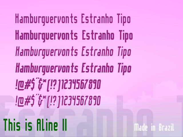
Now presenting: Aline II.
A modular sans serif type, sportif, and cool (I guess).
| Attachment | Size |
|---|---|
| aline2_critique.png | 35.5 KB |
Now presenting: Aline II.
A modular sans serif type, sportif, and cool (I guess).
| Attachment | Size |
|---|---|
| aline2_critique.png | 35.5 KB |

Adreson,
You most likely are not aware that I designed a typeface a couple of years ago called "Align" with a "g". The spelling is different but could still cause some confusion.
http://typophile.com/alignsans
ChrisL

I'd say loosen up the spacing a bit, make the ear of r shorter, and make the crossbar of t shorter. They're making big white spots.
ah! Aline sounds like "a-lee-ne", it is a brazilian name.
::: sempre online :::
Captured from web.archive.org on 16 Apr 2015. view this capture