
Hello does anyone have any resource on museum exhibit signage. ....rules, examples whatever.
also has anyone read this book.
Exhibit Labels: An Interpretive Approach: An Interpretive Approach (Paperback)
by Beverly Serrell
best
s
f
Hello does anyone have any resource on museum exhibit signage. ....rules, examples whatever.
also has anyone read this book.
Exhibit Labels: An Interpretive Approach: An Interpretive Approach (Paperback)
by Beverly Serrell
best
s
f

There has been posts here in the past about this subject. See If a forum director can help you find an archive
Thanks Dan. I did a search but found nothing. Forum Directorany help?

I'm not sure if this will be of much assistance, but Hoefler & Frere-Jones have designed two very distinct signage typefaces for museums, Whitney (for NYC's Whitney Museum) and Verlag for NYC's Guggenheim. There's only a little bit in the site's descriptions about how they fit into museum signage, but it's something.

The type of museum might play a role in your design decisions. Legibility is probably first and foremost though. Consider that you will have people of all diferent heights (and eye strengths) trying to read at a fixed level. Larger than usual leading and point sizes over 16 help out in these areas. Museums are often surprisingly darker than you think of them to be also.
The Museum may have a style guide that they adhere to. The copy editor might be a good person to inquire about that with. Or inquire with the installation manager. They are often aware of what works and what doesn't in their particular galleries.
Thanks you guys. some good info.
The typeface has been chosen. Garamond No. 3.
another question i have is...What's the best way to determine point size
on multi size information panels ranging from 2"x3" up to 8x16 feet.
should there be a system when upscaling type to bigger panels?
Or should it be more intuitive, what feels right for each size pane.this would be for both copy size and headline.
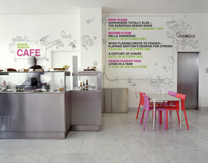
I would love to see more examples like this. and any more info. thanks.




Captured from web.archive.org on 7 Mar 2014. view this capture