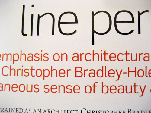
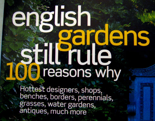
Garden Design magazine (US) recently redesigned and makes extensive use of this DIN-like sans. Distinctive characters include the g, the sloped legs of the M, high x-height, and the overall squareness.
Early hunches that didn’t pan out: Flama (Feliciano), CP Company (Fabrizio Schiavi), Metroflex (Garagefonts). And no, it’s not DIN or Conduit. ;)
(Apologies for the images — I don’t have a scanner handy.)
Thanks, and happy hunting!