Typophile

Letters we Love

This thread ran to 2 pages of replies and only one was recovered, so replies are missing.

pdxuser

The companion thread to Glyphs that Gall, as proposed by Matthew Desmond. I have to say, I can't think of any letter shapes that I'm particularly enchanted by, perhaps because I love letters that blend with the rest in the font. Perhaps I should create a third thread about great fonts in general, but surely that topic's been exhausted in other threads. Can anyone link to them?

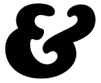
Anyway, for this topic, pattyfab suggested the ampersand of Caslon Italic. Quite fab indeed, Patty.

Clarendon “a” über alles.

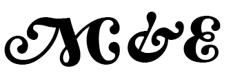
I've always loved Goudy and Cooper's work:

Goudy Swash:

Cooper Black:

And Hoefler's as well...

That swashy stuff gets me every time!


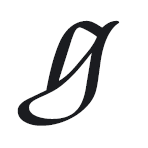
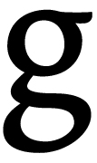
Galliard, g-italic

Clarendon's a? I rather dislike such a's with long tails that stick straight up. They make kerning difficult and remind me of the tail of an irritated cat.

Clarendon's 2
I like that one a lot.

Poetica's alt caps and ends: I'm with Matthew about good swash. :-)

Poms, Galliard’s italic «g» would have been my choice, too! I also really like the «g» and the «p» in Fred Smejiers’ Renard Italic. And Bell’s square brackets.

Haha! Someone else said "swashy"!

:P

No, dear god, please don't say "swashy"!

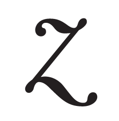
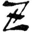
Zimbalo's Z is so wrong, yet so right.

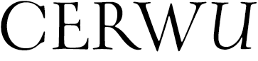
I designed Oneleigh as an homage to the unusual letterforms of Coooper, Goudy, and their era -- appropriating some of my favourites along the way:


C: Goudy Oldstyle
E: Bauer Text Initials
R: Bembo
W: Weiss Titling
U: Perpetua

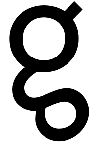
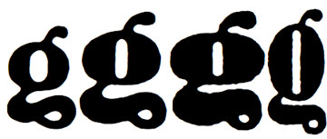
Peter Bruhn's lowercase 'g' for Mercury is almost Seussian:

Sweet g-seus Stewf, that is a beauty!

ChrisL

Clarendon’s a? I rather dislike such a’s with long tails that stick straight up. They make kerning difficult and remind me of the tail of an irritated cat.

Papa don’t preach. This is love. It’s got nothing to do with practicality.
Stephen, I almost nominated that ‘g’ myself. A finnish phone operator uses a modified version of Mercury. The g reminds me of telephone cord.

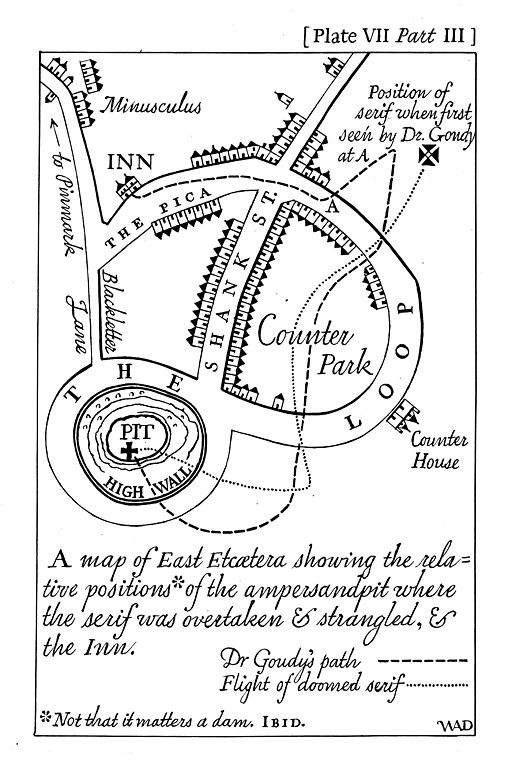
Speaking of ampersands, I can't resist adding this illustration made by Dwiggins, for the Typophile Fred Goudy book. Some of you will know this, but I hope it'll produce a moment of new glee for others of you.

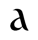
one of my favorite letters is the "a' from Catull

Jackie, that is one gorgeous glyph.

But 'glyph love', as Hrant has noted, can be a trap for type designers.

As Mario Feliciano said to me at TypeCon 2005: "You don't want beautiful letters, you want beautiful words."

Looking at sample words of Catull on MyFonts, the 'a' has 'color' problems, leaving a gap in the NE corner compared to the other lc letters. So the Catull a is exquisite, but a problem within the font.

Caslon Italic's ampersand is my favorite.

Gill Sans Italic's p.

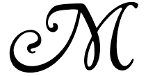
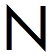
Johnston's M, see avatar. The beauty is in the function and legibility. Compare it to the nasty Helvetica and ugly, splayed Futura.

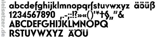
This is Elegant Grotesk by Stempel, from Gustav Möhring.
Its designed 1928 and comparing it with other fonts of this epoche I feel this one as one of the most beautiful Grotesk.

I love all the lower case letters within the bold version:

I don't know if there is a digitalized version of it.
But its not important for me.

Georg

William,

You would have appreciated seeing Catull set from an Alphatype machine, with a master font that had 6 different point sizes.

When Berthold bought out Alphatype they offered us some of their library - redrawn for the Alphatype. I was the only shop in New York City to have Catull. I loved that font. One of the publishing houses (I think it was Carol Publishing or Pinnacle or maybe even Ballantine) had an author who was producing romance books every few months. (Not quite a Barbara Cartland, but direct competition.) I convinced the art director to use Catull for the covers. A few years later (and many art directors later) I received a call asking what the face was -- and how come Cardinal, Photoletter, Haber, etc. didn't have it... it was so nice having an "exclusive."

And WTF must have one of Adobe's original fonts. There were so many problems with their releases. I laugh how folks think "professional" fonts are so great -- even though I own Adobe fonts -- I keep remembering when I first bought the library in the late 1980s. They told me I could sell the whole library when I was done with it. Nice of them... (I don't know if you remember this, they also gave me all the printer fonts on an 80mg hard disk that fit my Compugraphic imagesetter... making it just a little bit faster at the time.)

Very interesting, Georg. Licko must have been inspired by Elegant while designing her Base fonts.

Z:

That little g reminds me of the ones I redrew for Berthold’s LoType, fomerly known as Lo-Schrift.

Always loved LoType, if not only for the name.

I love the g's too from some of the Hellenic wide fonts - it's as if they didn't know quite what to do so they just went wwwwiiiiidddddeeeeee.

I think the g is a glyph to have fun with.

"I think the g is a glyph to have fun with."

I couldn't agree more ;-)

ChrisL

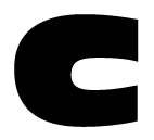
'C' of antique olive nord:

now that's a real beefcake.

alex
.........................................................
Bison Design
Spön

I must confess to a major crush on the Scala Sans lc 'a'.

I love Scala as a font. Yummy

I also like the lc g in Baskerville. Love that elegant little curl in the lower bowl.

Love the lowercase a in The Sans.

The lowercase g in Dolly is a beaut' too.

What do you think, Chris? ;)

The lowercase g in Dolly is a beaut’ too.

I love all of Dolly (I wish she had tabular nunmbers, though).

.........................................................
Bison Design
Spön

g whizz Terry, I like it!

ChrisL

Baskerville's Q is pretty amazing, as are Hoefler's italic Qs. Come to think of it, I love just about all of Hoefler's letters.

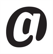
I enjoy the positive/negative approach to the @ of Stormtype's Lexon Gothic Bold

I wonder if any other fonts have taken a similar approach?

That is sweet, I'm sure that will work at smaller sizes than the traditional @ - I wonder if a (c) sign done the same way would be legal.

is the letter i'm most fond of
it's from Guenther Zainers second type (1470/1)
crude but not without elegance - a typical incunabula font

I love all of Dolly (I wish she had tabular nunmbers, though).

Dolly Small Caps does have tabular figures.

>Dolly Small Caps does have tabular figures.

my mistake, i meant lining. which the small cpas contain :-)

.........................................................
Bison Design
Spön


Futura


Avenir

>>Dolly Small Caps does have tabular figures.

>my mistake, i meant lining. which the small cpas contain :-)

what i miss is lining tabular figures on the cap-height (something tells me ijust wrote some really bad english)

.........................................................
Bison Design
Spön

I always love my latest acquisition most. And that's Locator (+Display) from Process Type. I'm using it for my new ID.

I always love my latest acquisition most. And that’s Locator (+Display) from Process Type. I’m using it for my new ID.

I love Process Type fonts! Bryant is my favorite.

g whizz Terry, I like it!

EEEEEEEEEEEEEEEENT! I'm sorry, that's incorrect! We were looking for Golly gee...golly gee. But we would have also accepted "Dolly Gee." But we do have some lovely parting gifts for you. :)

Chris doesn't have enough hair to part, does he? ;-)

That is why I don't own a comb Linda--if I did, you would never be able to find any DNA evidence on it either :-P

ChrisL


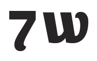
Costa's 7 and w looked like they have so much whimsy contained in their forms.

Maybe not hair, Linda, but the "sea of EULA" he does with style ;-)

P. S.
I am in love with almost all the glyphs of the quirky—if rather unpractical—Sirenne Six.

Florian,
Ihave just looked at Sirene and see why you loke it. I don't think it is all that impractical and wonder what makes you say so? Ofcourse, I like quirky things too :-)

ChrisL

Chris,

I think Sirenne’s an absolute beauty (have you seen the ampersand?)—but it’s just a font not suitable for everyday use. When used for longer texts, it starts to behave strangely—therefore, impractical. (Yes, I know there is a »Sirenne Text«, but it’s not the same …

Captured from web.archive.org on 27 Sep 2012. view this capture