Typophile

(x) narrow sans text face - ITC Officina Sans {Stephen}

macaroon

Font fans!

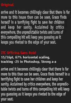
Can anyone discern what this typeface is? There's a slab serif on the lowercase i which makes things a little interesting. Oh and bonus points if you can ID the film the text is referring to. (That I know the answer to)

Thank you.

AttachmentSize
fontID.gif26.06 KB

My first guess is Spiekermann's FF Info / the others

FF Unit / The Others

Niall was on the right track. I am guessing a squooshed ITC Officina by Erik Spiekermann.

Close, Grot, but FF Unit has a double-storey 'g'.

Yes, just noted that myself. I also first thought it was Officina but changed to the wrong track…

The sample is quite small but this definitely looks squooshed. It may well be small enough to make the turning stems of Officina’s r, n, m disappear.

I'll take your word for it that it's Officina. And yes, the film in question is The Others. Good guess.

ff unit has actually two kinds of "g", the other one is in the alternate styles, so maybe…

FF Unit is "straighter". This is most probably ITC Officina. Sure "feels" like it.

I can only imagine how Erik feels about this. I’m so sorry, Mr S.

Especially with that word spacing... urgh.

I can only imagine how Erik feels about this. I’m so sorry, Mr S.

No need to be sorry. When you design type for other people to use, you have to live with bad use. If you write a pop song, tone-deaf people will sing it in their bathtubs. Or – much worse – at Karaoke. Whatever the circumstances, your work has entered the public domain and you have to see any usage at all as a compliment.

Mind you: people who pay for their type usually take a little more care not to harm it.

I bet that 90% of all ITC Officina in use that I see comes from a font that somebody “found“
on their hard drive. The license fees are certainly not in step with its widespread use.

Captured from web.archive.org on 14 Oct 2013. view this capture