
Have now completed all the upper and lower case, most of the numbers, and most of the basic punctuation
| Attachment | Size |
|---|---|
| sticki test2.pdf | 196.84 KB |
| sticki vers 3.pdf | 187.02 KB |
Have now completed all the upper and lower case, most of the numbers, and most of the basic punctuation
| Attachment | Size |
|---|---|
| sticki test2.pdf | 196.84 KB |
| sticki vers 3.pdf | 187.02 KB |

Diotima comes to mind.
Dmn. Found the characters on an old, old page, thought they looked nice. If just remaking one already out, probably should give it up now before spend too much time on it.

Why, having a typeface of your own is nice?
No licenses needed. ;)

Quincunx has a good point, plus, if you elaborate on the glyphic character of your font that you set in the 'g', for example, you got a much more unique font.
Not bee working on it much at all, but did do some slight changes to the characters
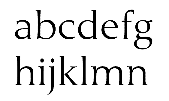
Nice. I love it. Especially the 'g' and the 'b'. The 'c' does also have quality, although in an odd manner.
I like it that the 'k' does not connect.
Some minor points of attention maybe; somehow I'm not sure about the 'd'. I mean how the bowl joins the stem. The 'm' can also use some work, the right shoulder seems a bit wobbly. But theres also a pixely-thing going on there.
How about a PDF next time? So people can look at individual shapes better, and to avoid strange pixel anomalies.
Keep it up.
Would love to attach a pdf, but all I got is attach image, with no pdf or file option.
Dont think possible anymore to attach a pdf, as it seems most dont want this option.

While it is true that you can only attatch images to new posts, you, as the originator of this thread are able to edit the first post of the thread to attach PDF or other file types besides the usual image formats. Have a look at my thread on Agamemnon in this subforum. I've appended the first post many times with new PDFs documenting the evolution of that font.
Thanks for the heads up. Have posted the PDF in the main post.
There was a wobble in the lower m. Have fixed it.
Ah, nice one. I love zooming in on glyphs. ;)
Your 'm' does indeed look better, but could probably still use a bit of tweaking here and there.
It might be the PDF, but your 'a' has a wobble where the lower stroke of the bowl joins the stem. And the 's' as well, on the top left curve.
Can't type longer reply right now, as it's too late right now over here.
have attached the latest to the original post, will be renaming it Umerica
Nice. Are you planning for any lowercase figures/numbers?
Not sure at present, am more occupied with getting the basics down, and then an italic version. Normally I just do an oblique, but this is a bit more 'professional' than I normally do, so would be silly to not at least attempt this.
Also having a visual display problem I am trying to clear up. As mentioned in another thread, there is a basic demo version I have placed in a newsgroup (alt.binaries.font - NOT fonts) which shows this.
Captured from commoncrawl.org on 21 Apr 2015. original URL