Typophile

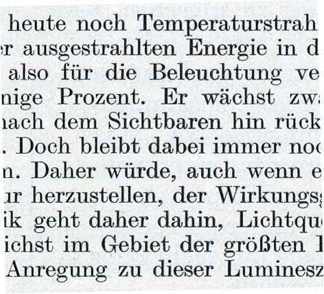
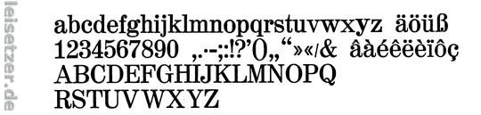
(x) Text face in old German book "Kurzes Lehrbuch der Physik" - (similar to) Monotype Modern Extended {Erik S}

Kriznikovski

Hello,

We are working on a book project and our research led us to this font:
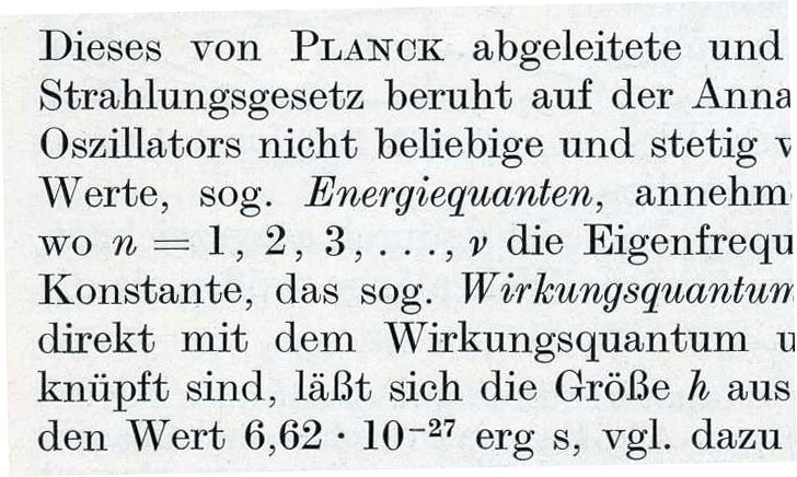

Unfortunately we were not able to identify the font by ourselves
and are seeking your help.If you might be able to suggest some
similar versions we would also be more than happy.

Thanks

Quite similar to Linotype Modern Extended. All bar the lowercase f.

Might be the old Alt Latein by Schelter & Giesecke. Don’t know if its been digitised though mate.

Muzz

I’m with Patty, I think it’s DeVinne. The ’a’ is not like the Alt Latein sample I find in Jaspert, and neither is the G.

- Mike Yanega

The ß and f in DeVinne aren’t the same as Kriz’s sample.

Unfortunately i have no Jaspert, but its definetly neither DeVinne nor Modern, i have already checked that.
DeVinne seems to be pretty close, but I can’t go for it cause there is no bold version, and it looks quite quirky if you set a bigger amount of text.
Alt Latin sounds interesting but I couldn’t find any sample of it.

For digital, try ATF Century Expanded; the Berthold version. Or you could use Bitstream’s Century 725, which, in turn, is Bitstream’s version of Berthold’s Madison, which, in turn was Berthold’s version of ATF Century... Check the figures: they are always a little different (look at the 2), and the f: it has no overhang.

Or for a modern interpretation of the above, try Hercules:

http://www.stormtype.com/typefaces-fonts-shop/families-19-hercules

Century-like forms with Storm’s typical idiosyncratic charm.

I’m seeing differences in all of these Erik, with either the g, t or f. They are all close, including DeVinne, which was what Century was based upon, but I haven’t seen any that are exactly the same. We don’t know if the sample we are shown are metal, or digital, or how old they are. Both of these families have been produced in a host of versions, but using the sc, italics and the numerals hasn’t helped to isolate one from the sources I can find. If this is from a European foundry that none of us has information about we can look until we go blind, and never exactly match it.

You may just have to pick the closest digital font you can find. We have given you some suggestions.

- Mike Yanega

We don’t know if the sample we are shown are metal, or digital, or how old they are
Yes, we do. Or at least I can guess from both the language and the printing that this book is from the beginning of the previous century, i.e. between 1900 and 1930. Max Planck published his first major paper in 1900, and the text refers to one of Planck’s discoveries concerning radiation. That’s why Alt Latein is a good guess. German scientific publishers were very conservative typographically.

Every foundry had a face like that, even before ATF Century (1904). As they were all more or less copies of each other, you’d have to look at a lot of old specimens to find the exact font. The book was probably set in Linotype or Intertype, but it could have been Monotype because of the amount of formulars involved. Mono wasn’t very widespread in Germany, but when it came to that type of setting, no other system was as flexible.

Finding the exact face wouldn’t do you any good, as you’d want to set the book today, and presumably not in hot metal.

Modern Extended from Monotype, 1902. The digital version has a different f, but everything else is spot on.

Not quite spot on. The ’e’ in the sample has a bit of an underbite which is not present in Modern Extended.

Not quite spot on

Of course not. We’re looking at a letterpress sample from 100 years ago. Fonts then often were size-specific, and digital versions will never be 100% identical. These people are looking to create a similar feel, not produce an exact clone, with bad spacing, no kerning et al.

Thanks a lot everybody.
There seems to be a common understanding that there is
no digital version of this particular font.
All your suggestions are fonts we have already considered.
Does anyone have some experience with setting a bigger
project in a stormtype font?
We are thinking about commissioning someone to digitalize
the font, anyboby interested?

This looks like Monotype hot metal typesetting. If my memory serves me more or less well, this specimen is Modern 189. Conor’s call is a good one because the Linotype version it really quite similar. Hopefully no need to digitise :)

Euclid is also quite close, and seemingly ubiquitous in science and maths publishing:

http://www.myfonts.com/fonts/mathtype/euclid/

Purple by NORM and Aurèle Sack seems a revival of the same metal type, altought the interpretation is somewhat different. distributed by www.lineto.com

This might imply that the original typeface is Normande which was NORM found in a type-specimen by the Haassche Schrftgiesserei AG. Münchenstein.

taken from the lineto website:
Called «Normande Halbfett» or «Antiqua Halbfett», its origins are a little unclear. «Normande» was published through the swiss-based Haas foundry, while the «Antiqua Halbfett» or «Gewöhnliche Antiqua» has its roots in Scotland and was published through Monotype in England at the beginning of the 19th century. The design is reminiscent of classical Antiqua faces like Didot or Bodoni, but is more accentuated.

It looks quite a bit like the LaTeX-standard font, Computer Modern. This font is freely available (I think) at this url:

http://www.ctan.org/tex-archive/fonts/cm/ps-type1/bakoma/ttf/

Looks most like Monotype Modern Extended (as suggested by Erik), of which it seems there were several iterations and lots of size variants (again see Erik above). I have had a look at Book Types from Clowes and it seems identical to Monotype Modern Extended No 1 except for the unique letter ’f’.

Here’s a theory (maybe nonsense):

Is it possible that German type needs a narrower ’f’ because the next letter is very often ’u umlaut’ (in the word ’für’ which I would guess is the most common word that uses the letter ’f’ in German and would give a rather unpleasant yet very common ’fü’ pair—see illustration below—with a standard English ’f’). Hence a ’German’ Modern (if well-crafted) will be slightly different (i.e. narrower) in the ’f’ department? Anyone ever thought about an fudiesesis ligature for the word ’für’?

Finally, what about the pointy italic ’v’, that’s got to be a ’nu’ hasn’t it? Every Modern I can find has curvy italic ’v’.

Great type though. Whatever it is.

Its not Alt-Latein, but its:
Antiqua XIII
J. John Söhne, Hamburg
Shortly after 1885

Source:
Seemann “Handbuch der Schriften”, 1926

But Erik is right:
Does this information really help?
I’ld recommand a Madison
(although known as “Amts-Antiqua”)
from Heinrich Hoffmeister, 1909
But I’m not sure if there is a digitalized version.

Georg

Captured from web.archive.org on 13 Jan 2008. view this capture