Typophile

Type for the cover of a traditional cookbook

This thread ran to 2 pages of replies and only one was recovered, so replies are missing.

missgiggles

Any ideas on typefaces that could be used for the cover of a cookbook with traditional recipes? I am thinking of an uppercase, chunky serif. What do you think? Let me know your views. Thank you
PS what about bodycopy inside? Surely that will have to reflect what is on the outside.

Is it going to be the first traditional recipes book ?

I'll think about this but whatever font you choose for body copy - especially the ingredients - make SURE it has fractions. Or at least an expert set that can be used to make fractions.

Sorry, I did not understand that Pattyfab. Please can you elaborate on the 'fractions' part. Thanks.

I doubt it Alessandro. Why would you ask that? Just confused.

Miss G,
fractional numbers. You might do well without if the recipes don’t use oz.

Well this might be an issue only in the US but there are a lot of fractions in ingredient lists:1/4 cup, 1/2 teaspoon, etc. I design a lot of cookbooks and have learned it's best when I use a font that has the fractions built in (an expert collection) rather than having to create them myself. But like I said, with the metric system the measurements might be simpler.

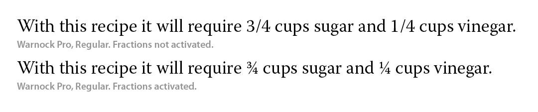
Hi Faz. Patty meant that for a cookbook you will want a typeface that does something like this:

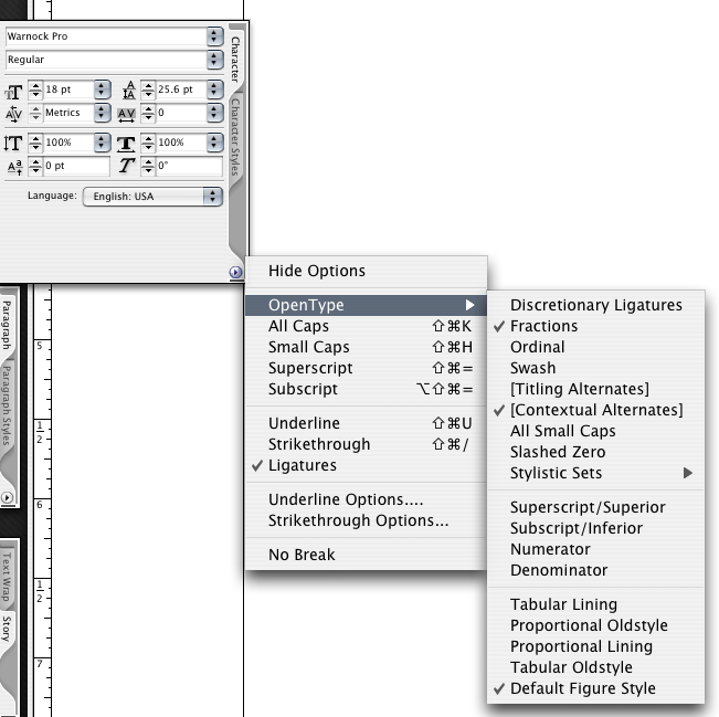
Many Opentype fonts have a fraction feature. If you are using InDesign you can find the feature underneath the Opentype tab:

Of course, you can make fractions out of any font by using superscript and subscript. But the plus of using fonts with figures designed for fractional use is they are visually weighted to balance within the text.

This sample shows using superscript, subscript, some manually kerning, and some baseline shifting to sort of approximate decent fractions:

I find super/subscript fractions really weak in general. When a font doesn't have native fractions and I have to create them manually I find I often have to go up a weight. Also, use shift+option+1 to get a better slash.

I forgot about Open Type - I guess it's in there, right? I have no idea how to use it. I assume you need special versions of the fonts.

Yeah. I'd never use the super/sub unless it was absolutely the only option.

Using fractions is quite easy. You could set up a stylesheet and bam!

Thank you Tiffany for the explanation. I understand it better now.

You're welcome, Faz. Now that we've given you all of this information about using fractions ... if you aren't going to use the font on the interior of the book it isn't so important. [grin] But, it is always a good idea to consider the fact that a typeface which you use on the cover might end up being used on the interior as well. In that case do consider a typeface that has figures designed for fractions.

Faz, what style of food? Indian, Mexican, Cornish, Dutch?

Traditional English food but would be better if focused on recipes using local Lancashire produce from the Northwest of England, UK. It's for an agriculture show in Lancashire and they would like a cover for a recipe book. I thought i could reflect the 'traditional' concept in the type i use. I have researched some that i think could be appropriate but not sure. I will post them as soon as.

Faz, if this is your first cookbook, I STRONGLY suggest you take yourself to the local bookseller and spend a few hours in the cookbook department. Cookbooks are really complicated and you should look at as many as you can to figure out what is and is not successful. They really have to be functional as well as attractive and you'll see pretty quickly which ones manage to be both.

For one thing, I think the ingredients need to stand clearly apart from any other text elements (headnote, directions, tips). People use them to make their shopping list and if they are buried in the recipe or not designed well they can be confusing. They are usually easier to read flush left/rag right than centered. Also, try to make the recipes fit on a single page or spread. It's a drag to have to turn the page mid recipe when your fingers are wet or sticky.

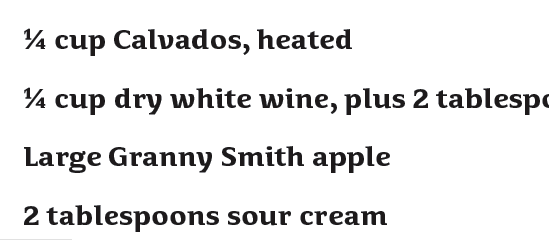
Fractions are avaiable in opentype by typing the normal figure followed by the normal slash and the normal figure. This text is then selected and "Fraction" is chosen in the popup opentype menu in InD. This will convert the normal typing into real fractions. It is a minimal amount of opentype feature code plus making the fraction glyphs.

Here is a small sample:

ChrisL

Gee, you could just stop after the Calvados and have a good evening.

(OK, so you'd need more Calvados than that!)

Mmmmm! Calvados… of the Breton variety.

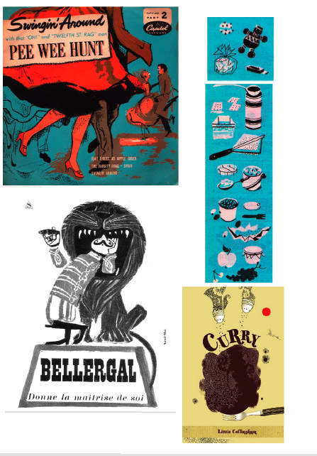
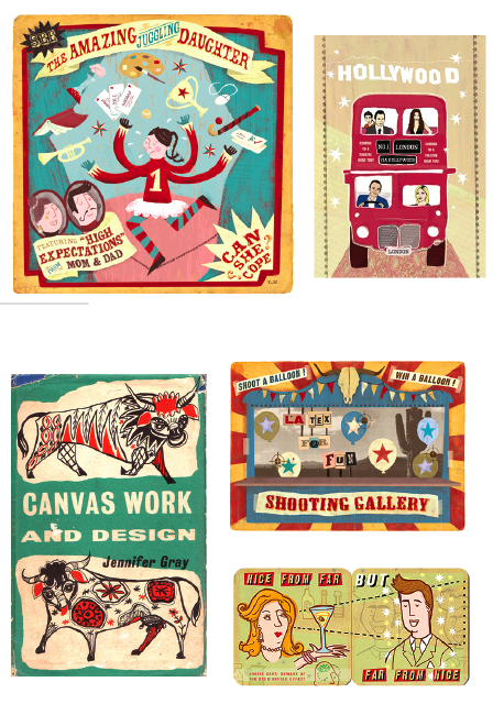
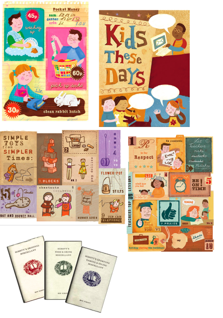
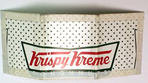
Here is the kind of look I am after. The traditional, old looking type that fits perfectly well with the style of old illustrations etc. I am only designing the cover, but the type for body copy I mentioned above was just for my own curiosity.

My favourite is from Normandy, actually.... ;-)

Faz, those are fun examples. A few foundries that might have some of what you are looking for:

Breaking the Norm
Font Diner
House Industries, specifically you might be interested in Burbank and Latino.

Font Bros. might be worth digging around as well.

In that case, hand lettering is much more appropriate, as most of these are not using typefaces. What is your budget?

http://www.myfonts.com/fonts/btn/concurso-italian-btn/
Seems like a good one but what about a type that is serif, quite dense and uppercase? Any ideas on that one?

Ah, nice examples. Those faces have a woodtype-ish look to them, and I love woodtype. ;)

what about a type that is serif, quite dense and uppercase? Any ideas on that one?

Constructa?
Spire?
Wood Type?

It's not exactly what you might want but for me Tyfa is quite nice for (traditional) recipe book.

_______
AL
lenart.pl

House Industries Las Vegas Font

One more suggestion, before you actually select a typeface, become familiar with what you are doing with it. If there are photographs in the cookbook, you may want to see what they are and then "marry" (oh how we use to use that word a lot in typography) a type font to that artwork. Something that will complement rather than detract.

So truth be told, I don't think any suggestions at this point would help you, the client, the designer, anyone. A good manuscript with careful thought out page layout along with photos if there are any would be the starting point for selecting a typeface or two.

P.S. Note to Miss Tiffany.
I would like to offer you one tip from when we use to make fractions in typesetting - we would do the fraction in one weight up -- so the reduced numbers would maintain the same looking weight as the body copy. Just had to share.

Hi Jackie, in the past, before type designers started including fractions I did do that. For this instance I was trying to stress the reason it would be best to find a font that has fractions designed to integrate. But thanks anyway, it is a very good point and perhaps will help others too. :^)

I'm actually in the middle of designing my own cookbook from scratch. I'm using a Brush Script (of my own making) for titles, or I might wait until Alejandro Paul's Candy Script is available and use that instead. For text type, I chose House's Paperback, partially because it has nut fractions (stacked fractions), which i prefer in cookbooks.
If you're going for vintage, like i am, you might like the vintage cookbook pool at flickr.

Thanks for the link, Paul, some great stuff there. I have quite a collection of those little books, picked up usually for a song at flea markets.

Some choice stuff here too

http://www.lileks.com/institute/gallery/index.html

Vintage look is definatly what i'm looking for. Thanks Paul.

What is this typeface by the way?

Drawn or brushed by hand.

But have a look at Fenway Park, it's very similar

http://www.myfonts.com/search?search%5Btext%5D=fenway+park

Thanks Pat.

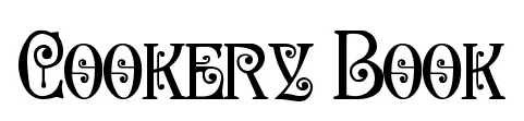
What do you think of the following type for the front cover of the cook book for traditional recipes?

From what era do most of the recipes come?

Maybe early 20th century. Not too old. It's really to do with using local produce for meals etc. So it's more of that kind. Does that typeface look Art Noveau-ish or Art Deco? I am wanting to do for the vintage look.

It feels more like a mid-century throwback to homey Victorian type than early 1900s. If you can live with that, go for it. It fits a cookbook well.

Is that Paul Hunt's Kilkenny?

If so, so for it!

How about Nicolas Cochin? It's from 1912.

http://www.identifont.com/find?font=nicolas+cochin&q=Go

No William, the font is called Secesja by Barmee from www.dafont.com
http://www.dafont.com/secesja-pl.font?text=Cookery+Book

It seems that Secesja is a digitisation of the same Victorian metal font. Paul Hunt's version looks like it's a cleaner version, plus it has the lower case, many swash characters, etc.

Perhaps he'll tell you more :)

Who is Paul Hunt? Is he a member of Typophile? I think he is. Is it possible to give me a link to his profile page for me to contact him. Thank you.

Here he is: http://typophile.com/user/7006

Or just check who's on line under Instant Messenger and IM him. He's one of the moderators--Thanks Paul!--so he checks in pretty often.

Captured from web.archive.org on 11 Jan 2015. view this capture