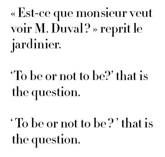
The standard practice in French and most European typography is to insert spaces (or a thin space and then a word space) around punctuation marks, except for full stops and commas.
Thus:
" Est-ce que monsieur veut voir M. Duval ? " reprit le jardinier.
By contrast, current practices in contemporary English (UK and US) typography do not 'air' punctuation marks.
It has long been my contention that the European practice should be followed since it makes for much finer typography. Then, reading an old Penguin set in 1961, I noticed that it does 'air' the punctuation marks. This prompted me to conduct a mini survey amongst the books in my library and I saw that many older books from highly respectable publishers were generally set in this 'airy' manner, both in the UK and the US.
Is it time to bring this custom back to English typesetting, or at least to offer it as viable alternative?
I say yes! ( or should I say, " I say yes ! " )