
Only in the last month or so have I run across Typophile. No sooner do I get here, of course, than I discover that this particular windmill already has plenty of broken lances stuck in it, and I’m late to the party. But...
For the last four years or so, I have been working on this. I program for a living, and very quickly got fed up with looking at Courier and friends. Because hubris is one of the cardinal virtues of programming, I banged out my own first draft in Fontographer, got a copy of MS VTT (for mac os 9!), and have been polishing and tweaking the font ever since. I use it as my main programming, email, and web page mono font, at first as motivation to keep improving it, but these days, because I don’t think it looks half bad.
I’ve now read through the various threads on monospaced type design now, particularly Eben Sorkin's Software Developer. It’s great to recognize problems I’ve fought with myself addressed here (and, sometimes, affirming to see similar solutions to my own!)
I now recognize this is a path well travelled, but it isn't often travelled well. I may yet have something worthwhile to contribute.
I give you: BakaMono.
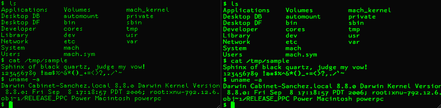
My design goals:
Usable both bitmapped and antialiased (I use both), down to as small a pixel size as possible. I.e., good hinting.
Not look like a "slave to the bitmap" like good old ProFont.
Make programming typographic idioms as blatant and unambiguous as possible. Heavy, obvious punctuation.
Avoid trouble spots that lots of otherwise excellent fonts get wrong: the O 0 o test; the l i 1 | ! test; ambiguous punctuation: , . : ; ’ ` ” [] {} () < >; and letters too similar: e @ a o D O g j y rn m z 2 S 5
A much more comprehensive sample is attached.
| Attachment | Size |
|---|---|
| bakasample.pdf | 52.78 KB |

