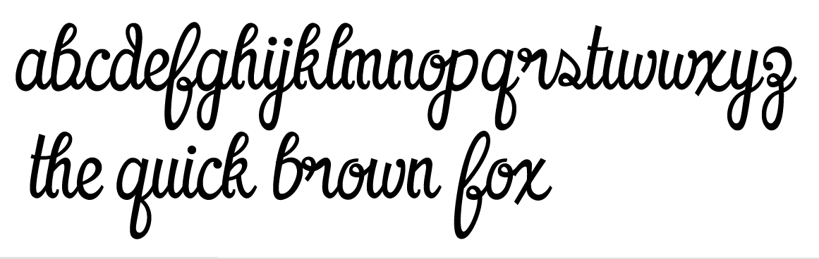
I'm really liking this one, sans the 'o' 'r' and 's', its still got work to do but wanted to see what ya'll thought so far, thanks!
| Attachment | Size |
|---|---|
| scriptry.png | 42.54 KB |
I'm really liking this one, sans the 'o' 'r' and 's', its still got work to do but wanted to see what ya'll thought so far, thanks!
| Attachment | Size |
|---|---|
| scriptry.png | 42.54 KB |

Looks pretty good to me so far, but I'm sure others with more authority in inspecting the curves will have more to say about that than I.
The internal up-hooks in the h, k, m, and n are pretty distracting to me, as they interrupt the flow of what one expects to see as a single stroke. Likewise with the top loops on b, d, h, k, and l, though it seems more of a stylistic decision than the afforementioned up-hooks. At least by the way I learned cursive, the connecting stroke from the b should come from the top, similar to the o and v, so this one looks a bit off to me.
Are your connecting strokes attached before or after the letters?

Looks nice, the general shapes and style of the script.
I think you might let the bottom of the g connect to the next character just like it does with the j. I agree with Jason Pagura that the connection of the b should be on top.
The s is a bit too thin.

the x is a little off, as well as your noted o, r, & s. perhaps it's just too harsh in contrast to the rest of your strokes.
Heres an updated pic, theres still a lot of issues to work out. I initially wanted them all to connect, but I don't think that will work. Does the "br" of "brown" look ok withought being connected? Does the "s" work or would a loop in it (blue) look better
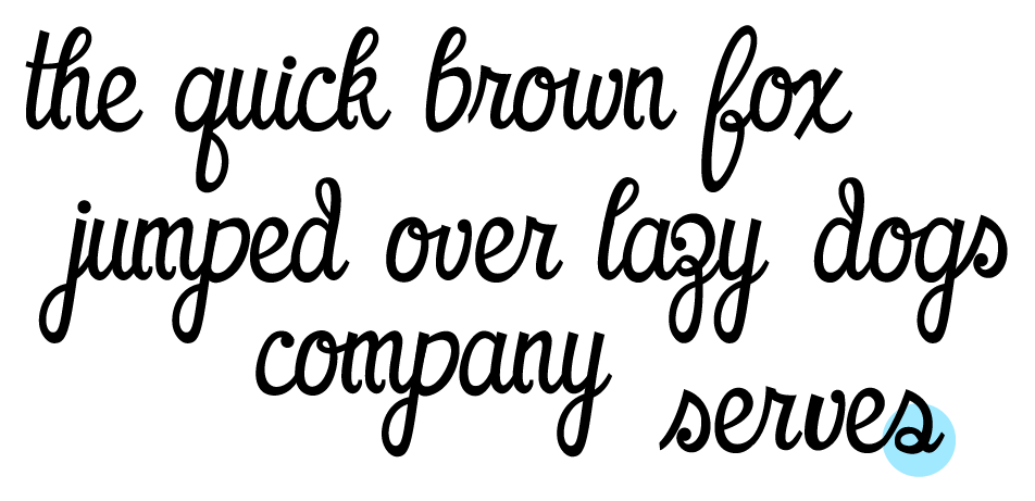
The b not connecting doesn't really bother me.
I like the looped s better, although they both work. (alternate?)
The lowercase feels pretty solid now, I'm now beginning uppercase. I'm still debating those uphooks on the "m" and "h" type letters, anything else seem in need ot tweaking?
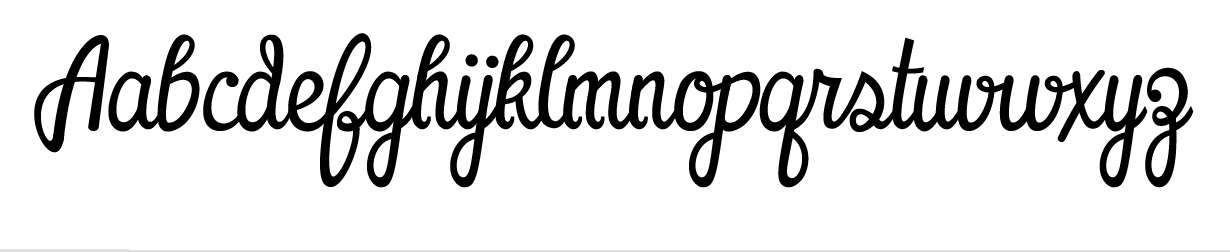
The l could be more open, like the top loop of your f, but that's just my opinion. It works the way you have it.

I think the 'h', 'k', 'm', and 'n' don't need the little hooks on their first strokes. Rounding them (like the top of 'u') might look better.
If you're really worried about the 'b' not connecting, you could try making it look like your 'v' with an ascender.
Overall, this is a really fun and tasty script. I like the direction you're taking with the caps 'A' as well.
- Lex
"... you could try making it look like your 'v' with an ascender"
That is actually a good point I think. That would make the b look better imo.
i agree with the v into a b point - good idea...
i just wanted to say that this looks really great and would love to know when you release it... cheers - sye :)
did anything ever happen with this idea?

Hey chillypepper!
Good work!
Thers's go my humble opinion:
I believe that there are some forms that do not get along between them, if one watches the system as a whole.
The stroke modulations and its relation with a pen are strange in "A".
There are thickenings and refinings where it must not have them (c,g,z,x, etc). Counterforms are unbalanced in some letters (f,z).
The final strokes (that small hook) of (h,k,m,n) I would make them subtler.
And finally, it seems to me that the "x" and "z" deserves a redesign. "z" looks like it has a big head and "x" seems not to be part of this group.
Sorry about my english, hope I has been clear...
Best regards!
Captured from web.archive.org on 19 Apr 2015. view this capture