Typophile

Condensed Display rough

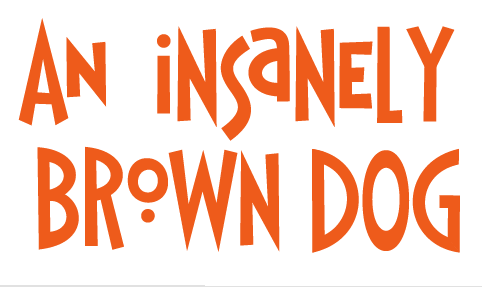
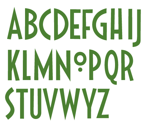
Here's a rough of a new font I'm working on. I wanted to try something fun with that "O" but not sure if it's going to work. I may just make this an all caps typeface with alternate caps for lowercase. - first thoughts? Thanks

*I added a second picture after I "funkified" it. Familiar to some House fonts maybe, but pretty fun, like?*

AttachmentSize
Picture 563.png29.29 KB
Picture 564.png29.03 KB

563 is much better, more usable. It's a festive little thing and could win a few fans as an all caps with alts.

I started playing with a few alternate letters

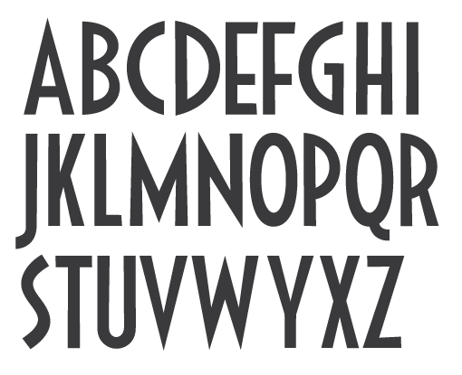
I think I'm pretty close on the uppercase, have a look- It sort of lost its funkiness in favor of a more deco feel

Nice. You can have two styles, Deco and Funky.

I think your Q might have a little too much weight at the bottom of the curve. 'U' too light all around, and maybe too narrow. 'S' is overshooting too much for this Deco version. 'H' crossbar may be too low too, as much as I like low-waisted letters.

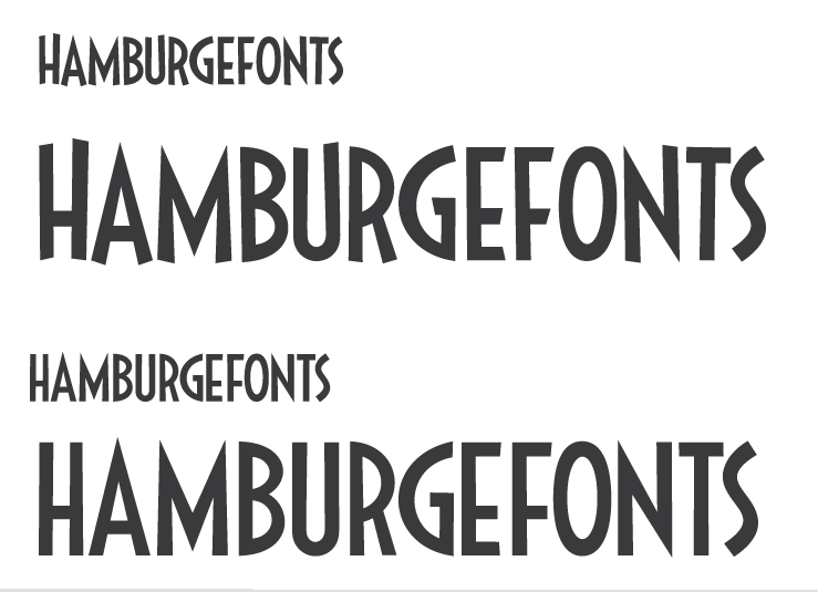
Cleaned it up quite a bit, much more uniform,

Do you like the clean or tilted edges of these exampes?

I like Stephen's comment about having "Funky" and "Deco" -- obviously, this image has them in that order.... ;-)

Agreed, I've decided that instead of trying to compromise, I'll make two seperate typefaces.. thanks guys

Much better without the dotted "o". I am a fan of that character, however, it just didn't fit with the rest of the set. Good lookin' font.

Captured from commoncrawl.org on 18 Apr 2015. original URL