
I like to make mine with five points, but in most fonts I see them done with six. Conceivably seven could work, but eight or four wouldn't in most cases. Three might, though.
What do you think about asterisks?
This thread ran to 2 pages of replies and only one was recovered, so replies are missing.
I like to make mine with five points, but in most fonts I see them done with six. Conceivably seven could work, but eight or four wouldn't in most cases. Three might, though.
What do you think about asterisks?

I've seen quite a lot of 5 point asterisks & in the 3 fonts I've made so far I've made them with 4, 5 & 6 points. I guess it mainly depends on the font & what the designer feels fits it best (as long as it's recognisable as a star).

I always felt 5 did the trick.
When the font is well thought-out - normally the asterick has been as well.
One of the ugliest I ever came across was a font named Caledo - it was Alphatype's version of Caledonia. It was one of the three characters they changed to call it a new font. They made an 8-pointed mess of it. I did find great use of it one day. Ballantine Books had one of their "Inspirational" book covers to design and they needed a dingbat to separate the author and title on the spine -- I gave them Caledo's asterick - it was the only place I could ever see it be used.
Glad others think along these lines. You know - the regular people out there would consider us all nuts...

"the regular people out there would consider us all nuts…"
And they would be right about us :-)
ChrisL

Speak for yourself, Chris! ;-)
Since the asterisk has represented a star as far back as the Sumerian civilization (some 5,000 years ago), the five-pointed version is so familiar to us. There's no reason why some other number of points wouldn't work (although I'd vote for an odd number), but when we see something else, it rates low on the comfort scale.
And here I have been making 6 pointed asterisks for all my fonts :-/
Guess I better get back on the comfort level banmdwagon quick :-)
ChrisL

Looking through some old specimen books, the six-pointed asterisk seems to be most common traditionally, at least 50% more than five pointed ones. I also saw the occasional oddball with four or eight points.
I usually make them with six points in my own fonts. I write them that way, too. It takes only three strokes.

Well, I'd vote for 6 pointed, since it's easier to hint in TrueType, in very small display sizes.
Guess this makes me nuttier than the nuts.
Jason C

Bringhurst actually talks about the asterisk in Elements. If i'm not mistaken, he states that 6 points are more mechanical and fitting to "modern" styles and the 5 pointed version is more orgainic, fitting for calligraphic forms.
I'll vote with Yoda :-)
ChrisL

Plenty of smalltalk potential in this thread...
"Excuse me, I'm rushing to teach the next workshop on hand tuning five pointed asterix grayscale bitmaps"

Well, I’d vote for 6 pointed, since it’s easier to hint in TrueType, in very small display sizes.
Ihad wondered about this but then I saw you they did 5 pts in Myriad & I wasn't so sure. Can you give an example?
I had a quick go looking at who does what:
6: Univers, FranklinG, Interstate, Udo, Petras Script
5: Quadraat Sans, Legato, Lutz Headline, Meta, News Gothic, Ronnia, Tiptoe Toy, Azdindenz, Wunderlich, Clan,
As much as you can draw conclusions there seem to be exceptions. Maybe it's just my skewed sample set but there seem to be far more 5 than 6... And newer fonts seem to favor 5 points. Looking at petras script made me skeptical about Bringhursts' point since it is far easier to make a 3 stroke hash than to make a star by hand...
who said calligraphy was about what's easy?
easyPerhaps, but what is more likely or natural? I am still having trouble imagining a 5 pointed asterisk being made by a calligrapher except in imitation of type. Maybe I am just not seeing something I aught to. I think Bringhurst's point may have been a theoretical and aesthetic one rather than a literal one. What do you thin?
My take or RB's comment is that 5 is more common in nature - you know core of an apple, petals on a flower - that kind of thing. I could be completely wrong...
That sounds right - and six is more man made etc. The classic 20th century contrast.
I guess i just associate the 5 with the ultimate caligraphic serif: Palatino.
Thanks for the smalltalk generator - I didn't know it existed - but I think it explains how some people choose their topics around... LOL
five pointed asterix

"Ils sont fous ces typographes!"
Ah! J'aime Asterix et ses amis!
Perhaps it's a factor of age, but I remember learning to draw two "stars" as a child: one was the one-two-three separate lines forming a six-pointed hash, the other the one-two-three-four-five, all connected. If one connected the points of the latter (and was good at drawing the initial form), one could create a pentagram, with all the potential danger therein.
>five pointed asterix
Ha, only Mark would have the Gaul to point out my typo ;-)

There is no "true" answer? This is why type design rules.

I remember reading a intesring article a long while back about the Asterisk and it's variant designs dependent on the number of points. From what I remember, it has a lot to do with current cultural trends, and also more specifically to cultural normatives of different societies around the world. Depending on were you are, I think the prefferred number of points varies.
So, when making a 5 pointed asterisk, which direction do you prefer to point it? One can rotate the angle of a 6 pointed one too, but somehow it seems to matter more with 5 points, at least as I look at it.
All of the 5 pointed I have seen so far are star-like with one point straight up unless they were italic or oblique. In the italic they are rotated. In the oblique they are ergh.... obliqued. Let me know if you find a font that diverges from this please - I would be interested.
Eben, I already decide to make one just to retort. Will post more later.
This is a forum to discuss typography; not one where members should attempt to boost page rankings with html signatures.
I was confused - post retracted.
Let me know if you find a font that diverges from this please - I would be interested.
did you even look at Palatino?
I did just now! And it seems that Choz will be too late to 'retort'. He could 're-retort' however. How are you feelining about Palatino these days Paul?

Both Minion and MVB Magnolia also have a five pointed asterisks with a slight rotation. It seems to me that there aren't any hard and fast rules for how many points an asterisk should have, Horley Old Style for instance uses an 8 pointed asterisk.
I personally find an odd number of points more aesthetically pleasing, while an even amount seems to be more natural seeing as most people would create an asterisk with two or more crossing strokes when writing.
How are you feelining about Palatino these days
i've always liked Palatino. In fact, it's embedded in my subconciousness so deeply, that when i tried to draw a lower-case for a serif face i was working on, it came out looking quite a bit like palatino without my intending it to.
My earlier comment about 6 points being easier to hint than 5 was meant in jest, BTW. Any design can be well hinted, and if the effort is put into it, the results will be great no matter which design is used to start.

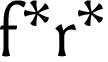
I hadn't thought of that Nick. I can see how the five point could be helpful there.
ChrisL
Nick, Yes, - very nice. Thank You!
Another combination to consider is the double asterisk, traditionally a common usage.
Vertically symmetrical asterisks, however many points, tend to touch points when doubled, so this may be another reason for the slightly rotated asterisks in many fonts.
Interesting. Yeah, I have not seen a double asterisk in a long time. Library Cards had them I think...
I had some jobs years ago where they strung as many as 4 in a row instead of using superior figures for footnotes. That was a case of one strange editor's proclivities though.
ChrisL
Reference marks in order of use:
* asterisk
† dagger
‡ double dagger
§ section
|| parallel
¶ paragraph
['printer's fist'] index
*** asterism
Order varies slightly according to sources. You can see why superior figures replaced this system. But what a great make-work project for idle characters, and how quaint!
I sure can Nick!
ChrisL
I have a soft spot for section marks.
So does the Federal Register Eben.
ChrisL
What is the 'federal register'? A Newspaper? Or an actual federal document of some type?

Eben, if you're not joking, see http://www.gpoaccess.gov/fr/index.html
"Published by the Office of the Federal Register, National Archives and Records Administration (NARA), the Federal Register is the official daily publication for rules, proposed rules, and notices of Federal agencies and organizations, as well as executive orders and other presidential documents."
Eben,
Someone from Athens just told you exactly what it is :-)
Yasou RC!
ChrisL
Yasou to you too, Chris! And, albeit quite belated, my sincere best wishes for many happy returns on your birthday, which I trust was nothing short of punderful — with no asterisks required.
RCC
LOL! Thanks RC!
ChrisL

Nice thread (thanks Simon for the heads-up).
Surely the number of points -and the orientation- depend on the font. To me a Didone likes 6, vertical. In my own fonts I tend to use a 5, upside down; the latter because the thing needs help doing its job (getting attention). Sometimes an off-kilter one makes most sense. I can even see a 4 making sense - maybe with strongly flaring ends, like that German cross - what's it called again? Hmmm, how 'about a 3?
The x-height of the font affects these decisions too: when it's big the asterisk can/should be bigger too, which makes a sixer less problematic (in terms of clotting), and reduces the need to make it ask for extra attention (allowing it to be right-side-up).
> six is more man made
Hmmm, snowflakes? Some flowers are sixers too.
> The design of the asterisk may be related to the “f”
Good point.
BTW, just like there's an asterism, we should have a special thing for two asterisks - maybe something where they lock together nicely.
hhp
Hmmm...
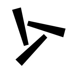
hhp

just like there’s an asterism, we should have a special thing for two asterisks
There is: ⁑ (Unicode 2051)
Captured from web.archive.org on 24 Apr 2015. view this capture