
Hey all- I'm workin on my first typeface (unnamed at the moment) and was wondering what you guys thought. I want it to be fun but not too crazy.
| Attachment | Size |
|---|---|
| Picture 515.png | 30 KB |
Hey all- I'm workin on my first typeface (unnamed at the moment) and was wondering what you guys thought. I want it to be fun but not too crazy.
| Attachment | Size |
|---|---|
| Picture 515.png | 30 KB |

Are you deliberately making some of the characters look like they are drawn backwards? If not, you may want to give that w a horizontal flip... it looks too much like a rotated m.

I kinda like it. How would it be used? Ricardo is right about that w.

I'm loving the lighter weight; I could see using it in a warm, humorous piece. Very latter twentieth-century, east-coast sort of feeling.
And that w is freaky.
haha- I guess I'll get to work on that w.
We'll I've tweaked it a bit- fixed the w and added a bit more quirkyness. The caps aren't looking so great on their own but look good when used along with lowercase.
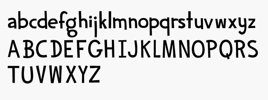

The caps have sort of a Dr. Seuss vibe to them. Very fun.
- Lex

In my opinion caps need to be a little more stronger. At the moment they look thiner than the lowercase characters

Cute. I think a lot of the issues with your typeface will work themselves out the further you'll get in development. Nice work.
I does look Suessian....
Say, why not start posting some phrases imaged so we can see how it swings.
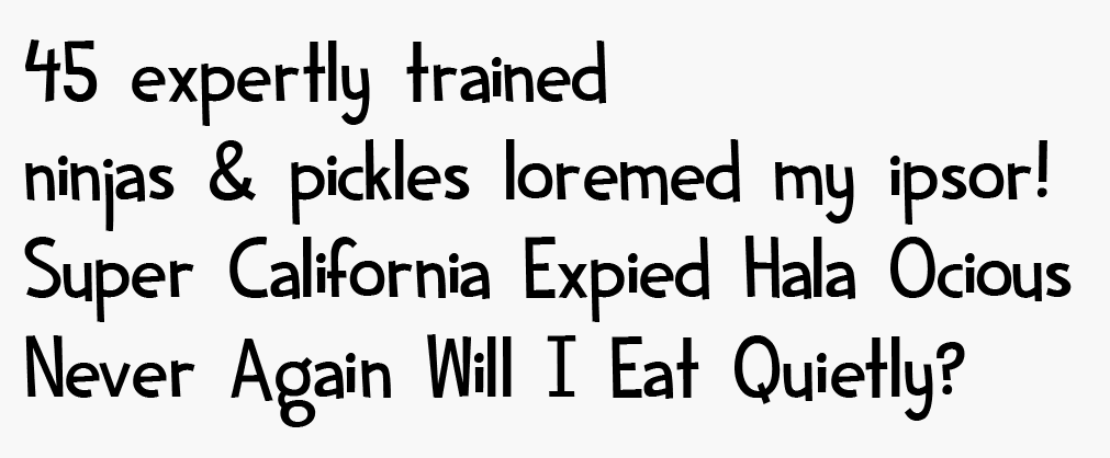
Yeah. Give that 'i' some air!
What about some scripting for swapping out one g for another ( and so on) . Or to eliminate the same latter looking identical. Like that double l in 'Will'. It's like the music stopped. :-(
Maybe scripting for Contextual alteration for 2nd & 3rd duplicate letters is what's needed. Now that would be Super Sweet!
I like your 'n' But your should be more different from it I think. I am not loving the 'r'. Maybe pitch the arm higher and start it lower.
Eben- how would I go about scripting some alternate letters? I'm using fontographer is thats a hinderance
That might well be a hinderance. I am not sure. If it is you could partner with somebody I suppose. Or maybe ( I am crossing my fingers for ya here) if a foundry picks it up they could handle it. BTW the old fontopgrapher or the new one re-released by fontlab? In any event, the thing to do is to take as far as you can before you take that step. If you get utterly stuck & want to do it I might be able to help.

A very funny font!
I think the space (between words) is too wide. Following Tchichold, give to him the same value of letter i. It works graceful
Captured from web.archive.org on 23 Jan 2015. view this capture
