hello all,
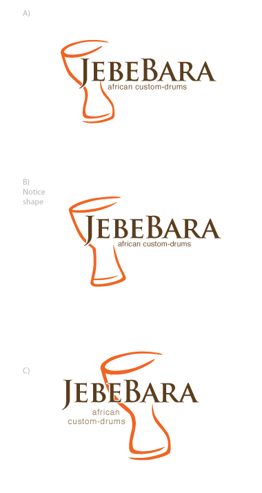
i am creating a logo for a guy who builds high quality african drums.
for those who know more, they are called djembes and dununs.
my first samples for him included more "african" fonts, bolder and more playful.
he really likes the Trajan and wants to go with a font like the Trajan.
My Questions to you:
A) What is your overall impression if you see these logos? Does it look like high-quality drums? does it still look like he is selling affordable drums? do you think it needs a more "african/ethnic" touch?
B) Which version do you like best?
C) Any suggestions for another font and general comments.
Thank you.
| Attachment | Size |
|---|---|
| trajan.gif | 11.59 KB |